Calculation Builder

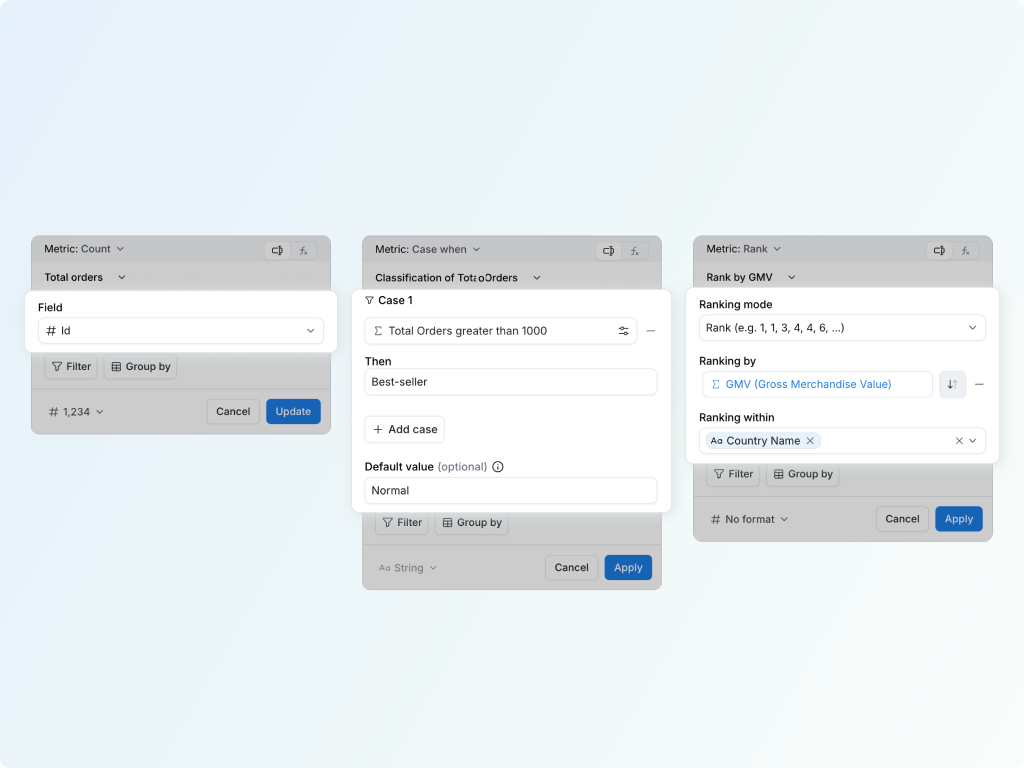
The Calculation Builder is the no-code interface for creating metrics while you build a report. Click a metric or column, pick what you want to compute, and Holistics builds it for you.

New to building calculations? Start with the Custom Calculations Handbook for a guided, task-by-task path. For opening the builder, browsing the catalog, creating with AI, and checking the generated AQL, see Start building with Calculation Builder.

Common metric settings

Most metric calculations share a few settings. They do not change which calculation you are using; they control the scope, grain, and display of the result.

The same panel usually brings those settings together: the metric you are building from, any metric-level conditions, grouping for aggregation, and the display format.

SettingWhat it controls
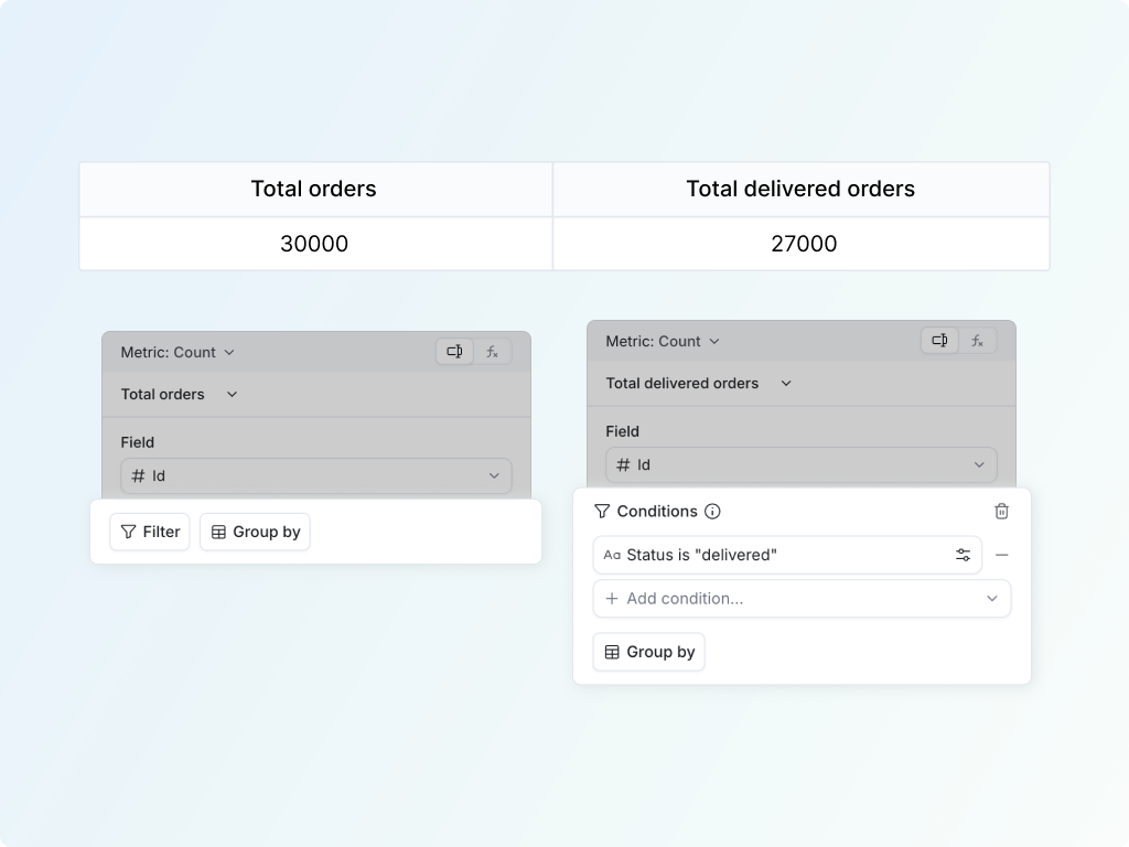
FilterConditions that apply to this metric only. Use it to turn revenue into delivered revenue without filtering the whole report.
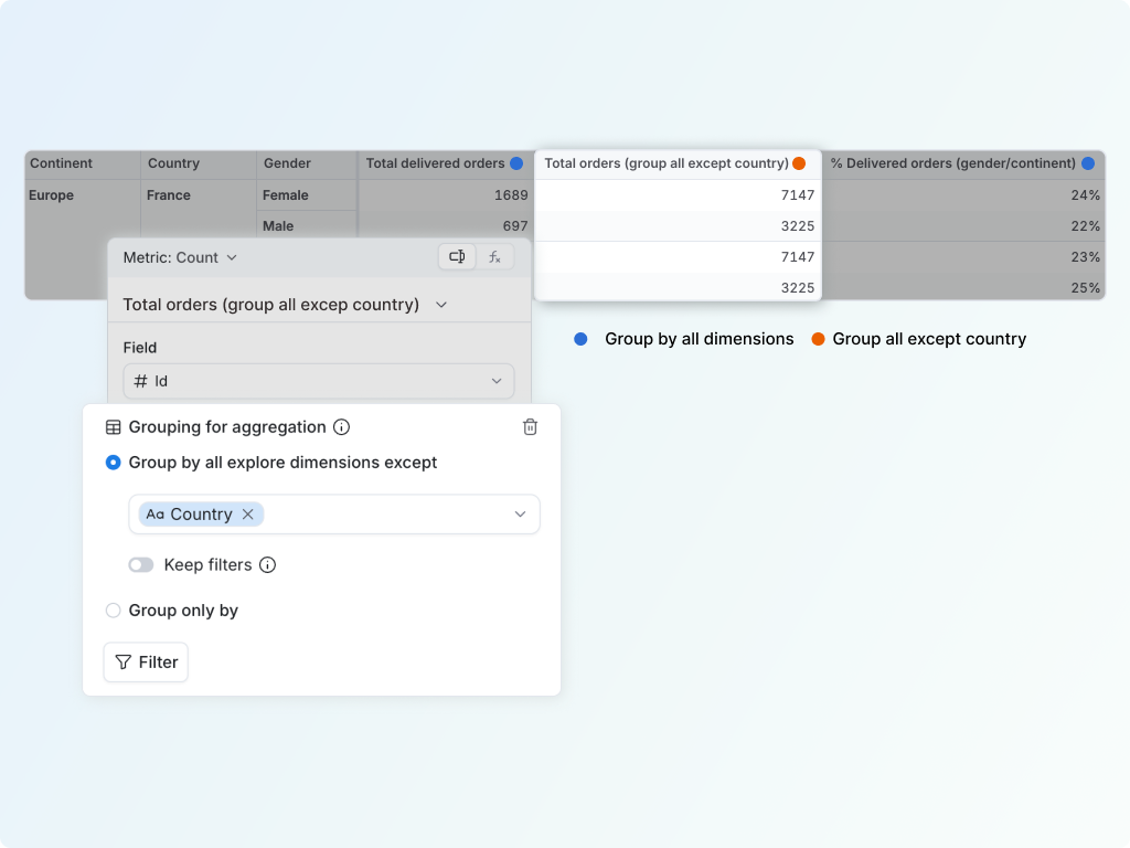
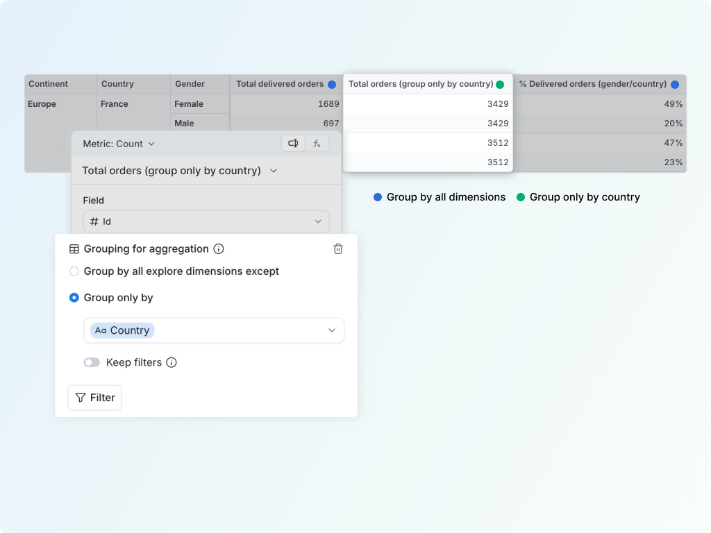
Grouping for aggregationThe grain where the metric is computed, also known as its Level of Detail. Use it for totals beside detail rows, or nested metrics like average orders per customer.
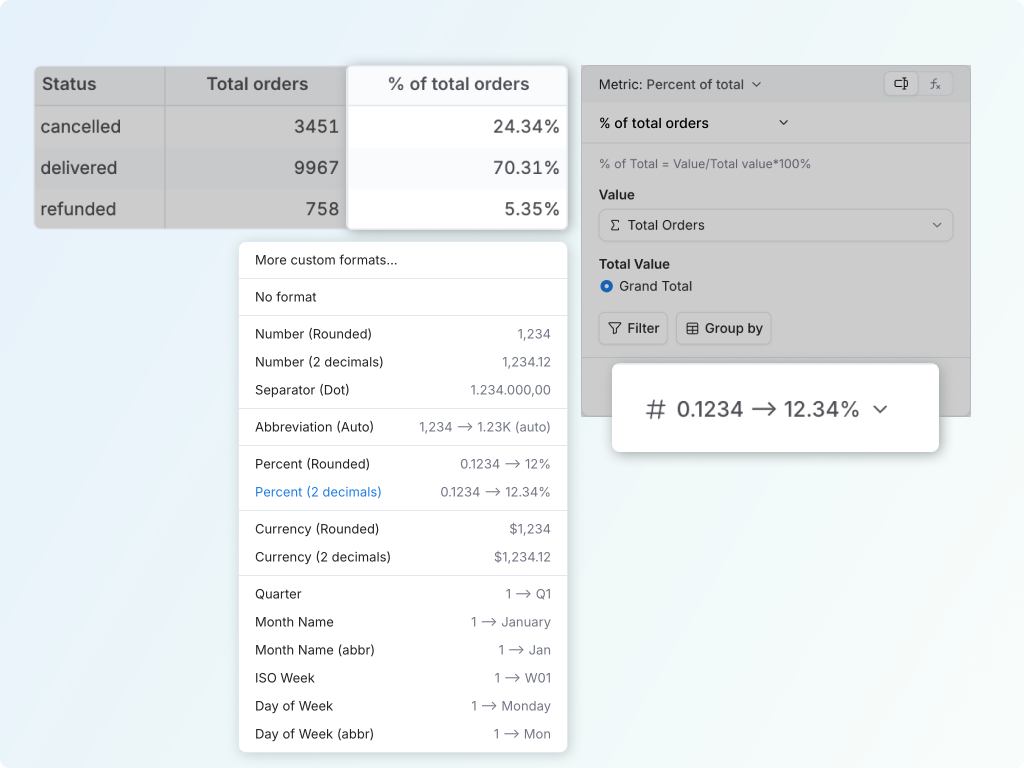
FormatHow the value displays, such as showing 0.124 as 12.4%, abbreviating 1200 as 1.2K, or displaying a ratio as currency.

Use the default grouping when you want the metric to follow the report's dimensions. Change the grouping only when the metric needs a different grain from the table or chart around it.

Filtered metric settings showing metric conditions and grouping for aggregation

The calculation builders

Each metric calculation below shows what it does, how to build it in the UI, and where to go for the AQL reference behind it.

Filtered metric

Scope a metric to a subset. Start from any metric and add a condition so it measures only the rows you care about. A revenue metric filtered to delivered orders, for example, becomes a completed-revenue metric. The condition lives on the metric itself, so your other metrics stay untouched. (This is the metric-level filter under Metric controls, not the report-level Filter that narrows every metric on the report at once.)

To build it:

  1. Start from any metric.
  2. Open its menu and choose Create metric from this → Metric controls → Filtered metric.
  3. Add a condition on a dimension (for example, an order status).
  4. Rename the result so it reads clearly.

Reference: where

Arithmetic

Combine two metrics with +, −, ×, or ÷. Arithmetic turns two existing metrics into a new one, the usual source of copy-paste SQL. Divide is the one you reach for most: a ratio like average order value is one revenue metric divided by an order-count metric, defined once and correct at every grain the report uses.

To build it:

  1. Open a metric's menu, choose Arithmetic, then the operator (Add, Subtract, Multiply, or Divide).
  2. Pick the first metric (for a ratio, the numerator).
  3. Pick the second metric (the denominator).
  4. Format the result (for example, as currency).

Reference: operator

Period over period

Compare a metric across two time windows. Period over period puts this period next to a past one without a self-join or a date spine. Point it at your date dimension, choose the comparison period, and pick the output you want.

To build it:

  1. Click the metric you want to compare.
  2. Choose Period over period.
  3. Point it at your date dimension and choose a previous or dynamic period.
  4. Pick the output: the display value, the absolute change, or the percent change.
Configuring a period-over-period comparison

Reference: time-intelligence-functions

Moving calculations

Recompute a metric over a sliding window. A moving calculation runs a function over a window of rows around each point, then slides that window along. Averaging the window smooths a noisy trend, so a spiky week-to-week line resolves into a readable curve. Point a different function at the same window and it measures how the line moves instead of smoothing it: a moving standard deviation gauges volatility, a trailing sum gives a rolling total, and a moving min or max tracks running highs and lows.

To build it:

  1. Click the metric on a time-based report.
  2. Choose Moving Calculation.
  3. Pick the function, the window shape, and (optionally) how the window is ordered, filtered, and grouped, as described below.
A moving average (navy) smoothing the raw weekly orders line (light blue)

It behaves like a moving average by default, but the panel has more range than the name suggests. Three choices shape the result.

Pick the function

The window doesn't have to average. In Moving Calculation you can run Sum, Average, Min, Max, Count, standard deviation (sample or population), or variance (sample or population) over the same window, and each answers a different question:

  • Average smooths the line into a trend. This is the default, shown above.
  • Sum gives a rolling total over a fixed lookback, like trailing 4-week volume or a trailing-12-months figure.
  • Standard deviation or variance turns the window into a volatility gauge that climbs when weekly orders get erratic and settles when they steady out.
  • Min or Max tracks the running low or high across the window, the way you follow a high-water mark or a rolling floor.

So the same builder covers two jobs: smoothing a line (Average) and measuring how it moves (the rest).

Shape the window: trailing, centered, or leading

Two fields set the window. Previous counts rows behind the current row, and Next counts rows ahead. Their mix decides where the window sits relative to each point:

ShapePreviousNextWhat it answers
TrailingN0How have the last N periods been trending? (the classic moving average)
CenteredNNWhat is the smooth trend around this period? (symmetric, best for seeing shape)
Leading0NWhat do the next N periods look like?

A trailing window is what most people mean by a moving average: it only looks backward over the last N periods (past 7 days, past 3 weeks, and so on), so it never borrows from the future. A centered window smooths most cleanly because it balances both sides, which is why it makes such a good hero line drawn over the raw data. A leading window points the other way, summarizing what is still ahead.

Order, filter, and group the window

A few more options control what the window slides over:

  • Order values by: the sequence the window follows. Leave it on Rows to slide along the report's own order (your weeks, top to bottom), and use the sort toggle to flip the direction.
  • Null if not enough values: near the edges of the data a full window doesn't exist yet. Leave this off and Holistics uses whatever rows are available. Turn it on to blank out those early rows so a partial window never reads as a real value.
  • Filter: add Conditions that apply to this calculation only, so the window runs over a subset (a moving average of just delivered orders, for instance) without changing any other metric.
  • Group by: set the Grouping for aggregation, which is the window's Level of Detail. It decides which dimensions the window runs within. Break weekly orders down by country and grouping keeps each country's window separate, so one country's spike never leaks into another's average. Choose Group by all explore dimensions except to inherit the report's dimensions (optionally dropping a few), or Group only by to name the grouping yourself.

Reference: window-function

Running total

Accumulate a metric along a date. Where a moving calculation slides a fixed-width window, a running total keeps adding as it goes, accumulating a metric (sum, average, min, or max) along a date dimension. It turns daily new users into cumulative users to date, or monthly revenue into revenue so far.

To build it:

  1. Click the metric.
  2. Choose Running total.
  3. Pick the date dimension to accumulate along.
  4. Read the cumulative value building up period by period.
Building a running total along a date dimension

Reference: running_total

Percent of total

Show each part against the whole. Percent of total divides a metric by its total and handles the dimension context for you, so revenue by category reads as a share instead of a raw number. The interesting part is the word "total": in a table with more than one dimension, there is more than one total a value could be measured against, and the metric's Total Value setting is where you pick which one.

To build it:

  1. Click the metric.
  2. Choose Percent of total.
  3. Pick the Total Value (the choices depend on the table type, below).
  4. Format the result as a percent.

Take orders by quarter and continent. The single cell for Asia in 2026 Q2 (3,673 orders) reads three different ways depending on the total you choose:

  • Against the grand total of every order (33,010): 11.13%.
  • Against Asia's column total (15,273): 24.05%.
  • Against 2026 Q2's row total (7,948): 46.21%.

Same number, three stories. Which one is right depends on the question you're asking, so the builder lets you say.

Example: percent of total in a pivot table

A pivot has a clear row axis and column axis, so Percent of Total (PoT) offers all three Total Value choices: Row Total, Column Total, and Grand Total. The setting is the denominator switch.

Start with this raw-count pivot. The examples below use the same numbers all the way through:

OrdersAfricaAsiaEuropeNorth AmericaOceaniaSouth AmericaTotal
2026 Q15203,2001,4001,6003105707,600
2026 Q26403,6731,4501,3203555107,948
2026 Q37104,3001,5001,6503604809,000
2026 Q46004,1001,3801,4803225808,462
Total2,47015,2735,7306,0501,3472,14033,010

The cell value stays the same: Asia in 2026 Q2 = 3,673 orders. Total Value only changes which total becomes the denominator.

Row Total

Use Row Total when you want each row to add up to 100%. For each time period (row), Holistics divides every continent by that row's total. In this example, 2026 Q2 is the row in focus, so every continent is divided by the 2026 Q2 total: 7,948 orders.

2026 Q2 exampleRaw ordersCalculationPercent of row
Africa in 2026 Q2640640 / 7,9488.05%
Asia in 2026 Q23,6733,673 / 7,94846.21%
Europe in 2026 Q21,4501,450 / 7,94818.24%
North America in 2026 Q21,3201,320 / 7,94816.61%
Oceania in 2026 Q2355355 / 7,9484.47%
South America in 2026 Q2510510 / 7,9486.42%
2026 Q2 Total7,9487,948 / 7,948100.00%

The final pivot looks like this. Each row's Total PoT is 100% because every cell is divided by its own row total.

QuarterAfrica ordersAfrica PoTAsia ordersAsia PoTEurope ordersEurope PoTNorth America ordersNorth America PoTOceania ordersOceania PoTSouth America ordersSouth America PoTTotal ordersTotal PoT
2026 Q15206.84%3,20042.11%1,40018.42%1,60021.05%3104.08%5707.50%7,600100.00%
2026 Q26408.05%3,67346.21%1,45018.24%1,32016.61%3554.47%5106.42%7,948100.00%
2026 Q37107.89%4,30047.78%1,50016.67%1,65018.33%3604.00%4805.33%9,000100.00%
2026 Q46007.09%4,10048.45%1,38016.31%1,48017.49%3223.81%5806.85%8,462100.00%
Total2,4707.48%15,27346.27%5,73017.36%6,05018.33%1,3474.08%2,1406.48%33,010100.00%

This answers: "Within 2026 Q2, how much did each continent contribute?"

Column Total

Use Column Total when you want each column to add up to 100%. For each continent (column), Holistics divides every time period by that column's total. In this example, Asia is the column in focus, so every quarter is divided by the Asia total: 15,273 orders.

Asia ordersRaw ordersCalculationPercent of column
Asia in 2026 Q13,2003,200 / 15,27320.95%
Asia in 2026 Q23,6733,673 / 15,27324.05%
Asia in 2026 Q34,3004,300 / 15,27328.15%
Asia in 2026 Q44,1004,100 / 15,27326.84%
Asia Total15,27315,273 / 15,273100.00%

The final pivot looks like this. Each continent's Total PoT is 100% because every cell is divided by its own column total.

QuarterAfrica ordersAfrica PoTAsia ordersAsia PoTEurope ordersEurope PoTNorth America ordersNorth America PoTOceania ordersOceania PoTSouth America ordersSouth America PoTTotal ordersTotal PoT
2026 Q152021.05%3,20020.95%1,40024.43%1,60026.45%31023.01%57026.64%7,60023.02%
2026 Q264025.91%3,67324.05%1,45025.31%1,32021.82%35526.35%51023.83%7,94824.08%
2026 Q371028.74%4,30028.15%1,50026.18%1,65027.27%36026.73%48022.43%9,00027.26%
2026 Q460024.29%4,10026.84%1,38024.08%1,48024.46%32223.90%58027.10%8,46225.63%
Total2,470100.00%15,273100.00%5,730100.00%6,050100.00%1,347100.00%2,140100.00%33,010100.00%

This answers: "Within Asia, how much did each quarter contribute?"

Grand Total

Use Grand Total when you want the whole pivot to add up to 100%. Every cell is divided by the same denominator: 33,010 orders.

CellRaw ordersCalculationPercent of grand total
Asia in 2026 Q23,6733,673 / 33,01011.13%
Europe in 2026 Q21,4501,450 / 33,0104.39%
All continents in 2026 Q27,9487,948 / 33,01024.08%
Asia across all quarters15,27315,273 / 33,01046.27%
Grand Total33,01033,010 / 33,010100.00%

The final pivot looks like this. Only the bottom-right Total PoT is 100% because every cell is divided by the same grand total.

QuarterAfrica ordersAfrica PoTAsia ordersAsia PoTEurope ordersEurope PoTNorth America ordersNorth America PoTOceania ordersOceania PoTSouth America ordersSouth America PoTTotal ordersTotal PoT
2026 Q15201.58%3,2009.69%1,4004.24%1,6004.85%3100.94%5701.73%7,60023.02%
2026 Q26401.94%3,67311.13%1,4504.39%1,3204.00%3551.08%5101.54%7,94824.08%
2026 Q37102.15%4,30013.03%1,5004.54%1,6505.00%3601.09%4801.45%9,00027.26%
2026 Q46001.82%4,10012.42%1,3804.18%1,4804.48%3220.98%5801.76%8,46225.63%
Total2,4707.48%15,27346.27%5,73017.36%6,05018.33%1,3474.08%2,1406.48%33,010100.00%

This answers: "Out of everything in this pivot, how much did this cell or subtotal contribute?"

In a flat table: grand total or a custom scope

A flat table has no separate row and column axes, so the presets collapse to two: Grand Total (divide by the total across every dimension in the table) and Custom, where you name the scope yourself.

Custom shows a checkbox for each dimension under "Calculate the total of all values across". Checking a dimension tells the metric to total over all of its values, so that dimension drops out of the denominator. Check Continent Name only, and every continent's percentage is measured within its own quarter (the quarter stays fixed, the continent is totalled away). It's the flat-table way of expressing the same choice the pivot makes with Row and Column Total: you're deciding which dimensions define "the whole".

The Custom total option in a flat table, totalling across the Continent Name dimension

Reference: percent_of_total

Case when

Bucket values into tiers. Case when returns a value based on the first condition that matches, which is how you turn a continuous field into tiers (for example, bucketing customers into age or spend bands). The result is a dimension (a bucketed field), not a metric.

To build it:

  1. Open the calculation menu and choose Case when.
  2. Add a condition and the value it should return.
  3. Add more conditions, one per tier (age group, spend band, and so on).
  4. Set a default value for anything that doesn't match.
Building a case-when calculation to bucket values

Reference: case-when


Open Markdown
Let us know what you think about this document :)