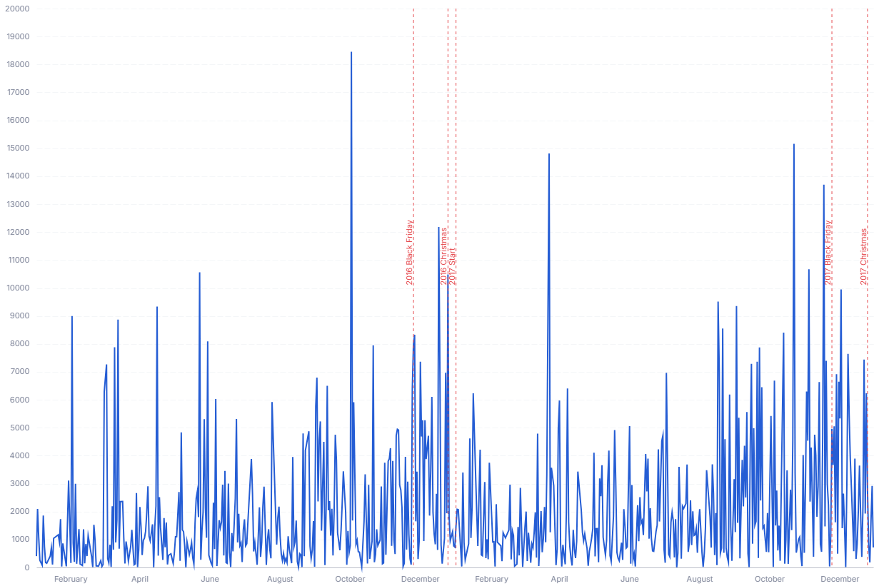
Annotated Time Series
A line chart with labeled event markers, so viewers can connect metric movements to campaigns, releases, and incidents.
- Good for: annotating a single metric's trend with releases, campaigns, or incidents; explaining a spike or dip by the event that caused it; sharing a timeline where context matters as much as the numbers.
- Not great for: comparing many series at once (use a multi-line or faceted sparkline chart), categorical data with no date axis, or trends that have no notable events to mark.
Syntax
Use the following AML definition to add the Annotated Time Series to your custom chart library.
CustomChartDef annotated_time_series {
  label: 'Annotated Time Series'
  description: 'To plot a metric over time with labeled event markers tied to specific dates.'
  fields {
    field date {
      label: 'Date'
      type: 'dimension'
      data_type: 'date'
      sort {
        apply_order: 1
        direction: 'asc'
      }
    }
    field value {
      label: 'Value'
      type: 'measure'
      sort {
        apply_order: 2
        direction: 'desc'
      }
    }
    field event_label {
      label: 'Event Label'
      type: 'dimension'
      sort {
        apply_order: 3
        direction: 'asc'
      }
    }
  }
  options {
    option line_color {
      type: 'color-picker'
      label: 'Line Color'
      default_value: '#255dd4'
    }
    option event_color {
      type: 'color-picker'
      label: 'Event Marker Color'
      default_value: '#e5484d'
    }
  }
  template: @vgl
  {
    "data": {"values": @{values}},
    "layer": [
      {
        "transform": [
          {"aggregate": [{"op": "sum", "field": @{fields.value.name}, "as": @{fields.value.name}}], "groupby": [@{fields.date.name}]}
        ],
        "mark": {"type": "line", "tooltip": true, "color": @{options.line_color.value}},
        "params": [
          {"name": "normalPointSelection", "select": {"type": "point", "toggle": "true", "clear": "mouseup"}},
          {"name": "hoverPointSelection", "select": {"type": "point", "on": "mouseover", "clear": "mouseout"}}
        ],
        "encoding": {
          "x": {
            "field": @{fields.date.name},
            "type": "temporal"
          },
          "y": {
            "field": @{fields.value.name},
            "type": "quantitative",
            "axis": {
              "format": @{fields.value.format},
              "formatType": "holisticsFormat"
            }
          },
          "tooltip": [
            {"field": @{fields.date.name}, "type": "temporal", "title": "Date"},
            {"field": @{fields.value.name}, "type": "quantitative", "title": "Value", "format": @{fields.value.format}, "formatType": "holisticsFormat"}
          ]
        }
      },
      {
        "transform": [
          {"filter": "datum['@{fields.event_label.name}'] != null && datum['@{fields.event_label.name}'] != ''"}
        ],
        "layer": [
          {
            "mark": {"type": "rule", "strokeDash": [4, 4], "color": @{options.event_color.value}},
            "encoding": {
              "x": {"field": @{fields.date.name}, "type": "temporal"},
              "tooltip": [
                {"field": @{fields.event_label.name}, "type": "nominal", "title": "Event"},
                {"field": @{fields.date.name}, "type": "temporal", "title": "Date"}
              ]
            }
          },
          {
            "mark": {
              "type": "text",
              "angle": 270,
              "align": "left",
              "baseline": "bottom",
              "dx": 4,
              "color": @{options.event_color.value}
            },
            "encoding": {
              "x": {"field": @{fields.date.name}, "type": "temporal"},
              "text": {"field": @{fields.event_label.name}}
            }
          }
        ]
      }
    ],
    "holisticsConfig": {
      "crossFilterSignals": ["normalPointSelection"],
      "contextMenuSignals": ["hoverPointSelection"]
    },
    "config": {
      "background": null,
      "view": {"stroke": null},
      "font": "Inter",
      "axis": {
        "title": null,
        "ticks": false,
        "labelPadding": 10,
        "labelFontSize": 11,
        "labelColor": "#858B9E",
        "titleColor": "#858B9E",
        "labelOverlap": "parity",
        "gridDash": [8, 3],
        "gridColor": "#F4F6F8",
        "domainColor": "#bec1cb"
      },
      "axisX": {"grid": false, "labelAngle": 0},
      "axisY": {"domain": false, "grid": true},
      "legend": {"orient": "bottom", "title": null, "labelFontSize": 11, "labelColor": "#858B9E", "symbolStrokeWidth": 0}
    }
  }
  ;;
}
Required fields
An Annotated Time Series expects exactly three fields. The template draws the line from date and value; event_label adds the dashed markers and labels.
| Field | Label | Type | Role |
|---|---|---|---|
date | Date | dimension | Time axis (x). Sorted ascending (apply_order: 1). |
value | Value | measure | Line height (y). Sorted descending (apply_order: 2). |
event_label | Event Label | dimension | Event name shown as a vertical marker. Sorted ascending (apply_order: 3). |
Data requirements: Pre-aggregate to one row per date; the template plots value directly without summing, so duplicate dates draw a jagged or overlapping line. Populate event_label only on the dates that have an event and leave it null or empty otherwise (the template skips rows where it is null or '' for markers but still draws them on the line).
Sample data:
| date | value | event_label |
|---|---|---|
| 2024-01-01 | 4200 | |
| 2024-01-02 | 4350 | Product launch |
| 2024-01-03 | 5100 | |
| 2024-01-04 | 4980 | |
| 2024-01-05 | 6200 | Press feature |
| 2024-01-06 | 5800 |
Options
Set these options to adjust the chart without editing the Vega template. The CustomChartDef block above declares each option's type and allowed values.
| Option | Default | Effect |
|---|---|---|
line_color | #255dd4 | Color of the metric line. |
event_color | #e5484d | Color of the event marker rules and their labels. |
Known limitations
-
Event markers depend on a sparse label column. The label field must be null or empty on non-event dates. A value on every row draws a marker on every date and clutters the chart.
-
No second metric. The template plots one
valueseries. Comparing several metrics needs a different chart or a template edit. -
Dense event labels overlap. Labels render vertically at each event date, so many events close together collide. Keep events spaced or filter to the notable ones.