Bar Chart with Average Line
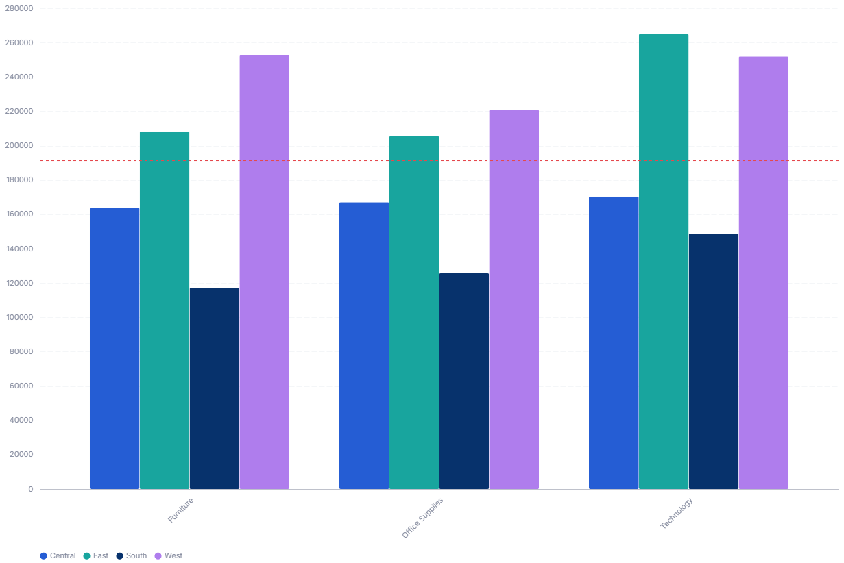
A bar chart with an average line overlays a horizontal mean line across a grouped bar chart, so viewers can instantly see which bars sit above or below the overall average.
- Good for: spotting over- and under-performers against the series average, comparing categories grouped by a second dimension, benchmark-style comparisons.
- Not great for: time-based moving averages (use Bar Chart with Running Average Line), part-to-whole composition, or a single bar with no comparison group.
Syntax
Use the following AML definition to add the Bar Chart with Average Line to your custom chart library.
CustomChartDef bar_chart_with_average_line {
  label: 'Bar Chart with Average Line'
  icon: 'hicon:chart-combination-2'
  description: 'To compare bar values against a horizontal average line across the whole series.'
  fields {
    field dimension {
      label: 'Dimension'
      type: 'dimension'
      sort {
        apply_order: 1
        direction: 'asc'
      }
    }
    field series {
      label: 'Series'
      type: 'dimension'
      sort {
        apply_order: 2
        direction: 'asc'
      }
    }
    field value {
      label: 'Value'
      type: 'measure'
      sort {
        apply_order: 3
        direction: 'desc'
      }
    }
  }
  options {
  }
  template: @vgl {
    "data": {"values": @{values}},
    "layer": [
      {
        "mark": {"type": "bar", "tooltip": true},
        "params": [
          {"name": "normalPointSelection", "select": {"type": "point", "toggle": "true", "clear": "mouseup"}},
          {"name": "hoverPointSelection", "select": {"type": "point", "on": "mouseover", "clear": "mouseout"}}
        ],
        "encoding": {
          "x": {
            "field": @{fields.dimension.name},
            "axis": {"format": @{fields.dimension.format}, "formatType": "holisticsFormat", "grid": false}
          },
          "y": {
            "field": @{fields.value.name},
            "type": "quantitative",
            "axis": {"format": @{fields.value.format}, "formatType": "holisticsFormat"}
          },
          "xOffset": {"field": @{fields.series.name}},
          "color": {
            "field": @{fields.series.name},
            "legend": {"title": null, "orient": "bottom"}
          }
        }
      },
      {
        "mark": {"type": "rule", "strokeDash": [4, 4], "color": "#E5484D", "size": 2, "tooltip": true},
        "encoding": {
          "y": {"aggregate": "mean", "field": @{fields.value.name}, "type": "quantitative"},
          "tooltip": [{"aggregate": "mean", "field": @{fields.value.name}, "type": "quantitative", "title": "Average", "format": @{fields.value.format}, "formatType": "holisticsFormat"}]
        }
      }
    ],
    "holisticsConfig": {
      "crossFilterSignals": ["normalPointSelection"],
      "contextMenuSignals": ["hoverPointSelection"]
    }
  };;
}
 View on GitHub
Legacy syntax
CustomChart {
  fields {
    field x {
      type: 'dimension'
    }
    field legend {
      type: 'dimension'
    }
    field y {
      type: 'measure'
    }
  }
  options {
  }
  template: @vgl {
    "data": {"values": @{values}},
    "layer": [{
      "mark": {
        "type": "bar",
        "tooltip": true
      },
      "encoding": {
        "x": {
          "field": @{fields.x.name},
          "axis": {
            "format": @{fields.x.format},
            "formatType": "holisticsFormat",
            "labelAngle": 45
          }
        },
        "y": {
          "field": @{fields.y.name},
          "type": "quantitative",
          "axis": {
            "format": @{fields.y.format},
            "formatType": "holisticsFormat"
          }
        },
        "xOffset": {
          "field": @{fields.legend.name}
        },
        "color": {
          "field": @{fields.legend.name}
        },
      }
    }, {
      "mark": "rule",
      "encoding": {
        "y": {
          "aggregate": "mean",
          "field": @{fields.y.name},
          "type": "quantitative"
        },
        "color": {"value": "firebrick"},
        "size": {"value": 3}
      }
    }],
  };;
}
Required fields
A Bar Chart with Average Line expects exactly three fields. Each row is one bar, grouped along the x-axis by dimension and split into side-by-side bars by series.
| Field | Label | Type | Role |
|---|---|---|---|
dimension | Dimension | dimension | X-axis category; one group of bars per value. Sorted ascending (apply_order: 1). |
series | Series | dimension | Splits each group into side-by-side bars and drives the color and legend. Sorted ascending (apply_order: 2). |
value | Value | measure | Bar height. The average line is the mean of this field across all rows. Sorted descending (apply_order: 3). |
Data requirements: Pre-aggregate to one row per dimension and series pair; the bar layer plots values as-is and does not combine duplicates. The average line is the mean of every plotted value, so it reflects all bars in view.
Sample data:
| dimension | series | value |
|---|---|---|
| Jan | Online | 4200 |
| Jan | Retail | 3100 |
| Feb | Online | 3800 |
| Feb | Retail | 3600 |
| Mar | Online | 5100 |
| Mar | Retail | 2900 |
Known limitations
-
One flat average across the whole series. The line is a single mean over all plotted rows, not a per-group or per-series average. For a trend that moves period by period, use Bar Chart with Running Average Line instead.
-
Requires a series field. The definition has three fields, including
seriesfor the color split. With only one category per x value, leaveseriesconstant or pick a simple bar chart. -
Average is sensitive to outliers. A few very large or very small bars pull the mean line away from the typical value, which can mislead at a glance.