Bubble Plot
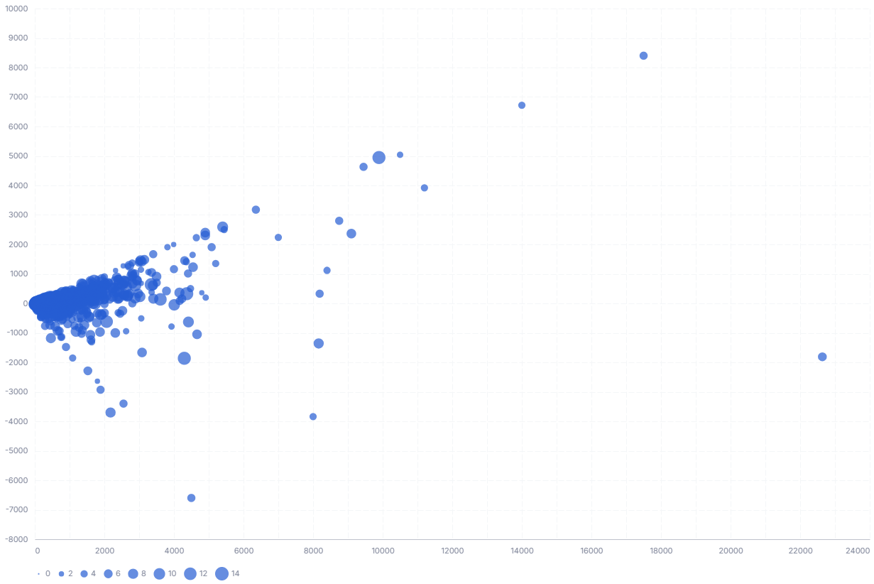
A bubble plot positions points by two quantitative values and uses the size of each circle to encode a third. It is a scatter plot with an added magnitude dimension.
- Good for: comparing three numeric measures at once, spotting outliers, correlation with a magnitude (for example, revenue vs. profit sized by order count).
- Not great for: part-to-whole composition (use a sunburst or treemap), category magnitudes without x/y coordinates (use a packed bubble chart), or time series.
Syntax
Use the following AML definition to add the Bubble Chart to your custom chart library.
CustomChartDef bubble_chart {
  label: 'Bubble Chart'
  description: 'To visualize the magnitude of a measurement using the size of each circle.'
  fields {
    field x_axis {
      label: 'X-axis'
      type: 'dimension'
      sort {
        apply_order: 1
        direction: 'asc'
      }
    }

    field y_axis {
      label: 'Y-axis'
      type: 'dimension'
      sort {
        apply_order: 2
        direction: 'asc'
      }
    }

    field size {
      label: 'Size'
      type: 'dimension'
      data_type: 'number'
      sort {
        apply_order: 3
        direction: 'asc'
      }
    }

    field category {
      label: 'Category'
      type: 'dimension'
    }

  }

  template: @vgl {
    "data": {
      "values": @{values}
    },
    "params": [
      {"name": "normalPointSelection", "select": {"type": "point", "fields": [@{fields.category.name}], "toggle": "true", "clear": "mouseup"}},
      {"name": "hoverPointSelection", "select": {"type": "point", "fields": [@{fields.category.name}], "on": "mouseover", "clear": "mouseout"}}
    ],
    "mark": {"type": "circle", "opacity": 0.7},
    "encoding": {
      "x": {
        "field": @{fields.x_axis.name},
        "type": "quantitative",
        "scale": {"zero": false},
        "axis": {"format": @{fields.x_axis.format}, "formatType": "holisticsFormat"}
      },
      "y": {
        "field": @{fields.y_axis.name},
        "type": "quantitative",
        "scale": {"zero": false},
        "axis": {"format": @{fields.y_axis.format}, "formatType": "holisticsFormat"}
      },
      "size": {
        "field": @{fields.size.name},
        "type": "quantitative",
        "title": null,
        "legend": {"orient": "bottom"}
      },
      "color": {
        "field": @{fields.category.name},
        "type": "nominal",
        "legend": {"orient": "right", "title": null}
      },
      "tooltip": [
        {"field": @{fields.category.name}, "type": "nominal"},
        {"field": @{fields.x_axis.name}, "type": "quantitative", "format": @{fields.x_axis.format}, "formatType": "holisticsFormat"},
        {"field": @{fields.y_axis.name}, "type": "quantitative", "format": @{fields.y_axis.format}, "formatType": "holisticsFormat"},
        {"field": @{fields.size.name}, "type": "quantitative", "format": @{fields.size.format}, "formatType": "holisticsFormat"}
      ]
    },
    "holisticsConfig": {
      "crossFilterSignals": ["normalPointSelection"],
      "contextMenuSignals": ["hoverPointSelection"]
    },
    "config": {
      "background": null,
      "view": {"stroke": null},
      "font": "Inter",
      "axis": {
        "title": null,
        "ticks": false,
        "labelPadding": 10,
        "labelFontSize": 11,
        "labelColor": "#858B9E",
        "titleColor": "#858B9E",
        "labelOverlap": "parity",
        "gridDash": [8, 3],
        "gridColor": "#F4F6F8",
        "domainColor": "#bec1cb"
      },
      "axisX": {"grid": true, "labelAngle": 0},
      "axisY": {"domain": false, "grid": true},
      "legend": {"orient": "bottom", "title": null, "labelFontSize": 11, "labelColor": "#858B9E", "symbolStrokeWidth": 0}
    }
  };;
}
Legacy syntax
CustomChart {
  fields {
    field x_axis {
      type: "dimension"
      label: "X axis"
    }

    field y_axis {
      type: "dimension"
      label: "Y axis"
    }

    field size {
      type: "dimension"
      label: "Size"
    }

  }

  template: @vgl {
    "data": {
      "values": @{values}
    },
    "mark": {
      "type": "circle",
      "opacity": 0.8,
      "stroke": "black",
      "strokeWidth": 1
    },
    "encoding": {
      "x": {
        "field": @{fields.x_axis.name},
        "type": "temporal",
        "axis": {"grid": false}
      },
      "y": {
        "field": @{fields.y_axis.name},
        "type": "nominal",
        "axis": {"title": ""}
      },
      "size": {
        "field": @{fields.size.name},
        "type": "quantitative",
        "title": "Annual Global Deaths",
        "legend": {"clipHeight": 30},
        "scale": {"rangeMax": 5000}
      },
      "color": {"field": @{fields.y_axis.name}, "type": "nominal", "legend": null}
    }
  };;
}
Required fields
A Bubble Chart expects four fields. Each row of input is one bubble, identified by its category.
| Field | Label | Type | Role |
|---|---|---|---|
x_axis | X-axis | dimension | Horizontal position; read as a quantitative value. Sorted ascending (apply_order: 1). |
y_axis | Y-axis | dimension | Vertical position; read as a quantitative value. Sorted ascending (apply_order: 2). |
size | Size | dimension | Bubble area; larger values render as larger circles. Sorted ascending (apply_order: 3). |
category | Category | dimension | Names each bubble, colors bubbles by category, and is the field a click cross-filters on. |
Data requirements: Pre-aggregate to one row per bubble; the template does not aggregate, so each input row draws its own circle. Use numeric values for x, y, and size (all plotted as quantitative); category is a nominal label.
Sample data:
| category | x_axis | y_axis | size |
|---|---|---|---|
| Chairs | 12000 | 3200 | 540 |
| Tables | 8500 | 2100 | 320 |
| Phones | 21000 | 6400 | 910 |
| Binders | 4300 | 900 | 150 |
| Accessories | 15600 | 4800 | 720 |
Known limitations
-
X, Y, and size must be numeric. The template encodes X, Y, and size as quantitative, so non-numeric values for those fields will not plot correctly.
-
Rows are not aggregated. Duplicate x/y points each draw a separate overlapping circle, so pre-aggregate before charting.