Density Contour Plot
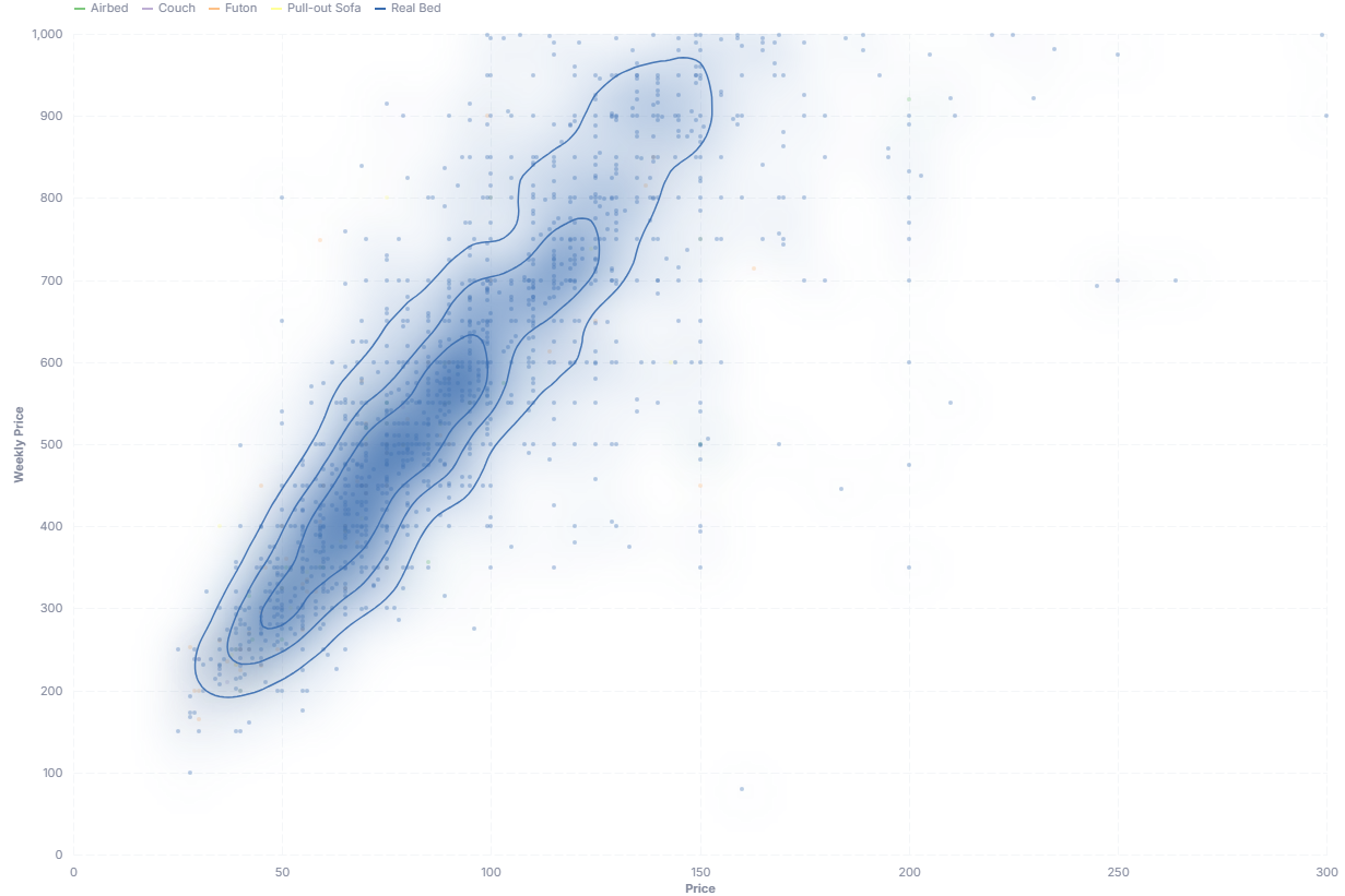
A density contour plot shows where observations concentrate across two numeric metrics, drawing a set of nested contour lines per group like a topographic map of each group's density.
- Good for: seeing where groups cluster across two numeric metrics, spotting overlap or separation between segments, replacing an overplotted scatter cloud (spend vs frequency by segment, price vs rating by category).
- Not great for: a single ungrouped distribution (use a histogram), comparing one numeric value across categories (use a ridgeline chart), or categorical (non-numeric) axes.
Syntax
Use the following AML definition to add the Density Contour Plot to your custom chart library.
CustomChartDef density_contour_plot {
  label: 'Density Contour Plot'
  icon: 'hicon:chart-density-contour'
  description: 'To show where observations cluster across two numeric metrics, with per-group 2D density contours over a scatter plot.'

  fields {
    field x_axis {
      label: 'X-axis'
      type: 'dimension'
      data_type: 'number'
      sort {
        apply_order: 1
        direction: 'asc'
      }
    }

    field y_axis {
      label: 'Y-axis'
      type: 'dimension'
      data_type: 'number'
      sort {
        apply_order: 2
        direction: 'asc'
      }
    }

    field group {
      label: 'Group'
      type: 'dimension'
      sort {
        apply_order: 3
        direction: 'asc'
      }
    }
  }

  options {
    option bandwidth {
      label: 'Smoothing bandwidth (0 = automatic)'
      type: 'number-input'
      default_value: 0
    }

    option contour_levels {
      label: 'Number of contour levels'
      type: 'select'
      options: [
        2,
        3,
        4,
        5,
        6
      ]
      default_value: 4
    }

    option show_points {
      label: 'Show scatter points'
      type: 'toggle'
      default_value: true
    }

    option show_heatmap {
      label: 'Show filled density heatmap'
      type: 'toggle'
      default_value: false
    }

    option show_tooltip {
      label: 'Show tooltip'
      type: 'toggle'
      default_value: true
    }
  }

  template: @vg {
    "$schema": "https://vega.github.io/schema/vega/v5.json",
    "signals": [
      {
        "name": "width",
        "init": "containerSize()[0] - 82",
        "on": [{ "events": "window:resize", "update": "containerSize()[0] - 82" }]
      },
      {
        "name": "height",
        "init": "containerSize()[1] - 68",
        "on": [{ "events": "window:resize", "update": "containerSize()[1] - 68" }]
      },
      {"name": "bw", "update": "@{options.bandwidth.value} <= 0 ? -1 : @{options.bandwidth.value}"},
      {"name": "levels", "update": "@{options.contour_levels.value}"},
      {"name": "showHeatmap", "update": "@{options.show_heatmap.value}"},
      {
        "name": "hovered",
        "value": null,
        "on": [
          {"events": "@legendSymbol:mouseover, @legendLabel:mouseover", "update": "datum.value"},
          {"events": "@legendSymbol:mouseout, @legendLabel:mouseout", "update": "null"}
        ]
      },
      {
        "name": "normalPointSelection",
        "value": null,
        "on": [
          {"events": "@pointMark:click", "update": "{'@{fields.group.name}': [datum['group']]}"},
          {"events": "click[!event.item]", "update": "null"}
        ]
      },
      {
        "name": "hoverPointSelection",
        "value": null,
        "on": [
          {"events": "@pointMark:mouseover", "update": "{'@{fields.group.name}': [datum['group']]}"},
          {"events": "@pointMark:mouseout", "update": "null"}
        ]
      }
    ],
    "holisticsConfig": {
      "crossFilterSignals": ["normalPointSelection"],
      "contextMenuSignals": ["hoverPointSelection"]
    },
    "data": [
      {
        "name": "source",
        "values": @{values},
        "transform": [
          {"type": "formula", "expr": "datum['@{fields.x_axis.name}']", "as": "x_value"},
          {"type": "formula", "expr": "datum['@{fields.y_axis.name}']", "as": "y_value"},
          {"type": "formula", "expr": "datum['@{fields.group.name}']", "as": "group"},
          {"type": "filter", "expr": "datum.x_value != null && datum.y_value != null"}
        ]
      },
      {
        "name": "density",
        "source": "source",
        "transform": [
          {
            "type": "kde2d",
            "groupby": ["group"],
            "size": [{"signal": "width"}, {"signal": "height"}],
            "x": {"expr": "scale('x', datum.x_value)"},
            "y": {"expr": "scale('y', datum.y_value)"},
            "bandwidth": {"signal": "[bw, bw]"},
            "counts": true
          }
        ]
      },
      {
        "name": "contours",
        "source": "density",
        "transform": [
          {
            "type": "isocontour",
            "field": "grid",
            "resolve": "shared",
            "levels": {"signal": "levels"}
          }
        ]
      }
    ],
    "scales": [
      {
        "name": "x",
        "type": "linear",
        "round": true,
        "nice": true,
        "zero": true,
        "domain": {"data": "source", "field": "x_value"},
        "range": [0, {"signal": "width"}]
      },
      {
        "name": "y",
        "type": "linear",
        "round": true,
        "nice": true,
        "zero": true,
        "domain": {"data": "source", "field": "y_value"},
        "range": [{"signal": "height"}, 0]
      },
      {
        "name": "color",
        "type": "ordinal",
        "domain": {"data": "source", "field": "group", "sort": true},
        "range": "category"
      }
    ],
    "axes": [
      {"scale": "x", "orient": "bottom", "tickCount": 5, "title": "@{fields.x_axis.name}", "grid": true},
      {"scale": "y", "orient": "left", "title": "@{fields.y_axis.name}", "grid": true, "titlePadding": 6}
    ],
    "legends": [
      {
        "stroke": "color",
        "title": null,
        "orient": "top",
        "direction": "horizontal",
        "symbolType": "stroke",
        "encode": {
          "symbols": {
            "name": "legendSymbol",
            "interactive": true,
            "update": {
              "strokeWidth": {"value": 2},
              "opacity": {"signal": "hovered === null || hovered === datum.value ? 1 : 0.2"}
            }
          },
          "labels": {
            "name": "legendLabel",
            "interactive": true,
            "update": {
              "opacity": {"signal": "hovered === null || hovered === datum.value ? 1 : 0.3"}
            }
          }
        }
      }
    ],
    "marks": [
      {
        "type": "symbol",
        "name": "pointMark",
        "zindex": 1,
        "interactive": @{options.show_points.value},
        "from": {"data": "source"},
        "encode": {
          "update": {
            "x": {"scale": "x", "field": "x_value"},
            "y": {"scale": "y", "field": "y_value"},
            "size": {"value": 14},
            "fill": {"scale": "color", "field": "group"},
            "fillOpacity": {
              "signal": "@{options.show_points.value} ? (hovered === null ? 0.35 : (hovered === datum.group ? 0.6 : 0.06)) : 0"
            },
            "tooltip": {
              "signal": "@{options.show_tooltip.value} ? {'Group': datum.group, '@{fields.x_axis.name}': format(datum.x_value, ','), '@{fields.y_axis.name}': format(datum.y_value, ',')} : null"
            }
          }
        }
      },
      {
        "type": "image",
        "from": {"data": "density"},
        "clip": true,
        "interactive": false,
        "encode": {
          "update": {
            "x": {"value": 0},
            "y": {"value": 0},
            "width": {"signal": "width"},
            "height": {"signal": "height"},
            "aspect": {"value": false},
            "opacity": {"signal": "showHeatmap ? 0.8 : 0"}
          }
        },
        "transform": [
          {
            "type": "heatmap",
            "field": "datum.grid",
            "resolve": "shared",
            "color": {"expr": "scale('color', datum.datum.group)"}
          }
        ]
      },
      {
        "type": "path",
        "clip": true,
        "from": {"data": "contours"},
        "encode": {
          "enter": {
            "strokeWidth": {"value": 1.5},
            "stroke": {"scale": "color", "field": "group"},
            "tooltip": {
              "signal": "@{options.show_tooltip.value} ? {'Group': datum.group} : null"
            }
          },
          "update": {
            "strokeOpacity": {
              "signal": "hovered === null ? 0.9 : (hovered === datum.group ? 1 : 0.12)"
            }
          }
        },
        "transform": [
          {"type": "geopath", "field": "datum.contour"}
        ]
      }
    ]
  };;
}
Required fields
A Density Contour Plot expects exactly three fields. Each row of input is one observation, plotted as a point and fed into its group's density estimate.
| Field | Label | Type | Role |
|---|---|---|---|
x_axis | X-axis | dimension | Numeric value on the horizontal axis. Sorted ascending (apply_order: 1). |
y_axis | Y-axis | dimension | Numeric value on the vertical axis. Sorted ascending (apply_order: 2). |
group | Group | dimension | Splits observations into groups; one contour set and color per group. Sorted ascending (apply_order: 3). |
Data requirements: Feed raw observations (one row per record), not pre-aggregated values, since the template estimates each group's density with KDE. Both x_axis and y_axis must be numeric; the template drops rows where either is null before rendering.
Sample data:
| x_axis | y_axis | group |
|---|---|---|
| 120 | 4.2 | Enterprise |
| 95 | 3.8 | Enterprise |
| 60 | 4.5 | SMB |
| 45 | 3.1 | SMB |
| 80 | 2.9 | Mid-market |
| 110 | 3.6 | Mid-market |
Options
Set these options to adjust the chart without editing the Vega template. The CustomChartDef block above declares each option's type and allowed values.
| Option | Default | Effect |
|---|---|---|
bandwidth | 0 | KDE smoothing bandwidth. 0 lets Vega pick automatically; larger values produce smoother, broader contours. |
contour_levels | 4 | Number of nested contour lines drawn per group. |
show_points | true | Whether the underlying scatter points are visible. |
show_heatmap | false | Whether to draw a filled density heatmap behind the contours. |
show_tooltip | true | Turns the hover tooltip on scatter points and contours on or off. |
Known limitations
-
Both axes must be numeric.
x_axisandy_axisfeed a 2D KDE, so categorical axes will not work. Use a different chart for non-numeric axes. -
Needs raw rows, not aggregates. The density estimate runs on individual observations, so pre-aggregated input gives a misleading shape. Feed one row per record.
-
Sparse groups produce unstable contours. A group with very few observations yields jumpy or empty contours, since KDE needs enough points to estimate density.