Diverging Bar Chart
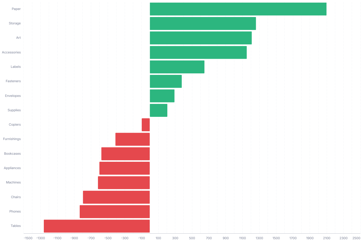
A diverging bar chart splits positive and negative values around a zero baseline, ideal for variance against budget or plan. The chart sorts categories by value, so the biggest gains and shortfalls sit at opposite ends.
- Good for: variance against budget or plan, net sentiment or profit-and-loss by category, any signed measure where direction matters.
- Not great for: all-positive measures (a plain bar chart is clearer), part-to-whole composition, or time series.
Syntax
Use the following AML definition to add the Diverging Bar Chart to your custom chart library.
CustomChartDef diverging_bar_chart {
  label: 'Diverging Bar Chart'
  description: 'To split positive and negative values around a zero baseline, ideal for showing variance against budget or plan.'
  fields {
    field dimension {
      label: 'Dimension'
      type: 'dimension'
      sort {
        apply_order: 1
        direction: 'asc'
      }
    }
    field value {
      label: 'Value'
      type: 'measure'
      sort {
        apply_order: 2
        direction: 'desc'
      }
    }
  }
  options {
    option positive_color {
      type: 'color-picker'
      label: 'Positive Color'
      default_value: '#2cb67f'
    }
    option negative_color {
      type: 'color-picker'
      label: 'Negative Color'
      default_value: '#e5484d'
    }
    option show_tooltip {
      type: 'toggle'
      label: 'Show tooltip'
      default_value: true
    }
  }
  template: @vgl
  {
    "data": {"values": @{values}},
    "params": [
      {"name": "normalPointSelection", "select": {"type": "point", "fields": [@{fields.dimension.name}], "toggle": "true", "clear": "mouseup"}},
      {"name": "hoverPointSelection", "select": {"type": "point", "fields": [@{fields.dimension.name}], "on": "mouseover", "clear": "mouseout"}}
    ],
    "mark": {
      "type": "bar",
      "tooltip": @{options.show_tooltip.value}
    },
    "encoding": {
      "y": {
        "field": @{fields.dimension.name},
        "type": "nominal",
        "sort": "-x"
      },
      "x": {
        "field": @{fields.value.name},
        "type": "quantitative",
        "axis": {
          "format": @{fields.value.format},
          "formatType": "holisticsFormat"
        }
      },
      "color": {
        "condition": {
          "test": "datum['@{fields.value.name}'] >= 0",
          "value": @{options.positive_color.value}
        },
        "value": @{options.negative_color.value}
      }
    },
    "holisticsConfig": {
      "crossFilterSignals": ["normalPointSelection"],
      "contextMenuSignals": ["hoverPointSelection"]
    },
    "config": {
      "background": null,
      "view": {"stroke": null},
      "font": "Inter",
      "axis": {
        "title": null,
        "ticks": false,
        "labelPadding": 10,
        "labelFontSize": 11,
        "labelColor": "#858B9E",
        "titleColor": "#858B9E",
        "labelOverlap": "parity",
        "gridDash": [8, 3],
        "gridColor": "#F4F6F8",
        "domainColor": "#bec1cb"
      },
      "axisX": {"grid": true},
      "axisY": {"domain": false, "grid": false},
      "bar": {"cornerRadius": 2}
    }
  }
  ;;
}
Required fields
A Diverging Bar Chart expects exactly two fields. Each row is one horizontal bar.
| Field | Label | Type | Role |
|---|---|---|---|
dimension | Dimension | dimension | Category for each bar (y-axis). The template re-sorts bars by value at render time, so the longest bars sit at the ends. Sorted ascending (apply_order: 1). |
value | Value | measure | Bar length and direction. Negative values extend left of the zero baseline, positive values extend right. Sorted descending (apply_order: 2). |
Data requirements: Pre-aggregate to one row per dimension; the template plots values as-is and does not combine duplicates. Use a signed measure with both positive and negative values, otherwise the bars all point the same way and there is nothing to diverge. The template assigns color by sign (value >= 0 gets the positive color, the rest get the negative color).
Sample data:
| dimension | value |
|---|---|
| North | 12000 |
| South | 4500 |
| East | -3200 |
| West | -8700 |
| Central | 1500 |
Options
Set these options to adjust the chart without editing the Vega template. The CustomChartDef block above declares each option's type and allowed values.
| Option | Default | Effect |
|---|---|---|
positive_color | #2cb67f | Color of bars with a value at or above zero. |
negative_color | #e5484d | Color of bars with a value below zero. |
show_tooltip | true | Toggles hover tooltips on the bars. |
Known limitations
-
Needs signed values to diverge. Color and direction are driven by the sign of
value. With all-positive or all-negative data every bar points the same way, so a plain bar chart reads more clearly. -
Color carries no other meaning. The two colors only mark positive versus negative, so you cannot encode a separate series or category through color without editing the template.
-
Bar order follows value, not your sort. Bars always re-sort by value (largest at the ends), so the field's own sort order does not control vertical placement.