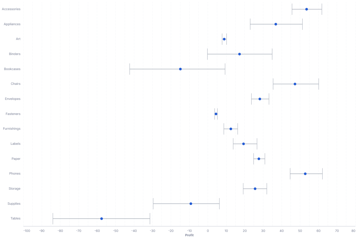
Error Bar
An error bar visualizes the uncertainty or degree of error in a reported measurement.
- Good for: showing the spread or confidence around a mean per category, comparing variability across groups, summarizing repeated measurements.
- Not great for: a single value with no spread (use a KPI or gauge), trends over time, or part-to-whole composition.
Syntax
Use the following AML definition to add the Error Bar to your custom chart library.
CustomChartDef error_bar {
  label: 'Error Bar'
  description: 'To visualize the uncertainty or degree of error in a reported measurement across categories.'
  fields {
    field value {
      label: 'Value'
      type: 'dimension'
      data_type: 'number'
      sort {
        apply_order: 1
        direction: 'asc'
      }
    }
    field dimension {
      label: 'Dimension'
      type: 'dimension'
      sort {
        apply_order: 2
        direction: 'asc'
      }
    }
  }

  options {
    option point_color {
      type: 'color-picker'
      label: 'Point Color'
      default_value: '#255DD4'
    }
    option extent {
      type: 'select'
      label: 'Error extent'
      options: ['ci', 'stderr', 'stdev', 'iqr']
      default_value: 'ci'
    }
  }

  template: @vgl {
    "data": {
      "values": @{values}
    },
    "encoding": {
      "y": {
        "field": @{fields.dimension.name},
        "type": "ordinal"
      }
    },
    "layer": [
      {
        "mark": {
          "type": "errorbar",
          "extent": @{options.extent.value},
          "color": "#9CA3AF",
          "thickness": 1.5,
          "ticks": true
        },
        "encoding": {
          "x": {
            "field": @{fields.value.name},
            "type": "quantitative",
            "scale": {"zero": false},
            "axis": {"format": @{fields.value.format}, "formatType": "holisticsFormat"}
          },
          "tooltip": [
            {"field": @{fields.dimension.name}, "type": "nominal", "title": "Category"}
          ]
        }
      },
      {
        "params": [
          {"name": "normalPointSelection", "select": {"type": "point", "toggle": "true", "clear": "mouseup"}},
          {"name": "hoverPointSelection", "select": {"type": "point", "on": "mouseover", "clear": "mouseout"}}
        ],
        "mark": {
          "type": "point",
          "filled": true,
          "size": 80,
          "color": @{options.point_color.value}
        },
        "encoding": {
          "x": {
            "field": @{fields.value.name},
            "type": "quantitative",
            "aggregate": "mean",
            "scale": {"zero": false}
          },
          "tooltip": [
            {"field": @{fields.dimension.name}, "type": "nominal", "title": "Category"},
            {"field": @{fields.value.name}, "type": "quantitative", "aggregate": "mean", "title": "Mean", "format": @{fields.value.format}, "formatType": "holisticsFormat"}
          ]
        }
      }
    ],
    "holisticsConfig": {
      "crossFilterSignals": ["normalPointSelection"],
      "contextMenuSignals": ["hoverPointSelection"]
    },
    "config": {
      "background": null,
      "view": {"stroke": null},
      "font": "Inter",
      "axis": {
        "title": null,
        "ticks": false,
        "labelPadding": 10,
        "labelFontSize": 11,
        "labelColor": "#858B9E",
        "titleColor": "#858B9E",
        "labelOverlap": "parity",
        "gridDash": [8, 3],
        "gridColor": "#F4F6F8",
        "domainColor": "#bec1cb"
      },
      "axisX": {"grid": true},
      "axisY": {"domain": false, "grid": false}
    }
  };;
}
Legacy syntax
CustomChart {
  fields {
    field point {
      type: "dimension"
      label: "Points"
    }
    field variety {
      type: "dimension"
      label: "Variety"
    }
  }
  template: @vgl
  {
      "data": {
        "values": @{values}
      },
      "layer": [
        {
          "mark": {
            "type": "point",
            "filled": true
          },
          "encoding": {
            "x": {
              "type": "quantitative",
              "field": @{fields.point.name},
              "scale": {
                "zero": false
              },
              "title": "Barley Yield",
              "aggregate": "mean"
            },
            "color": {
              "value": "black"
            }
          }
        },
        {
          "mark": {
            "type": "errorbar",
            "extent": "ci"
          },
          "encoding": {
            "x": {
              "type": "quantitative",
              "field": @{fields.point.name},
              "title": "Barley Yield"
            }
          }
        }
      ],
      "encoding": {
        "y": {
          "type": "ordinal",
          "field": @{fields.variety.name}
        }
      }
    }
  ;;;
}
Required fields
An Error Bar expects exactly two fields. Each input row is one observation, and the template groups observations by category to compute the mean and spread.
| Field | Label | Type | Role |
|---|---|---|---|
value | Value | dimension | Numeric observation on the x axis (data_type: 'number'). The mean sets the point, and the chosen extent sets the bar. Sorted ascending (apply_order: 1). |
dimension | Dimension | dimension | Category on the y axis (one error bar per value). Sorted ascending (apply_order: 2). |
Data requirements: Do not pre-aggregate. The template computes the mean and the error extent from the raw rows, so each category needs multiple observations for a meaningful spread.
Sample data:
| value | dimension |
|---|---|
| 42 | Region A |
| 47 | Region A |
| 39 | Region A |
| 51 | Region B |
| 55 | Region B |
| 49 | Region B |
| 33 | Region C |
| 38 | Region C |
Options
Set these options to adjust the chart without editing the Vega template. The CustomChartDef block above declares each option's type and allowed values.
| Option | Default | Effect |
|---|---|---|
point_color | #255DD4 | Fill color of the mean point marker. |
extent | ci | How the template computes the error bar length (confidence interval, standard error, standard deviation, or interquartile range). |
Known limitations
-
Needs multiple rows per category. The bar reflects spread across observations, so a single row per category produces a point with no visible error bar.
-
The center point is always the mean of
value. Showing a median or another statistic requires editing the template. -
One dimension only. The chart plots one category axis. Comparing a second grouping (for example, by color) requires editing the template.