Pareto Chart
A Pareto chart combines sorted bars with a cumulative percentage line to show which categories contribute most of the total. It answers 80/20 questions like "which customers drive most of our revenue?" at a glance.
- Good for: 80/20 analysis, ranking categories by contribution, finding the vital few that drive most of a total (revenue by customer, defects by cause, sales by product).
- Not great for: time series, part-to-whole composition across a hierarchy (use a sunburst or treemap), or data with too many categories to label along the x-axis.
Syntax
Use the following AML definition to add the Pareto Chart to your custom chart library.
CustomChartDef pareto_chart {
  label: 'Pareto Chart'
  description: 'To combine sorted bars with a cumulative percentage line and reveal which categories contribute most of the total.'
  fields {
    field dimension {
      label: 'Dimension'
      type: 'dimension'
      sort {
        apply_order: 1
        direction: 'asc'
      }
    }
    field value {
      label: 'Value'
      type: 'measure'
      sort {
        apply_order: 2
        direction: 'desc'
      }
    }
  }
  options {
    option bar_color {
      type: 'color-picker'
      label: 'Bar Color'
      default_value: '#255dd4'
    }
    option line_color {
      type: 'color-picker'
      label: 'Cumulative Line Color'
      default_value: '#e5484d'
    }
    option show_threshold {
      type: 'toggle'
      label: 'Show 80% threshold line'
      default_value: true
    }
    option threshold {
      type: 'number-input'
      label: 'Threshold (0 to 1)'
      default_value: 0.8
    }
  }
  template: @vgl
  {
    "data": {"values": @{values}},
    "transform": [
      {
        "sort": [{"field": @{fields.value.name}, "order": "descending"}],
        "window": [{"op": "sum", "field": @{fields.value.name}, "as": "cumulative_sum"}],
        "frame": [null, 0]
      },
      {
        "joinaggregate": [{"op": "sum", "field": @{fields.value.name}, "as": "grand_total"}]
      },
      {
        "calculate": "datum.cumulative_sum / datum.grand_total",
        "as": "cumulative_percent"
      },
      {
        "calculate": "datum['@{fields.value.name}'] / datum.grand_total",
        "as": "item_share"
      },
      {
        "joinaggregate": [{"op": "min", "field": @{fields.value.name}, "as": "min_value"}]
      },
      {
        "calculate": "datum['@{fields.value.name}'] === datum.min_value ? (format(@{options.threshold.value}, '.0%') + ' of total') : ''",
        "as": "threshold_label"
      }
    ],
    "encoding": {
      "x": {
        "field": @{fields.dimension.name},
        "type": "nominal",
        "sort": {"field": @{fields.value.name}, "order": "descending"},
        "scale": {"paddingInner": 0.25}
      }
    },
    "layer": [
      {
        "mark": {
          "type": "bar",
          "color": @{options.bar_color.value}
        },
        "params": [
          {"name": "normalPointSelection", "select": {"type": "point", "toggle": "true", "clear": "mouseup"}},
          {"name": "hoverPointSelection", "select": {"type": "point", "on": "mouseover", "clear": "mouseout"}}
        ],
        "encoding": {
          "y": {
            "field": @{fields.value.name},
            "type": "quantitative",
            "title": null,
            "axis": {
              "format": @{fields.value.format},
              "formatType": "holisticsFormat",
              "grid": true,
              "gridDash": [8, 3],
              "gridColor": "#F4F6F8",
              "gridOpacity": 1
            }
          },
          "tooltip": [
            {"field": @{fields.dimension.name}, "type": "nominal", "title": "Category"},
            {"field": @{fields.value.name}, "type": "quantitative", "title": "Value", "format": @{fields.value.format}, "formatType": "holisticsFormat"},
            {"field": "item_share", "type": "quantitative", "title": "Share of Total", "format": ".1%"},
            {"field": "cumulative_percent", "type": "quantitative", "title": "Cumulative", "format": ".1%"}
          ]
        }
      },
      {
        "layer": [
      {
        "mark": {
          "type": "line",
          "point": {"filled": true, "size": 50, "fill": @{options.line_color.value}, "stroke": "white", "strokeWidth": 1},
          "color": @{options.line_color.value}
        },
        "encoding": {
          "y": {
            "field": "cumulative_percent",
            "type": "quantitative",
            "axis": {
              "format": ".0%",
              "title": "Cumulative %",
              "orient": "right",
              "titleColor": @{options.line_color.value},
              "grid": false
            },
            "scale": {"domain": [0, 1]}
          },
          "tooltip": [
            {"field": @{fields.dimension.name}, "type": "nominal", "title": "Category"},
            {"field": "cumulative_percent", "type": "quantitative", "title": "Cumulative", "format": ".1%"}
          ]
        }
      },
      {
        "mark": {
          "type": "rule",
          "strokeDash": [4, 4],
          "color": "#9ba1a6",
          "opacity": {"expr": "@{options.show_threshold.value} ? 1 : 0"}
        },
        "encoding": {
          "x": null,
          "y": {"datum": @{options.threshold.value}, "type": "quantitative"}
        }
      },
      {
        "mark": {
          "type": "text",
          "align": "right",
          "baseline": "bottom",
          "dx": 6,
          "dy": -5,
          "fontSize": 10,
          "color": "#9ba1a6",
          "opacity": {"expr": "@{options.show_threshold.value} ? 1 : 0"}
        },
        "encoding": {
          "y": {"datum": @{options.threshold.value}, "type": "quantitative"},
          "text": {"field": "threshold_label"}
        }
      }
        ]
      }
    ],
    "resolve": {"scale": {"y": "independent"}},
    "holisticsConfig": {
      "crossFilterSignals": ["normalPointSelection"],
      "contextMenuSignals": ["hoverPointSelection"]
    },
    "config": {
      "background": null,
      "view": {"stroke": null},
      "font": "Inter",
      "axis": {
        "domain": false,
        "ticks": false,
        "labelPadding": 10,
        "labelFontSize": 11,
        "labelColor": "#858B9E",
        "titleFontSize": 11,
        "titleColor": "#858B9E"
      },
      "axisX": {
        "title": null,
        "grid": false,
        "labelOverlap": "parity",
        "labelAngle": -45,
        "domainColor": "#bec1cb"
      },
      "axisY": {
        "domain": false
      },
      "legend": {
        "labelFontSize": 11,
        "labelColor": "#858B9E",
        "symbolStrokeWidth": 0
      },
      "bar": {
        "cornerRadius": 2
      }
    }
  }
  ;;
}
Required fields
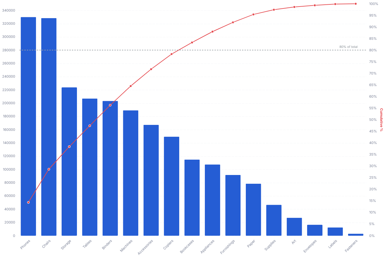
A Pareto Chart expects exactly two fields. Each row is one category with its value.
| Field | Label | Type | Role |
|---|---|---|---|
dimension | Dimension | dimension | Category shown as a bar along the x-axis. Sorted ascending (apply_order: 1). |
value | Value | measure | Bar height; also drives the descending sort and the cumulative percentage line. Sorted descending (apply_order: 2). |
Data requirements: Pre-aggregate to one row per category, since the template does not combine duplicate categories before sorting and accumulating. The template sorts categories by value in descending order and computes each one's cumulative share of the grand total, so values should be non-negative for the cumulative line to climb correctly.
Sample data:
| dimension | value |
|---|---|
| Pricing | 320 |
| Onboarding | 210 |
| Performance | 160 |
| Support | 95 |
| Documentation | 60 |
| Other | 35 |
Options
Set these options to adjust the chart without editing the Vega template. The CustomChartDef block above declares each option's type and allowed values.
| Option | Default | Effect |
|---|---|---|
bar_color | #255dd4 | Fill color of the value bars. |
line_color | #e5484d | Color of the cumulative percentage line, its points, and the right-axis title. |
show_threshold | true | Shows or hides the dashed threshold reference line and its label. |
threshold | 0.8 | Cumulative share (0 to 1) where the template draws the threshold line, for example 0.8 for the 80% mark. |
Known limitations
-
The chart sorts categories by value, not by your dimension order. The template forces a descending sort on
value, so you cannot keep a custom category order on the x-axis. -
Cumulative line assumes non-negative values. The template computes the cumulative percentage against the grand total, so negative values distort the climb and can push the line outside the 0 to 1 range.
-
Too many categories crowd the axis. Every category gets a labeled bar, so large category counts make the x-axis hard to read; group small categories into an "Other" bucket first.