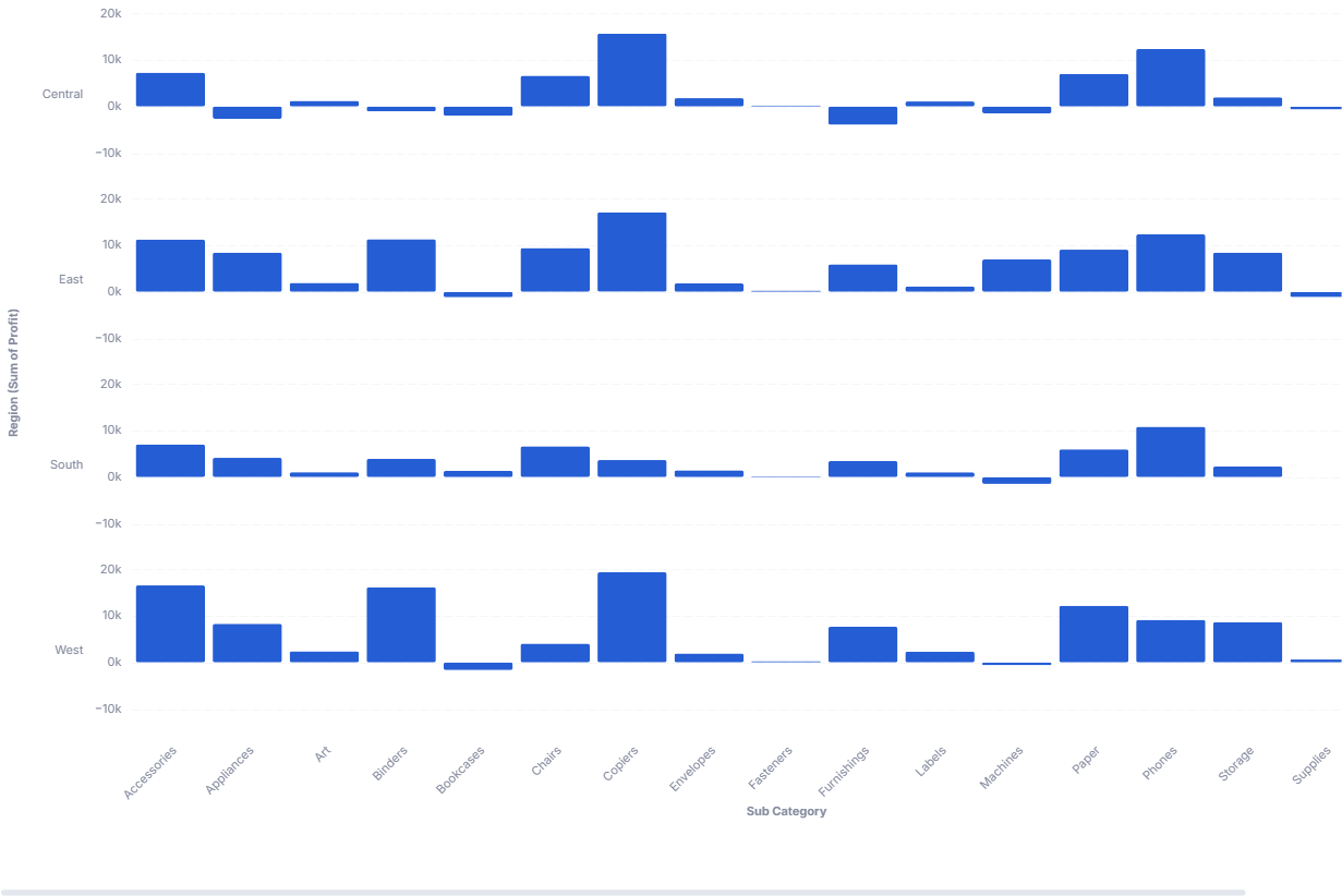
Trellis Chart
A Trellis plot (or small multiple) is a series of similar plots that displays different subsets of the same data, facilitating comparison across subsets.
- Good for: comparing the same bar breakdown across segments (sales by category per region, counts by stage per team), spotting which segments differ from the rest, laying out many small bar charts in a stacked grid of rows.
- Not great for: time-series x-axes (the template treats the x-axis as ordinal and may not handle dates well), a single segment (a plain bar chart is simpler), or part-to-whole composition (use a sunburst or treemap chart).
Syntax
Use the following AML definition to add the Trellis Chart to your custom chart library.
// Generate comparative insights across segments
// 1) Select a row dimension to categorize data into segments,
// 2) Choose an x-axis dimension (may not work with time yet)

CustomChartDef trellis_chart {
  label: 'Trellis Chart'
  description: 'To display a series of similar small-multiple plots, one per subset, so you can compare patterns across segments.'
  fields {
    field facet {
      label: 'Facet'
      type: 'dimension'
      sort {
        apply_order: 1
        direction: 'asc'
      }
    }
    field x_axis {
      label: 'X-axis'
      type: 'dimension'
      sort {
        apply_order: 2
        direction: 'asc'
      }
    }
    field value {
      label: 'Value'
      type: 'measure'
      sort {
        apply_order: 3
        direction: 'desc'
      }
    }
  }
  options {
    option show_y_axis_label {
      label: 'Show Y axis label'
      type: 'toggle'
      default_value: true
    }

    option row_sort {
      label: "Row Sort perference"
      type: "select"
      options: ['ascending','descending']
      default_value: 'ascending'
    }

    option row_height {
      label: "Height of the row"
      type: "number-input"
      default_value: '25'
    }

    option row_width {
      label: "Width of the chart"
      type: "number-input"
      default_value: '800'
    }

    option row_space {
      label: "Space between rows"
      type: "number-input"
      default_value: '25'
    }

    option fill_color {
      label: 'Fill Color'
      type: 'color-picker'
      default_value: '#aaa'
    }


  }

  template: @vgl {
    "data": { "values": @{values}},

    "transform": [
      {
        "window": [
          {
            "op": "mean",
            "field": @{fields.value.name},
            "as": "meanValue"
          }
        ],
        "frame": [null, null],
        "groupby": [@{fields.facet.name}]
      }
    ],

    "facet": {
      "row": {
        "field": @{fields.facet.name},
        "type": "nominal",
        "sort": @{options.row_sort.value},
        "header": {
          "title": "@{fields.facet.name} (@{fields.value.name})"
        }
      }
    },

    "spacing": {"row": @{options.row_space.value}},

//    "height": "container",
//    "width": "container",

    "spec": {
      "layer": [
        {
          "height": @{options.row_height.value},
          "width": @{options.row_width.value},
          "mark": "bar",
          "params": [
            {"name": "normalPointSelection", "select": {"type": "point", "toggle": "true", "clear": "mouseup"}},
            {"name": "hoverPointSelection", "select": {"type": "point", "on": "mouseover", "clear": "mouseout"}}
          ],
          "encoding": {
            "x": {
              "field": @{fields.x_axis.name},
              "title": @{fields.x_axis.name},
              "type": "ordinal"
            },
            "y": {
              "field": @{fields.value.name},
              "type": "quantitative",
              "scale": {"zero": false},
              "axis": {
                "title": null,
                "labels": @{options.show_y_axis_label.value}
              }
            },
            "color": {
              "value": @{options.fill_color.value}
            },
            "tooltip": [
              {"field": @{fields.facet.name}, "title": @{fields.facet.name}},
              {"field": @{fields.x_axis.name}, "title": @{fields.x_axis.name}},
              {"field": @{fields.value.name}, "title": @{fields.value.name}, "type": "quantitative"},
              {"field": "meanValue", "title": "Mean for row", "type": "quantitative"}
            ]
          }
        }
      ]
    },
    "holisticsConfig": {
      "crossFilterSignals": ["normalPointSelection"],
      "contextMenuSignals": ["hoverPointSelection"]
    },
    "config": {
      "background": null,
      "view": {"stroke": null},
      "font": "Inter",
      "axis": {
        "title": null,
        "ticks": false,
        "domain": false,
        "labelPadding": 10,
        "labelFontSize": 11,
        "labelColor": "#858B9E",
        "titleColor": "#858B9E",
      },
      "axisX": {"grid": false, "labelAngle": -45},
      "axisY": {
        "grid": true,
        "gridDash": [8, 3],
        "gridColor": "#F4F6F8",
        "gridOpacity": 1,
        "format": "~s"
      },
      "header": {
        "labelAngle": 0,
        "labelAlign": "left",
        "labelColor": "#858B9E",
        "titleColor": "#858B9E",
        "labelFontSize": 11,
        "titleColor": "#858B9E",
        "titleFontSize": 11
      },
      "bar": {"cornerRadius": 2}
    }
  };;
}
Legacy syntax
// Generate comparative insights across segments
// 1) Select a row dimension to categorize data into segments,
// 2) Choose an x-axis dimension (may not work with time yet)

CustomChart {
  fields {
    // row
    field row {
      type: "dimension"
      label: "Facet to group into rows"
    }

    // x axis
    field x {
      type: "dimension"
      label: "X-axis (categorical) "
    }

    // measure
    field measure {
      type: "measure"
      label: "Metric to measure"
    }
  }
  options {
    option show_y_axis_label {
      label: 'Show Y axis label'
      type: 'toggle'
      default_value: true
    }

    option row_sort {
      label: "Row Sort perference"
      type: "select"
      options: ['ascending','descending']
      default_value: 'ascending'
    }

    option row_height {
      label: "Height of the row"
      type: "number-input"
      default_value: '25'
    }

    option row_width {
      label: "Width of the chart"
      type: "number-input"
      default_value: '800'
    }

    option row_space {
      label: "Space between rows"
      type: "number-input"
      default_value: '25'
    }

    option fill_color {
      label: 'Fill Color'
      type: 'color-picker'
      default_value: '#aaa'
    }


  }

  template: @vgl {
    "data": { "values": @{values}},

    "transform": [
      {
        "window": [
          {
            "op": "mean",
            "field": @{fields.measure.name},
            "as": "meanValue"
          }
        ],
        "frame": [null, null],
        "groupby": [@{fields.row.name}]
      }
    ],

    "facet": {
      "row": {
        "field": @{fields.row.name},
        "type": "nominal",
        "sort": @{options.row_sort.value},
        "header": {
          "title": "@{fields.row.name} (@{fields.measure.name})",
          "labelAngle": 0,
          "labelAlign": "left"
        }
      }
    },

    "spacing": {"row": @{options.row_space.value}},

//    "height": "container",
//    "width": "container",

    "spec": {
      "layer": [
        {
          "height": @{options.row_height.value},
          "width": @{options.row_width.value},
          "mark": "bar",
          "encoding": {
            "x": {
              "field": @{fields.x.name},
              "title": @{fields.x.name},
              "type": "ordinal"
            },
            "y": {
              "field": @{fields.measure.name},
              "type": "quantitative",
              "scale": {"zero": false},
              "axis": {
                "title": null,
                "labels": @{options.show_y_axis_label.value},
                "ticks": false,
                "format": "~s"
              }
            },
            "color": {
              "value": @{options.fill_color.value}
            },
            "tooltip": [
              {"field": @{fields.row.name}, "title": @{fields.row.name}},
              {"field": @{fields.x.name}, "title": @{fields.x.name}},
              {"field": @{fields.measure.name}, "title": @{fields.measure.name}, "type": "quantitative"},
              {"field": "meanValue", "title": "Mean for row", "type": "quantitative"}
            ]
          }
        }
      ]
    },
    "config": {
      "axis": {
        "grid": false,
        "domain": false
      }
    }
  };;
}
Required fields
A Trellis Chart expects exactly three fields. facet becomes one row of bars per value; within each row, x_axis and value draw the bars.
| Field | Label | Type | Role |
|---|---|---|---|
facet | Facet | dimension | Splits the data into one row (small multiple) per value. Sorted ascending (apply_order: 1). |
x_axis | X-axis | dimension | Categorical x position within each row. Sorted ascending (apply_order: 2). |
value | Value | measure | Bar height (y). Sorted descending (apply_order: 3). |
Data requirements: Pre-aggregate to one row per facet and x-axis combination; the template plots value directly as bars without summing. The template treats the x-axis as ordinal, so use categorical values rather than dates. The template also computes a per-row mean of value (shown in the tooltip as "Mean for row").
Sample data:
| facet | x_axis | value |
|---|---|---|
| North | Q1 | 4200 |
| North | Q2 | 4800 |
| North | Q3 | 5100 |
| South | Q1 | 3100 |
| South | Q2 | 3400 |
| South | Q3 | 3000 |
Options
Set these options to adjust the layout without editing the Vega template. The CustomChartDef block above declares each option's type and allowed values.
| Option | Default | Effect |
|---|---|---|
show_y_axis_label | true | Toggles the y-axis labels in each row. |
row_sort | ascending | Orders the facet rows ascending or descending. |
row_height | '25' | Height of each row's plot, in pixels. |
row_width | '800' | Width of the chart, in pixels. |
row_space | '25' | Vertical gap between rows, in pixels. |
fill_color | #aaa | Fill color of the bars. |
Known limitations
-
X-axis is ordinal, not temporal. The template treats dates on the x-axis as categories, so a true time axis may not render correctly. Use categorical x-values, or another chart for time series.
-
Width and height are fixed values, not container-fit.
row_widthandrow_heightset static pixel sizes (the container-fit lines are commented out), so wide content can overflow or leave whitespace. Tune the size options to your layout. -
Many facets make a tall chart. Each facet value adds a row, so a large number of facets produces a long scroll. Filter to the segments you want to compare.