Interactive Control Buttons
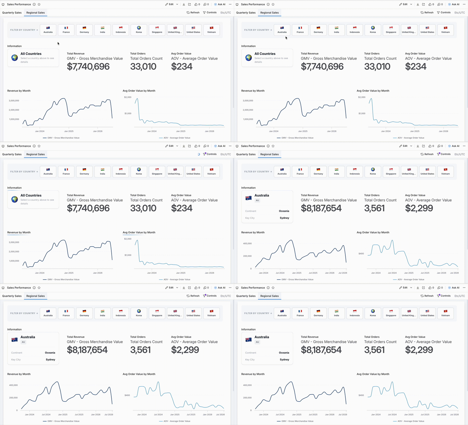
Control Buttons let dashboard viewers filter data by clicking styled buttons, without relying on the standard filter panel. When a button is clicked, it cross-filters other visualizations on the page.
They're built inside a Dynamic Content block, where you write HTML/CSS to control the appearance and a small template tag to wire up the filtering logic.
How to set it up
Step 1: Add a Dynamic Content block and configure its data
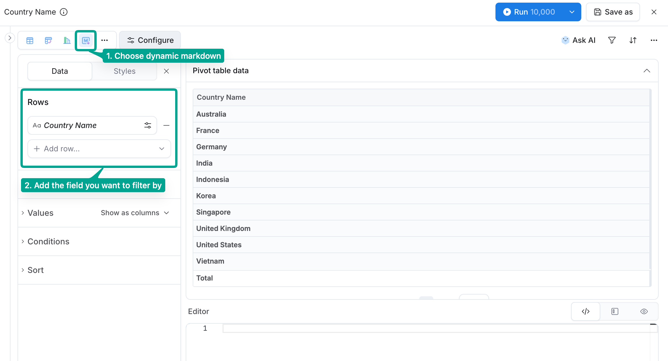
- Add a dynamic markdown visualization to your dashboard.
- In the configure panel, add the field you want to filter by to Rows.
This queries all distinct values from your data, each one will become a button.
Step 2: Loop through the rows
Then, in the Editor tab, use {% map(rows) %} to loop through those rows:
{% map(rows) %}
  <!-- one button per row -->
{% end %}
Step 3: Wrap each button with <h-drill>
Inside that loop, wrap each item with <h-drill>. This is what makes each button clickable and triggers cross-filtering on other charts. Your template should now look like this:
{% map(rows) %}
  <h-drill row="0" value="{{ `Your Field`.raw }}">
    <div class="your-button">{{ `Your Field`.formatted }}</div>
  </h-drill>
{% end %}
row="0"tells<h-drill>which column group to filter on. For single-field filters (the most common case), this is always0.value="{{ `Your Field`.raw }}"is the raw value passed as the filter{{ `Your Field`.formatted }}is the display text shown on the button- When selected, the
.h-drill-selectedclass is added to the button element
Step 4: Connect to other dashboard components
Once your buttons are in place, other charts on the dashboard will cross-filter automatically as long as they use the same field as the button block. If a visualization isn't responding, make sure its dataset includes that same field.
Examples
Both examples below are drop-in starting points. Swap in your own field names and adjust the CSS to match your brand.
Category buttons (country filter)
Filters the dashboard by country. Requires two fields: Country (the filter value) and Country Icon (a flag emoji for display).
<style>
  .country-selector {
    display: flex;
    gap: 1rem;
    padding: 1rem;
    flex-wrap: wrap;
  }
  .country-card {
    position: relative;
    display: flex;
    flex-direction: column;
    align-items: center;
    gap: 0.5rem;
    padding: 1.25rem 1.5rem;
    background: #FFFFFF;
    border: 2px solid #E5E7EB;
    border-radius: 12px;
    cursor: pointer;
    transition: all 0.15s ease;
    min-width: 120px;
    text-align: center;
  }
  .country-card:hover {
    border-color: #3B82F6;
    background: #F8FAFC;
    transform: translateY(-2px);
    box-shadow: 0 4px 12px rgba(59, 130, 246, 0.15);
  }
  .country-card:active {
    border-color: #1B7CE4;
    background: #EFF6FF;
    transform: translateY(0);
  }
  .h-drill-selected.country-card {
    border-color: #1B7CE4;
    background: #EFF6FF;
    transform: translateY(0);
  }
  .h-drill-selected.country-card > .country-label {
    color: #1B7CE4;
  }
  .country-icon {
    font-size: 1.5rem;
    line-height: 1;
  }
  .country-label {
    font-size: 0.9375rem;
    font-weight: 600;
    color: #111827;
  }
</style>

<div class="country-selector">
{% map(rows) %}
  <h-drill row="0" value="{{ `Country`.raw }}">
    <div class="country-card">
      <span class="country-icon">{{ `Country Icon`.formatted }}</span>
      <span class="country-label">{{ `Country`.formatted }}</span>
    </div>
  </h-drill>
{% end %}
</div>
Required data fields
| Field | Type | Description |
|---|---|---|
Country | Dimension | Filter value (e.g. country name) |
Country Icon | Dimension | Display icon (e.g. flag emoji) |
Sample data: sample-data-control-buttons.csv
Country,Country Icon
Germany,🇩🇪
Singapore,🇸🇬
United States,🇺🇸
Vietnam,🇻🇳
Quarter selector buttons (date filter)
Filters the dashboard by quarter. Add your date field to Rows and set the time-grain to Quarter. The block queries all distinct quarters from your data, so the buttons always reflect what's in the dataset.
<style>
  .quarter-selector {
    display: flex;
    flex-direction: row;
    flex-wrap: wrap;
    gap: 0.5rem;
    padding: 0.75rem 1rem;
    align-items: center;
    background: #F9FAFB;
    border-radius: 8px;
  }
  .qs-label {
    font-size: 0.75rem;
    font-weight: 700;
    color: #9CA3AF;
    text-transform: uppercase;
    letter-spacing: 0.06em;
    margin-right: 0.25rem;
  }
  .quarter-btn {
    display: inline-flex;
    align-items: center;
    justify-content: center;
    padding: 0.375rem 1rem;
    background: #FFFFFF;
    border: 2px solid #E5E7EB;
    border-radius: 6px;
    cursor: pointer;
    font-size: 0.875rem;
    font-weight: 600;
    color: #374151;
    transition: all 0.15s ease;
    min-width: 80px;
    user-select: none;
  }
  .quarter-btn:hover {
    border-color: #6366F1;
    color: #6366F1;
    background: #F5F3FF;
  }
  .h-drill-selected.quarter-btn {
    border-color: #6366F1;
    background: #6366F1;
    color: #FFFFFF;
  }
</style>

<div class="quarter-selector">
  <span class="qs-label">Filter by quarter →</span>
  {% map(rows) %}
  <h-drill row="0" value="{{ `Quarter`.raw }}">
    <div class="quarter-btn">{{ `Quarter`.formatted }}</div>
  </h-drill>
  {% end %}
</div>
Required data field
| Field | Type | Description |
|---|---|---|
Quarter | Date dimension | Add to Rows with time-grain set to Quarter |
Customization tips
Once the buttons are working, you can adjust their appearance to match your dashboard's design without touching the filtering logic.
- Colors: Change the border and background colors to match your brand
- Hover/selected states: Adjust
:hoverand.h-drill-selected.your-button-class(both classes must be on the same element) - Richer buttons: Add metrics, descriptions, or icons by extending the card HTML