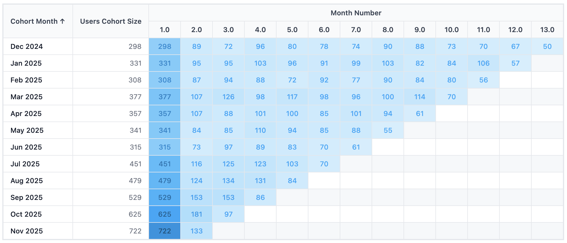
Retention Heatmap
We support multiple ways to build a retention heatmap. Here's a quick comparison to help you pick the right one:
| Option | Custom colors | Auto color scale* | Maintenance |
|---|---|---|---|
| Built-in, legacy Retention Heatmap | No | Yes | Low -- built-in visualization |
| Pivot Table with conditional formatting (recommended) | Yes | Coming soon | Low -- built-in visualization |
| Dynamic Content Block (this page) | Yes | Yes | Higher -- you maintain the HTML/CSS yourself |
(*) Auto color scale: Color intensity adjusts automatically to the current data range. Without it, a heatmap built for a max of 1,000 will look washed out when a user's data only goes up to 80, or when a time filter reduces the range.
A cohort retention heatmap where the color intensity dynamically adjusts based on actual data values, and you have full control over the color scheme (combining the best of both built-in options).
Best for: Cohort retention analysis, user engagement tracking, subscription churn monitoring
Key techniques: Pivot-style map(columns) + nested map(values), CSS custom properties for dynamic color, hsl() color calculations
How this template handles auto color scale
A fixed color scale causes problems when your data range varies (either across different users or different time filters):
- Across different users: If your color scale is fixed at max = 1,000, Client A with max = 1,000 looks great. But Client B with max = 80 sees a washed-out heatmap because the scale wasn't built for their data range.
- Across different time filters: With a "last year" filter, max = 1,000 fills the darkest color. Switch to "last month" and max drops to 200: but it renders as a pale shade because the scale was designed for 1,000.
This template solves both by adding a Heat Intensity field to your data query, normalized to a 0–1 range. The CSS then maps this value to color intensity, so the darkest color always reflects your current maximum.
Template Code
<style>
  .cohort-container {
    font-family: -apple-system, BlinkMacSystemFont, 'Segoe UI', sans-serif;
    font-size: 12px;
    overflow-x: auto;
    padding: 1rem;

    /* Centralized color scale settings -- change these to customize */
    --hue: 201;
    --saturation: 96%;
  }

  .cohort-table {
    border-collapse: collapse;
    width: 100%;
    min-width: 900px;
  }

  .cohort-table th,
  .cohort-table td {
    padding: 8px 12px;
    text-align: center;
    border: 1px solid #E5E7EB;
    white-space: nowrap;
  }

  .cohort-table thead th {
    background-color: #F9FAFB;
    font-weight: 600;
    color: #374151;
  }

  .cohort-table th.month-header {
    min-width: 55px;
  }

  .cohort-table th.cohort-header {
    text-align: left;
    min-width: 120px;
  }

  .cohort-table th.size-header {
    text-align: right;
    min-width: 120px;
  }

  .cohort-table td.cohort-cell {
    text-align: left;
    font-weight: 500;
    color: #111827;
    background-color: #FFFFFF;
  }

  .cohort-table td.size-cell {
    text-align: right;
    color: #6B7280;
    background-color: #FFFFFF;
  }

  /* Dynamic color scale for percentage cells */
  .cohort-table td.percentage-cell {
    --percentage: 0;
    --bg-lightness: calc(95 - var(--percentage) * 50);
    --text-lightness: calc(25 + (1 - var(--percentage)) * 30);

    font-weight: 500;
    min-width: 55px;
    background-color: hsl(var(--hue) var(--saturation) calc(var(--bg-lightness) * 1%));
    color: hsl(var(--hue) var(--saturation) calc(var(--text-lightness) * 1%));
  }

  .month-group-header {
    text-align: center;
    font-weight: 600;
    color: #374151;
  }
</style>

<div class="cohort-container">
<table class="cohort-table">
  <thead>
    <tr>
      <th class="cohort-header" rowspan="2">Cohort Month</th>
      <th class="size-header" rowspan="2">Cohort Size</th>
      <th class="month-group-header" colspan="13">Month Number</th>
    </tr>
    <tr>
      {% map(columns) %}
        <th class="month-header">{{ `Month Number` }}</th>
      {% end %}
    </tr>
  </thead>
  <tbody>
  {% map(rows) %}
  <tr>
    <td class="cohort-cell">{{ `Cohort Month` }}</td>
    <td class="size-cell">{{ `Users Cohort Size` }}</td>
    {% map(values) %}
      <td class="percentage-cell" style="--percentage: {{ value.`Heat Intensity`.raw }};">
        {{ value.`Total Users` }}
      </td>
    {% end %}
  </tr>
  {% end %}
  </tbody>
</table>
</div>
How the Dynamic Color Scale Works
The color magic happens through CSS custom properties and hsl() calculations. Here's how the pieces fit together:
1. You set the base color once at the container level:
.cohort-container {
  --hue: 201;        /* Blue -- change this to pick your color */
  --saturation: 96%; /* Color richness */
}
2. Each cell receives a --percentage value (0 to 1) from your data via inline style:
<td class="percentage-cell" style="--percentage: {{ value.`Heat Intensity`.raw }};">
3. CSS calculates the lightness dynamically:
--bg-lightness: calc(95 - var(--percentage) * 50);
/* percentage = 0 → lightness 95% (nearly white) */
/* percentage = 1 → lightness 45% (deep color) */

background-color: hsl(var(--hue) var(--saturation) calc(var(--bg-lightness) * 1%));
The text color also adjusts (darker text on light cells, lighter text on dark cells) so values stay readable at any intensity.
Since --percentage comes from a normalized field in your query (value / max_value), the scale always maps your current data range to the full color spectrum, regardless of the absolute numbers.
Required Data Fields
| Field | Type | Slot | Description |
|---|---|---|---|
Cohort Month | Dimension | Row | The cohort period (e.g., "Jan 2024") |
Users Cohort Size | Dimension | Row | Number of users in the cohort |
Month Number | Dimension | Column (pivot) | Duration period (0, 1, 2, ...) |
Total Users | Measure | Value | Count of returning users per cell |
Heat Intensity | Measure | Value | Normalized value between 0 and 1 for color intensity |
Preparing the Heat Intensity Field
The Heat Intensity field drives the color scale. It should be a value between 0 and 1, where 1 = the maximum in your current data.
In AML, you can create a calculated measure using window_max to normalize against the current maximum:
calculation heat_intensity {
  label: 'Heat Intensity'
  formula: @aql case(
    when: window_max(total_users) == 0,
    then: null,
    else: (total_users * 1.0) / window_max(total_users)
  );;
  calc_type: 'measure'
  data_type: 'number'
}
This divides each cell's value by the maximum value across the entire grid. Since window_max recalculates when filters change, the color scale automatically adjusts when users switch time filters or other dashboard filters.
Preparing the Users Cohort Size Field
To repeat the cohort size for each row, use dimensionalize to turn a measure into a row-level dimension:
calculation users_cohort_size {
  label: 'Users Cohort Size'
  formula: @aql dimensionalize(
    total_users,
    ecommerce_users.cohort_month
  );;
  calc_type: 'dimension'
  data_type: 'number'
  model: ecommerce_users
}
Customization Tips
Change the color scheme
Adjust --hue and --saturation in .cohort-container to any color you want:
| Color | --hue | --saturation |
|---|---|---|
| Blue (default) | 201 | 96% |
| Green | 142 | 70% |
| Purple | 270 | 80% |
| Orange | 25 | 90% |
| Teal | 175 | 70% |
Adjust the intensity range
The lightness formula calc(95 - var(--percentage) * 50) means:
- 95 = lightest value (when percentage = 0)
- 50 = the range of lightness variation
To make the contrast more dramatic, increase the range (e.g., * 60). To make it subtler, decrease it (e.g., * 30).
Display retention percentage instead of raw counts
The template displays Total Users (raw count) in each cell, but you can also add a retention percentage measure and display that instead. Create a calculated measure using of_all:
calculation total_users_retention {
  label: 'Retention Rate'
  formula: @aql (total_users * 1.0)
    / (total_users | of_all(ecommerce_orders.month_number, keep_filters: true));;
  calc_type: 'measure'
  data_type: 'number'
}
Then swap the displayed value in the template:
<td class="percentage-cell" style="--percentage: {{ value.`Heat Intensity`.raw }};">
  {{ value.`Retention Rate` }}
</td>
Add row/column totals
You can add totals using the row_total and col_totals accessors from the Syntax Reference. For example, add a totals column at the end of each row:
<td><strong>{{ `row_total`.`Total Users` }}</strong></td>