The Holistics handbook for business users
Everything a business user can do in one place. See what each capability is for and how it works, so new users get the full picture and seasoned users find what they've missed.
Getting answers quickly
Instead of hunting through dashboards, ask a question in plain language. Holistics surfaces trusted dashboards, charts, and answers, and can explain how to use the platform as you go.
Start with Ask AI
Ask a business question and get a trusted chart or dashboard back.
Ask Follow-Up Questions
Clarify a metric, trend, or spike from the chart itself.
Summarize a Dashboard with AI
Get a plain-language summary of what a dashboard is showing.
Ask AI Across Widgets with Your Org's Context
Select several widgets, ask one question across them, and get an answer shaped by your organization's own context and preferences, not generic guesses.
Interact with AI-Generated Charts
Hover, filter, and drill into an AI result instead of reading a static chart.
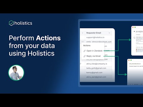
Use Holistics from Your Own AI Interface
Connect Holistics to your chat or command-line tools via MCP.
Exploring dashboards & reports
Go beyond a static answer. Filter, cross-filter, and slice a dashboard down to the view you need.
Filter a Dashboard or Report
Narrow results by time, region, segment, or product, even by hidden fields.
Filter by a Relative Date or Time
Filter on moving windows like the last 7 days, this month, or year to date. The view stays current without editing the date each time.
Cross-Filter a Dashboard
Click a chart to filter every related chart on the dashboard at once.
Filter to Top or Bottom N
Show only the highest or lowest N records, applied after your other filters.
Drill Through to Another Dashboard
Jump from a summary view to a related detail dashboard.
Refresh Data to the Latest
Pull the newest numbers when data has been added since the dashboard last loaded. Refresh a whole dashboard or a single widget on demand.
KPI Metric Sheets
See the same set of key KPIs side by side across different time aggregations (day, week, month, quarter, year) in one compact view that updates automatically.
Understand the Context Behind Your Data
See what each metric and field actually means, straight from the definitions your BI team maintains, so you read every number with the right context.
Uncover the who and why behind a number
Drill into any number until a pattern jumps out, then open the records behind the spike to see the actual customers and orders. In Holistics every metric works this way by default, with no drill paths to pre-build.
Drill Down into a Metric
Slice a number open dimension by dimension, until the pattern driving it stands out.
View Underlying Data
See the exact records behind a number, so a spike becomes the named customers or orders that caused it.
Creating & saving your own analysis
Safe self-service. Customize, save, and share your own analysis without touching official dashboards.
Explore a Report
Adjust dimensions and measures for your own analysis.
Create a Dashboard from a Dataset
Spin up a brand-new dashboard straight from a dataset you already have access to.
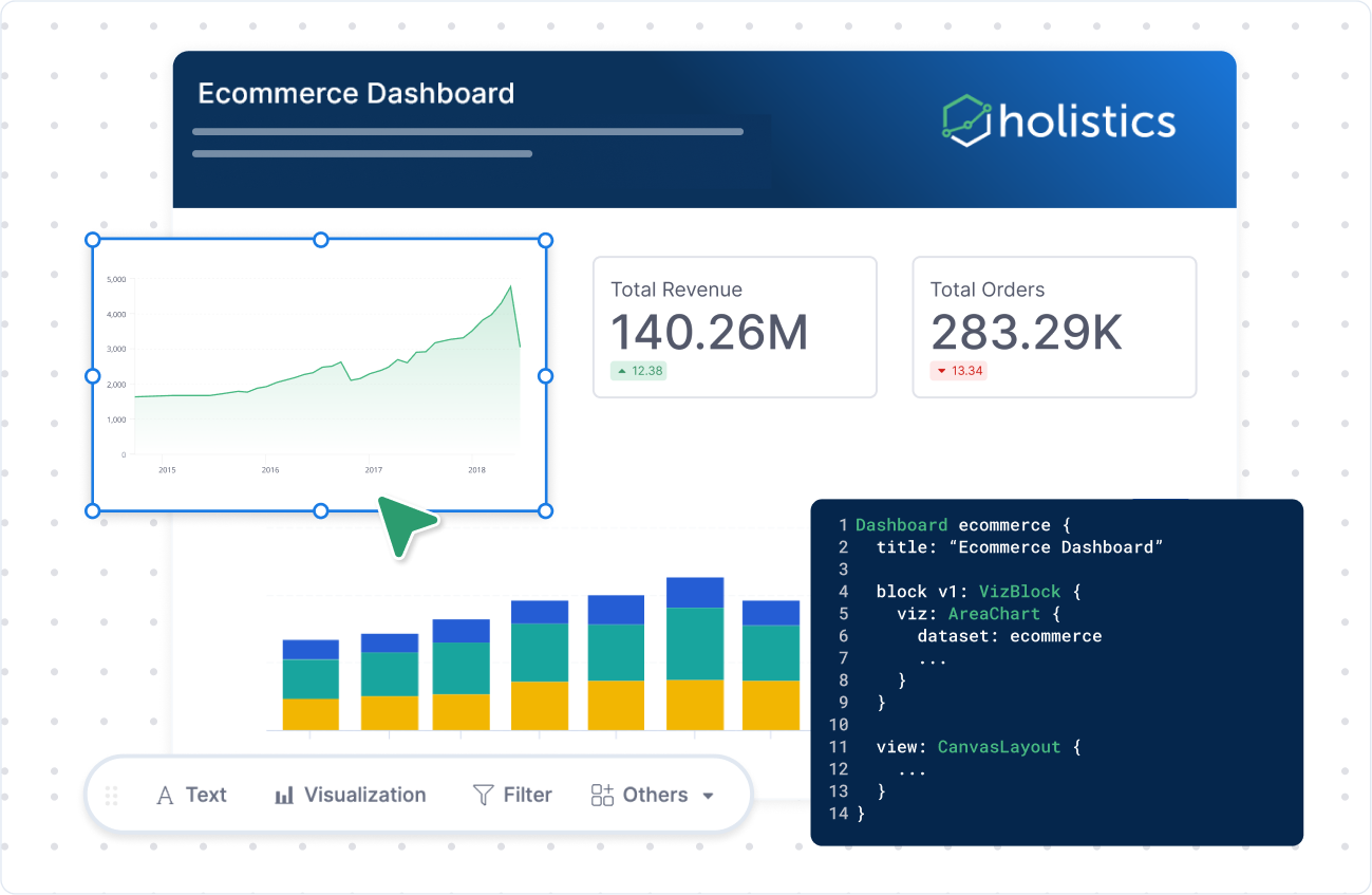
Find Your Way Around the Visualization Interface
Know where the chart selector, Configure panel, and toolbar actions live.
Customize Your Dashboard Editor
Set your default layout preferences for the editor, like whether widgets can overlap and how content is trimmed, so every dashboard you build starts the way you lay things out.
Save to Personal Workspace
Keep your own version of an analysis, privately.
Auto-Sync a Report to Google Sheets
Keep a Google Sheet in step with a Holistics report, refreshed on a schedule, so the numbers your team works with in Sheets are always current.
Export to CSV or Excel
Continue analysis offline, where permitted.
Build calculations, conditions & analytic functions
Add calculated fields with a point-and-click builder or with AI, layer in advanced filter conditions, apply prebuilt analytic functions like period-over-period and trend lines, or package a repeatable analysis as a governed AI skill.
Create Advanced Nested Conditions
Combine AND/OR grouped filters without SQL.
Create Period-over-Period Comparisons
Compare current vs previous period in a few clicks.
Create a Running Total
Accumulate a metric across a dimension, like running revenue by month.
Add Moving Calculations
Smooth noisy trends with moving averages and measure change over time.
Add a Trend Line
Overlay a trend line to see the direction behind the data points.
Add a Reference Line
Mark a target, average, or threshold line on a chart.
Suggest Organization-Specific AI Skills
Package a repeated analytical workflow as a reusable, governed AI skill.
Design & style your dashboard
Make your dashboards clear, branded, and great to look at.
Add Conditional Formatting
Highlight values that cross a threshold.
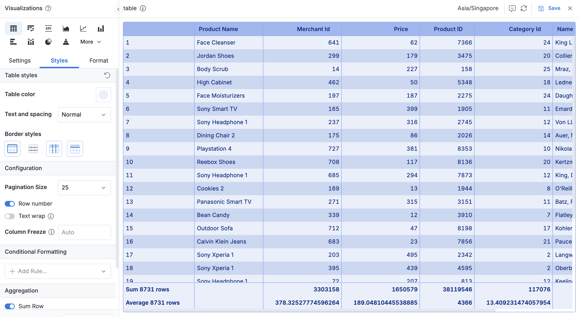
Change Colors & Style
Restyle a chart or table with your own colors and formatting.
Use Custom Charts
Go beyond the built-in charts with open-source visualizations.
Build Rich Layouts with HTML & CSS
Design branded, web-app-like dashboard themes and layouts.
Deliver, share & act on data
Get data and insights out of Holistics, delivered to inboxes and channels, shared with external viewers, or used to trigger action in other systems. Most of these are set up with your data team. Need more access to do them yourself? Ask your data team.
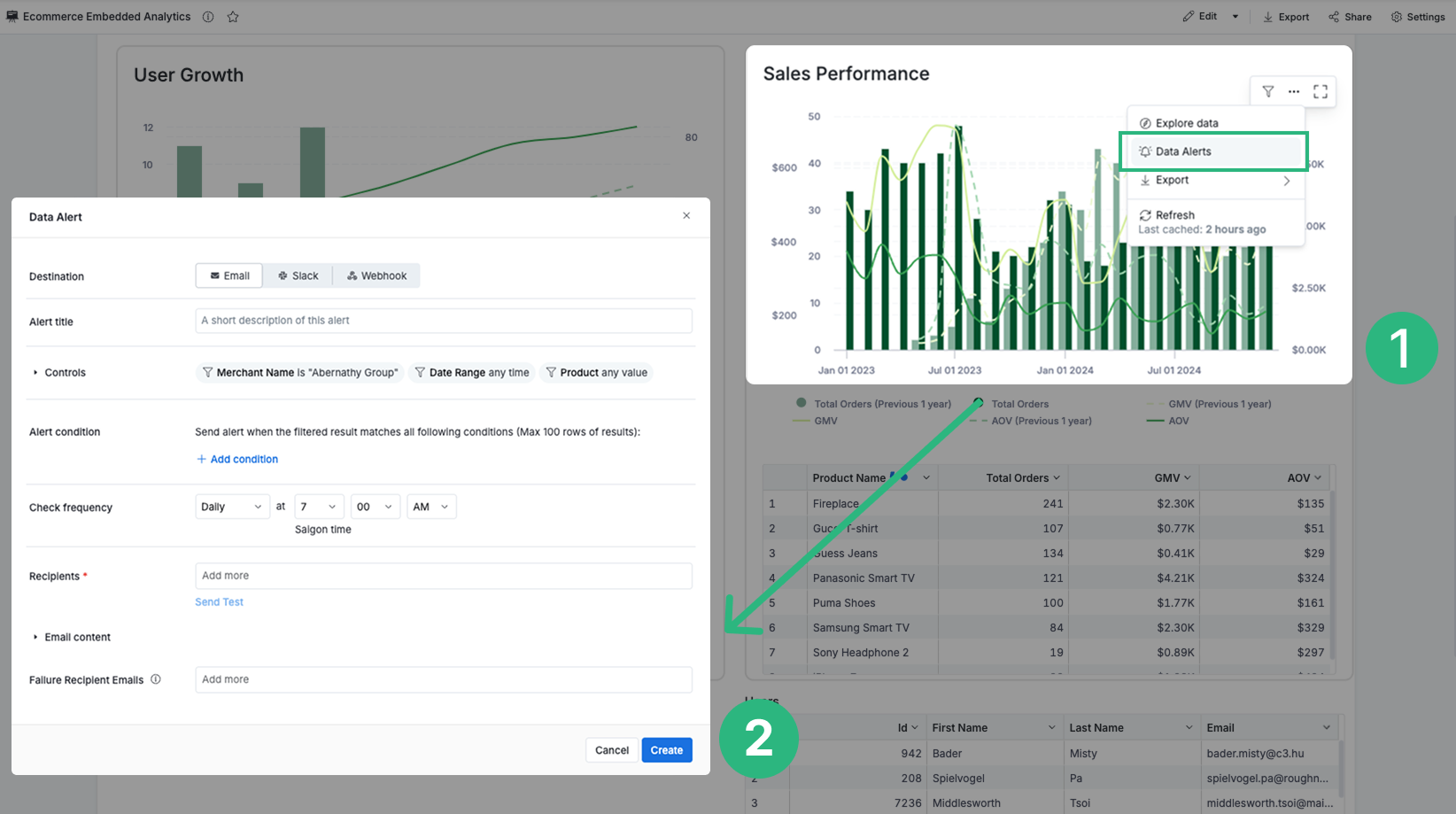
Schedule Report Delivery
Have recurring reports delivered automatically to where your team already works, from email and Slack to Google Sheets and SFTP.