Healthcare Overview
Healthcare · Bold colour · Light · Tabbed
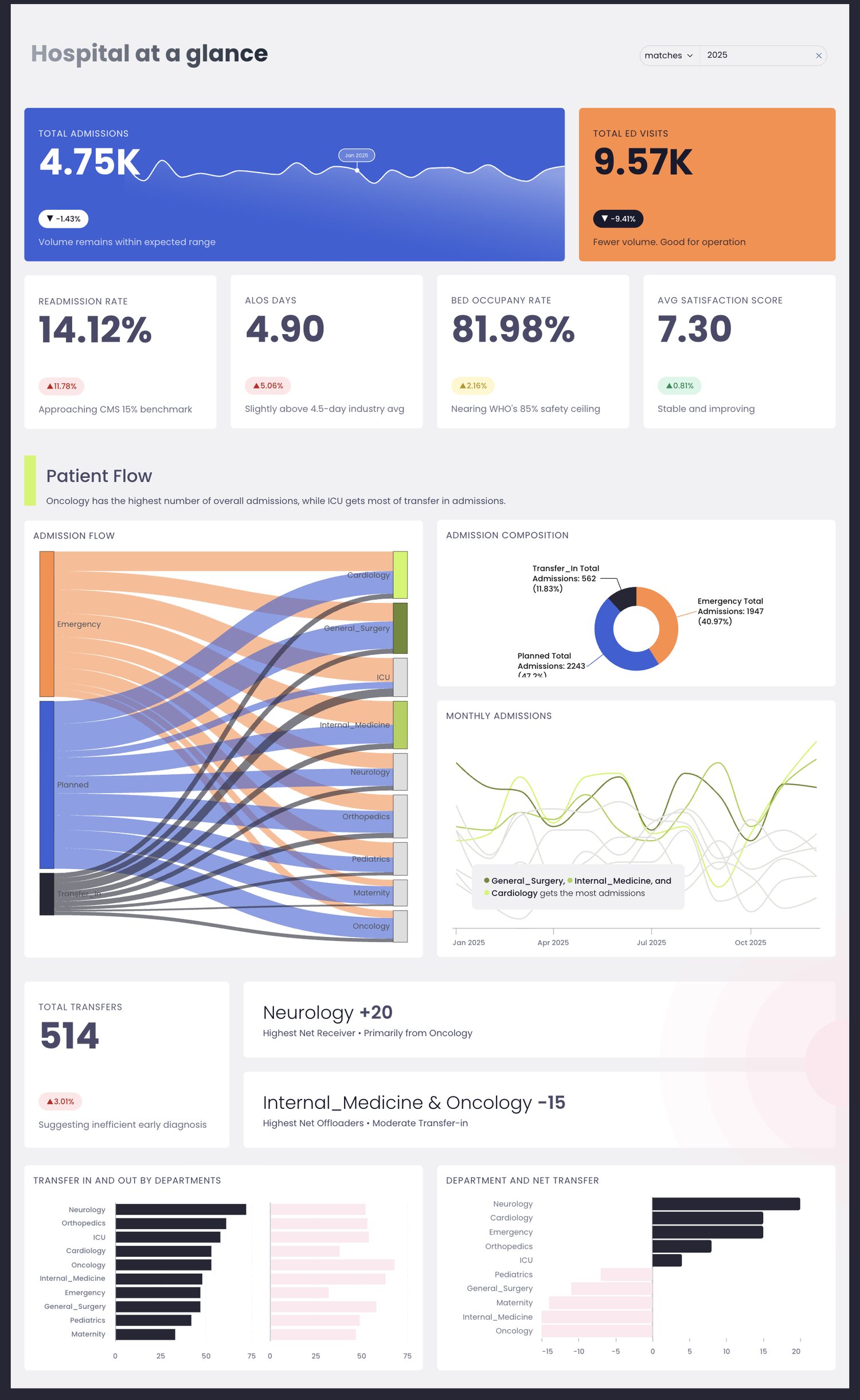
Five tabs of hospital operations that hold a single visual system from end to end. It has the widest range of chart types in the gallery, and it is the clearest example here of a theme that was designed rather than picked.
What makes it work
- Three accent colours (cobalt, orange, lime) are each assigned a fixed meaning and never reused for anything else, so the colour tells you what kind of number you are looking at before you read the label.
- Every tab opens with the same KPI band in the same position. Switching tabs feels like turning a page in one document rather than opening a different report.
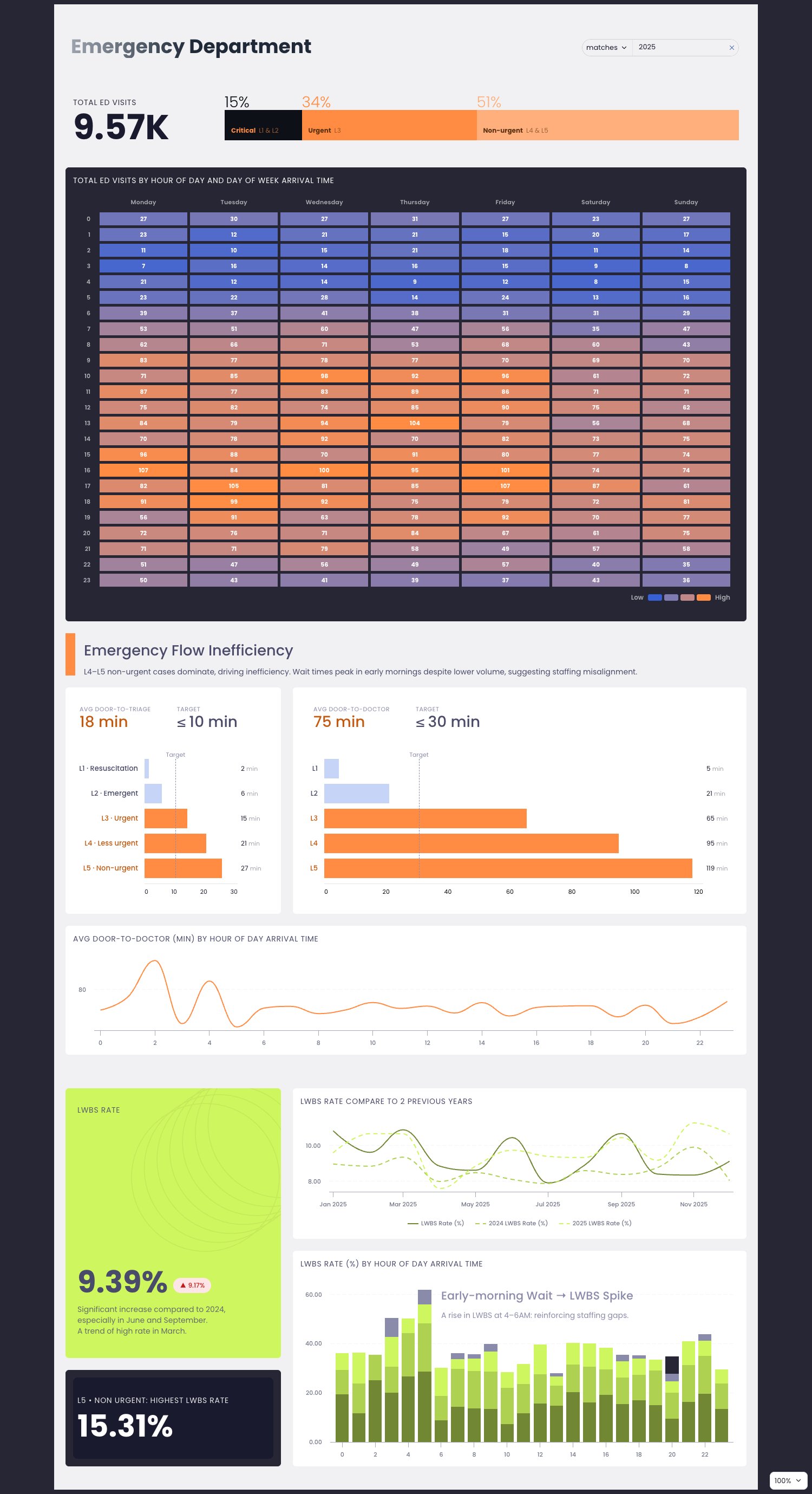
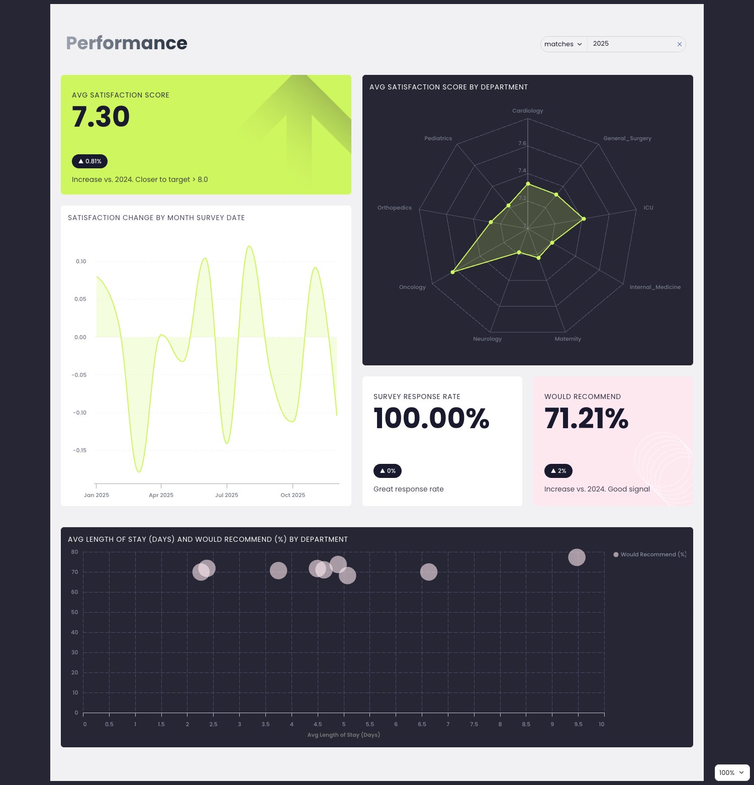
- The chart vocabulary goes well past bar and line: a Sankey for patient flow, an hour-of-day heatmap, a radar for department comparison, and a bubble scatter.
- White space does the grouping, so there are almost no borders or boxes.
The views
Each tab is shown below at full width.
Overview
Emergency Dept
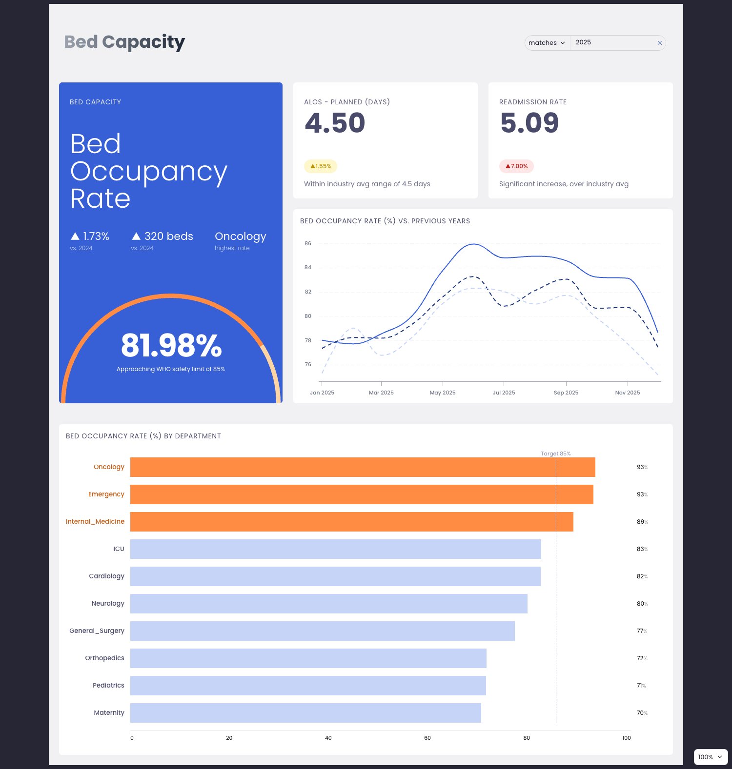
Bed Capacity
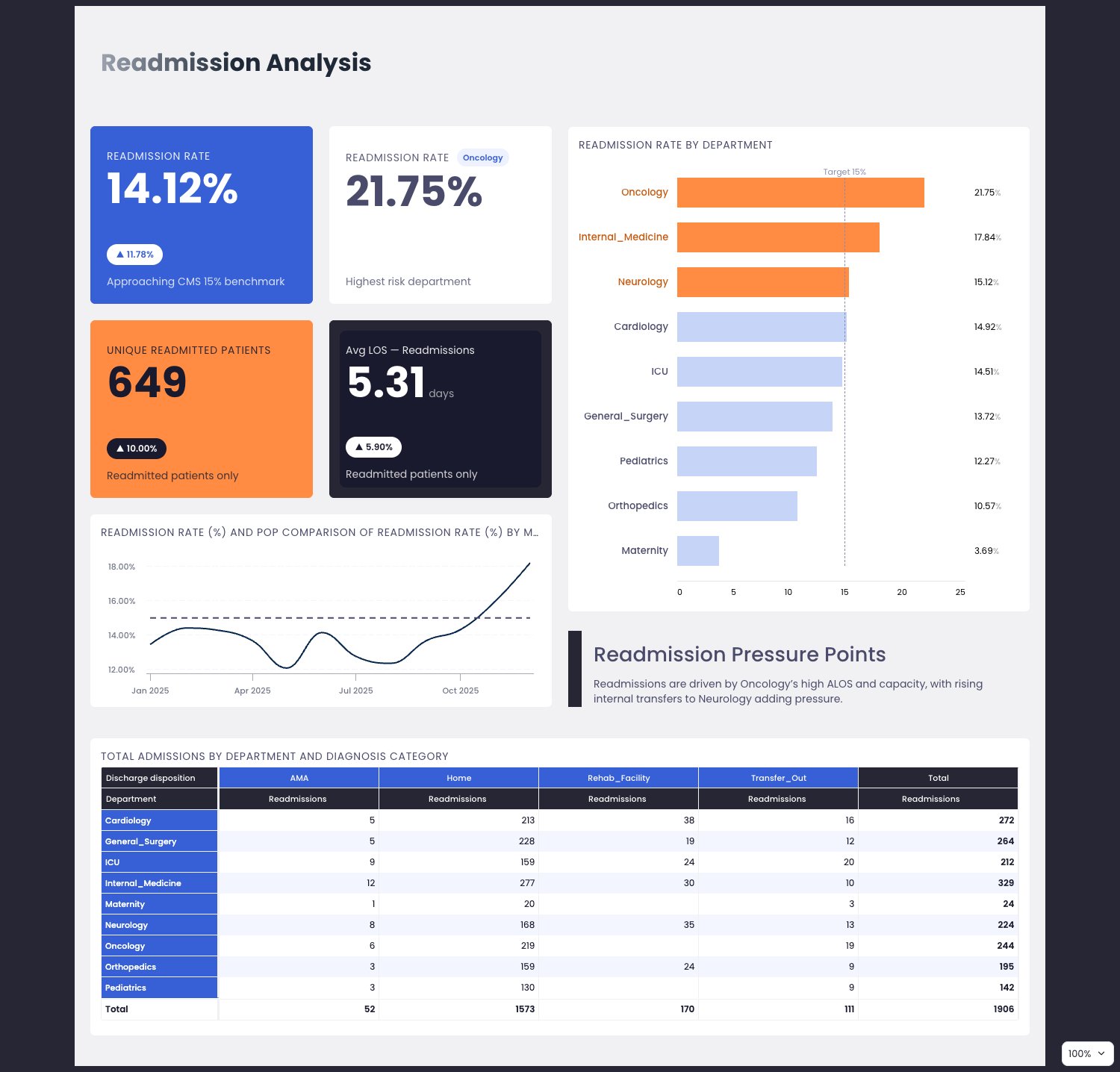
Readmission
Performance
See it live
Open the live dashboard to click through it yourself. No Holistics account needed.
Theme code
The theme this dashboard actually uses, written out as a reusable PageTheme. Paste it into a
.theme.aml file under Development > Library > Themes to reuse it across your own dashboards,
or inline it as a single dashboard's theme: property. Chart colour palettes are set
separately, so they are not included here.
healthcare_overview_theme.theme.aml
PageTheme healthcare_overview_theme {
  background {
    bg_color: "#262635"
  }
  canvas {
    border {
      border_style: "none"
      border_width {
        top: 0
        left: 0
        right: 0
        bottom: 0
      }
    }
    shadow: "none"
    opacity: 1
    background {
      bg_color: "#F1F1F3"
    }
  }
  block {
    text {
      font_size: 12
      font_color: "#1A1A2E"
      font_style: "normal"
      font_family: "Poppins"
      font_weight: "normal"
    }
    label {
      font_size: 16
      font_color: "#4A4A6A"
      font_style: "normal"
      font_family: "Poppins"
      font_weight: "light"
    }
    border {
      border_style: "none"
      border_width {
        top: 0
        left: 0
        right: 0
        bottom: 0
      }
      border_radius {
        top_left: 6
        top_right: 6
        bottom_left: 6
        bottom_right: 6
      }
    }
    shadow: "none"
    opacity: 1
    padding {
      top: 14
      left: 14
      right: 14
      bottom: 14
    }
    background {
      bg_color: "#FFFFFF"
    }
  }
  viz {
    table {
      header {
        bg_color: "#262635"
        font_size: 11
        font_color: "#FFFFFF"
        font_weight: "medium"
      }
      general {
        bg_color: "#FFFFFF"
        font_size: 12
        font_color: "#1A1A2E"
        font_family: "Poppins"
        hover_color: "#E8F5A3"
        banding_color: "#F4F6FF"
        grid_color: "#F1F1F3"
        border_color: "#F1F1F3"
        border_width: 1
      }
      sub_title {
        font_size: 10
        font_color: "#8A8AAA"
        font_weight: "normal"
      }
      sub_header {
        bg_color: "#3760D6"
        font_size: 11
        font_color: "#FFFFFF"
        font_weight: "medium"
      }
    }
  }
}
The theme is paired with custom CSS, which lives beside it rather than inside it. See Custom CSS for where it goes.
Custom CSS
@import url('https://fonts.googleapis.com/css2?family=Poppins:wght@300;400;500;600;700&display=swap');

/* apply Poppins globally */
* {
  font-family: 'Poppins', sans-serif !important;
}

/* gentle wide shadow on all blocks */
.block-content-wrapper {
  box-shadow: 0 2px 60px 0 rgba(0, 0, 0, 0.03) !important;
}

/* kill holistics default shadow on filter form */
.dm-filter-form.shadow-sm {
  box-shadow: none !important;
}

/* uppercase block labels — healthcare/tech feel */
/* All block titles */
.dac-viz-block-label,
.block-title {
  text-transform: uppercase !important;
  letter-spacing: 0.05em !important;
  font-size: 14px !important;
  font-weight: 400 !important;
}

/* Entire filter container */
.dm-filter-container,
.dm-filter-form {
  background-color: #F1F1F3 !important;
  border-radius: 999px !important;
  overflow: hidden !important;
  border-color: #d1d1d5 !important;
}

/* Operator pill ("matches") */
.ci-operator-select,
.hui-select-trigger.operator-select {
  background-color: #F1F1F3 !important;
  color: #1A1A2E !important;
}
.ci-operator-select .h-icon[data-icon="angle-down"],
.ci-operator-select .truncate {
  color: #1A1A2E !important;
}

/* Value input ("2025") */
.ci-value-select,
.date-picker-custom-input,
.h-highlightable-input.ci-date-picker-input {
  background-color: #F1F1F3 !important;
  color: #1A1A2E !important;
}

/* The <mark> highlight tag inside the input */
.h-highlightable-input mark {
  background-color: transparent !important;
  color: #1A1A2E !important;
}

/* Clear (×) button */
.hui-btn-clear-default {
  background-color: transparent !important;
  color: #DBDBDC !important;
}

[data-uname="v_s55p"] .dac-viz-block-label {
  color: #FFFFFF !important;
}

[data-uname="v_zndc"] .dac-viz-block-label {
  color: #FFFFFF !important;
}

[data-uname="v_s7lx"] .dac-viz-block-label {
  color: #FFFFFF !important;
}

[data-uname="v_zndc"] .highcharts-grid.highcharts-xaxis-grid.highcharts-radial-axis-grid path,
[data-uname="v_zndc"] .highcharts-grid.highcharts-yaxis-grid.highcharts-radial-axis-grid path {
  stroke: #8A8AAA !important;
  stroke-width: 0.5px !important;
}
[data-uname="v_zndc"] .highcharts-axis.highcharts-radial-axis path {
  stroke: #8A8AAA !important;
}