Mobile App Marketing Performance
Marketing · Bold colour · Dark · Single page
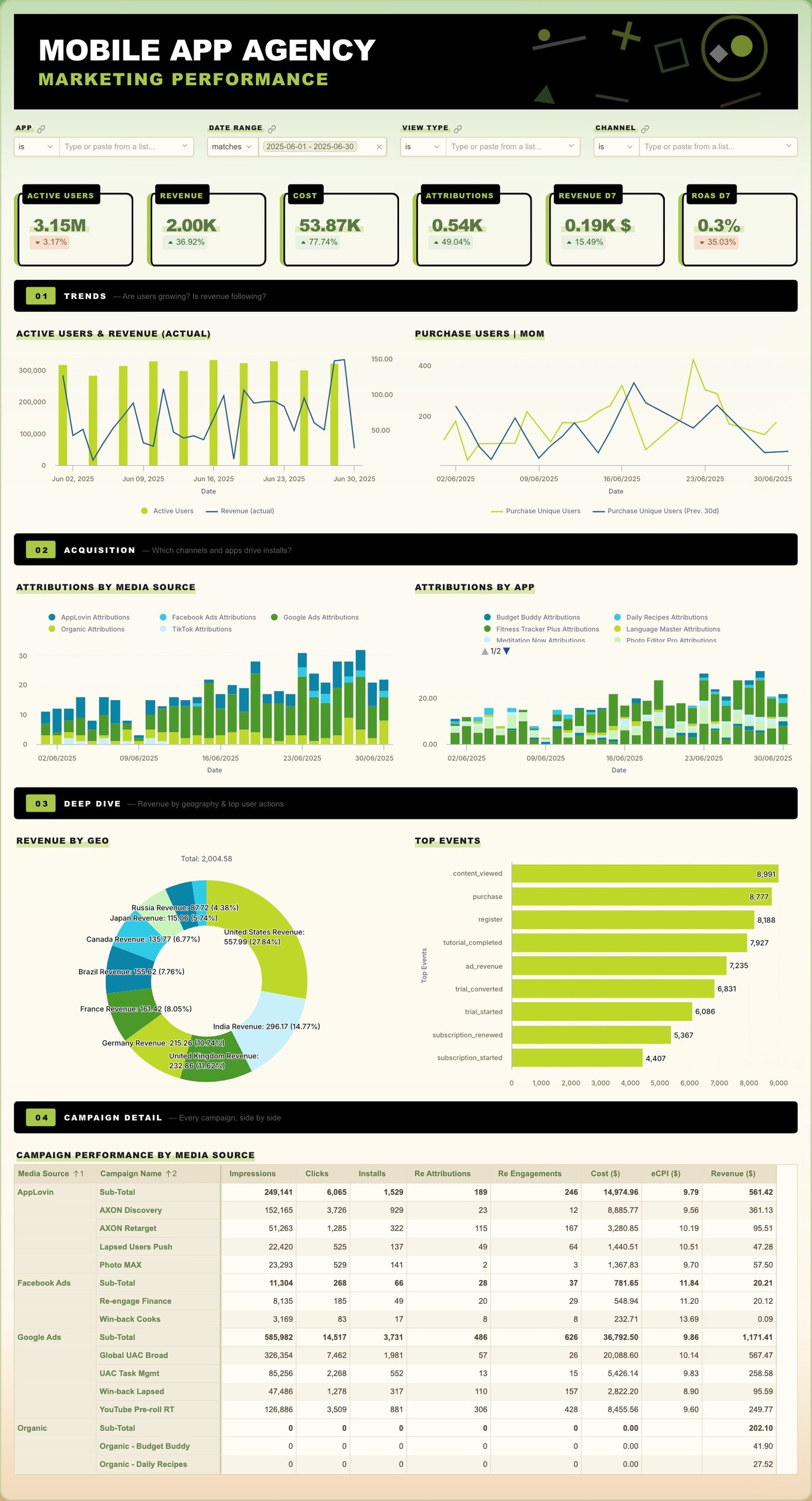
One long scrolling page instead of tabs, organised like an editorial spread. It shows how much a single canvas can carry when the typography does the work.
What makes it work
- Numbered section rules (01 Trends, 02 Acquisition, 03 Deep dive, 04 Campaign detail) give the scroll a spine.
- Black and lime, with the lime reserved for the numbers that matter.
- Section headers are set much larger than chart titles, so the hierarchy stays obvious when scrolling quickly.
- A useful pattern when your audience reads top to bottom rather than clicking between tabs.
The views
This dashboard is a single scrolling page, shown in full below.
See it live
Open the live dashboard to click through it yourself. No Holistics account needed.
Theme code
The theme this dashboard actually uses, written out as a reusable PageTheme. Paste it into a
.theme.aml file under Development > Library > Themes to reuse it across your own dashboards,
or inline it as a single dashboard's theme: property. Chart colour palettes are set
separately, so they are not included here.
mobile_app_marketing_theme.theme.aml
PageTheme mobile_app_marketing_theme {
  title: "Ghibli Meadow"
  background {
    bg_color: "#E5EADF"
    bg_image: "linear-gradient(180deg, #7AAD6A 0%, #BCCFAB 30%, #E5D0A0 65%, #D4A878 100%)"
  }
  canvas {
    border {
      border_color: "#C7D4A8"
      border_width {
        top: 2
        left: 2
        right: 2
        bottom: 2
      }
      border_radius {
        top_left: 16
        top_right: 16
        bottom_left: 16
        bottom_right: 16
      }
    }
    shadow: "sm"
    background {
      bg_color: "rgba(255, 252, 245, 0.88)"
    }
  }
  block {
    text {
      font_color: "#7A6B54"
      font_family: "Arial, sans-serif"
    }
    label {
      font_size: 15
      font_color: "#5B7744"
      font_family: "Arial Black, Impact, sans-serif"
      font_weight: "bold"
    }
    border {
      border_radius {
        top_left: 12
        top_right: 12
        bottom_left: 12
        bottom_right: 12
      }
    }
  }
  viz {
    table {
      header {
        bg_color: "#E8E0C8"
        font_color: "#5B7744"
        font_weight: "bold"
      }
      general {
        bg_color: "#FFFCF5"
        font_size: 13
        font_color: "#5B4A3A"
        font_family: "Arial, sans-serif"
        hover_color: "#F0EBDA"
        banding_color: "#F9F4E8"
        grid_color: "#E5DCC4"
        border_color: "#D4C9A8"
      }
      sub_title {
        font_size: 11
        font_color: "#9A8B70"
      }
      sub_header {
        bg_color: "#F0EBDA"
        font_color: "#6B8855"
      }
    }
  }
}
The theme is paired with custom CSS, which lives beside it rather than inside it. See Custom CSS for where it goes.
Custom CSS
/* ===== Frosted glass canvas ===== */
.h-canvas.dac-canvas {
  background: transparent !important;
  backdrop-filter: blur(40px) saturate(1.4) !important;
  -webkit-backdrop-filter: blur(40px) saturate(1.4) !important;
}
/* Re-apply the tinted overlay as a pseudo so blur shows through */
/* Gradient: transparent edges → opaque middle for readability */
.h-canvas.dac-canvas::before {
  content: '';
  position: absolute;
  inset: 0;
  background: linear-gradient(
    180deg,
    rgba(255, 252, 245, 0.55) 0%,
    rgba(255, 252, 245, 0.92) 12%,
    rgba(255, 252, 245, 0.95) 30%,
    rgba(255, 252, 245, 0.95) 70%,
    rgba(255, 252, 245, 0.92) 88%,
    rgba(255, 252, 245, 0.55) 100%
  );
  border-radius: 16px;
  z-index: 0;
  pointer-events: none;
}
/* Ensure canvas content stays above the overlay — but not system UI */
.h-canvas.dac-canvas > .h-canvas-item,
.h-canvas.dac-canvas > [class*="block"],
.h-canvas.dac-canvas > [class*="grid"] {
  position: relative;
  z-index: 1;
}

/* No custom font import needed — using system Arial/Impact */

/* Chart axis labels */
.highcharts-xaxis-labels span,
.highcharts-yaxis-labels span {
  color: #7A6B54 !important;
}
/* Chart colors — may conflict with Holistics built-in chart settings. Prefer Holistics UI for better control */
.highcharts-root {
  --chart-primary: #7AAC5D;
  --chart-secondary: #D4A574;
}

/* Column/Bar series — alternating primary/secondary with 3 tones */


/* KPI styles */
.h-kpi-metric-kpi {
  font-family: "Arial Black", Impact, sans-serif;
  color: #5B7744;
  font-weight: 900;
}

.h-kpi-metric-diff,
.h-kpi-metric-diff *,
.h-kpi-metric-diff .friendly-diff,
.h-kpi-metric-diff span {
  font-size: 14px !important;
}

.h-kpi-metric-diff .friendly-diff:not(.negative) {
  background: #E8F0E4;
  color: #3D6B2E;
  border-color: #C7D4A8;
}

.h-kpi-metric-diff .friendly-diff.negative {
  background: #F5E0D0;
  color: #A05A2C;
  border-color: #E0C4A8;
}

/* Control variables */
.h-theme-control-block {
  /* Select */
  --h-select-bg: #FFFCF5;
  --h-select-text: #5B4A3A;
  --h-select-border: #D4C9A8;
  --h-select-border-hover: #B8AA88;
  --h-select-border-focus: #7AAC5D;
  /* Input */
  --h-input-bg: #FFFCF5;
  --h-input-text-color: #5B4A3A;
  --h-input-border: #D4C9A8;
  --h-input-border-hover: #B8AA88;
  --h-input-border-focus: #7AAC5D;
  /* Badge */
  --h-badge-bg: #F0EBDA;
  --h-badge-text: #5B7744;
  --h-badge-border: #C7D4A8;
  --h-badge-hover-bg: #E8E0C8;
  /* Checkbox */
  --h-checkbox-checked-bg: #7AAC5D;
  --h-checkbox-checked-border: #5B7744;
}

/* Standalone controls + date filter form container */
.dac-ic-block .hui-select-trigger,
.dac-ic-block .h-input,
.h-theme-control-block .h-theme-dm-filter-container .dm-filter-form {
  border-radius: 14px;
}

/* PoP operator select — left edge rounded */
.dac-ic-block .pop-condition-select__operator-select {
  border-radius: 0;
  border-top-left-radius: 14px;
  border-bottom-left-radius: 14px;
}
/* PoP number input — no radius (middle element) */
.dac-ic-block .pop-condition-select__offset-input {
  border-radius: 0;
}
/* PoP period select — right edge rounded */
.dac-ic-block .pop-condition-select__period-select {
  border-radius: 0;
  border-top-right-radius: 14px;
  border-bottom-right-radius: 14px;
}

/* Date filter mark — synced with badge */
.h-highlightable-input mark {
  background-color: #F0EBDA;
  color: #5B7744;
  border: 1px solid #C7D4A8;
}

/* Pivot total row */
.ag-floating-bottom .ag-cell {
  background-color: #E8E0C8;
}
.ag-floating-bottom .ag-cell:not(.h-following-span) {
  color: #5B7744;
}

/* Metric sheet sparkline */
.h-chart-cell {
  --h-table-sparkline-color: #7AAC5D;
}

/* ===== Brutalist accent overlays ===== */

/* KPI card — overlay border with left accent stripe */
.h-kpi-metric {
  position: relative;
  border: none;
  border-radius: 12px;
  box-shadow: inset 0 0 0 3px #000;
  padding: 36px 16px 20px 20px;
  margin-top: 16px;
  height: calc(100% - 16px);
  box-sizing: border-box;
  border-left: 6px solid #A8C846 !important;
}

/* KPI label — black slab overlapping the border */
.h-kpi-metric-label {
  position: absolute;
  top: -14px;
  left: 8px;
  right: 8px;
  background: #000;
  color: #A8C846 !important;
  font-family: "Arial Black", Impact, sans-serif !important;
  font-size: 12px !important;
  font-weight: 900 !important;
  text-transform: uppercase;
  letter-spacing: 1px;
  padding: 4px 10px;
  border-radius: 4px;
  z-index: 1;
  white-space: nowrap;
  overflow: hidden;
  text-overflow: ellipsis;
  width: fit-content;
  max-width: calc(100% - 16px);
  transition: transform 0.3s ease-out, padding-left 0.3s ease-out;
}

/* KPI label — # prefix that slides in on hover */
.h-kpi-metric-label::before {
  content: '#';
  display: inline-block;
  width: 0;
  overflow: hidden;
  color: #fff;
  font-size: 20px !important;
  font-family: "Arial Black", Impact, sans-serif !important;
  font-weight: 900;
  letter-spacing: 0;
  vertical-align: -6px;
  white-space: nowrap;
  transform: rotate(-8deg);
  transition: width 0.3s ease-out;
  margin-right: -2px;
}

/* KPI label — scanline overlay */
.h-kpi-metric-label::after {
  content: '';
  position: absolute;
  top: 0; left: 0; right: 0; bottom: 0;
  background: repeating-linear-gradient(
    0deg, transparent, transparent 2px,
    rgba(255, 255, 255, 0.15) 2px, rgba(255, 255, 255, 0.15) 4px
  );
  background-size: 100% 4px;
  pointer-events: none;
  opacity: 0;
  transition: opacity 0.3s;
}
.h-kpi-metric:hover .h-kpi-metric-label::after {
  opacity: 1;
  animation: scanline-scroll 4s linear infinite;
}

/* KPI card hover — zoom label + show # */
.h-kpi-metric:hover .h-kpi-metric-label {
  transform: scale(1.06);
  transform-origin: left center;
}
.h-kpi-metric:hover .h-kpi-metric-label::before {
  width: 18px;
}

/* KPI number — brush highlight effect, bigger for wider cards */
.h-kpi-metric-kpi {
  font-size: 28px !important;
  background: linear-gradient(180deg, transparent 55%, rgba(168, 200, 70, 0.3) 55%, rgba(168, 200, 70, 0.3) 85%, transparent 85%);
  display: inline;
  padding: 0 6px;
}

/* ===== Chart/widget block titles — brush underline accent ===== */
.dac-viz-block-label {
  color: #1a1a1a !important;
  font-family: "Arial Black", Impact, sans-serif !important;
  font-size: 14px !important;
  font-weight: 900 !important;
  text-transform: uppercase;
  letter-spacing: 1px;
  padding: 2px 4px !important;
  position: relative;
  background: transparent !important;
  transition: transform 0.3s ease-out, text-shadow 0.3s ease-out;
}
/* Underline as pseudo — enables wipe animation */
.dac-viz-block-label::after {
  content: '';
  position: absolute;
  left: 4px; right: 4px;
  bottom: 0; height: 40%;
  background: rgba(168, 200, 70, 0.4);
  z-index: -1;
  transition: width 0.4s ease-out, background 0.3s ease-out;
}
/* # prefix — hidden by default */
.dac-viz-block-label::before {
  content: '#';
  display: inline-block;
  width: 0;
  overflow: hidden;
  color: #5B7744;
  font-size: 26px !important;
  font-family: "Arial Black", Impact, sans-serif !important;
  font-weight: 900;
  vertical-align: middle;
  white-space: nowrap;
  transform: rotate(-12deg);
  transition: width 0.3s ease-out;
  margin-right: 0px;
}
/* Hover on block — wipe underline + show # + lift + glow */
.dac-viz-block:hover .dac-viz-block-label {
  transform: translateY(-1px);
  text-shadow: 0 0 6px rgba(168, 200, 70, 0.3);
}
.dac-viz-block:hover .dac-viz-block-label::after {
  background: rgba(168, 200, 70, 0.6);
}
.dac-viz-block:hover .dac-viz-block-label::before {
  width: 22px;
}

/* ===== Section divider hover effects ===== */
.sec-bar {
  transition: box-shadow 0.3s ease-out;
  cursor: default;
  position: relative;
  overflow: hidden;
}
.sec-bar:hover {
  box-shadow: 0 0 14px rgba(168, 200, 70, 0.4), inset 0 0 20px rgba(168, 200, 70, 0.06);
}
/* CRT scanline overlay on section bar */
.sec-bar::after {
  content: '';
  position: absolute;
  top: 0; left: 0; right: 0; bottom: 0;
  background: repeating-linear-gradient(
    0deg, transparent, transparent 2px,
    rgba(0, 0, 0, 0.12) 2px, rgba(0, 0, 0, 0.12) 4px
  );
  background-size: 100% 4px;
  pointer-events: none;
  opacity: 0;
  z-index: 1;
  transition: opacity 0.3s;
}
.sec-bar:hover::after {
  opacity: 1;
  animation: scanline-scroll 4s linear infinite;
}
@keyframes scanline-scroll {
  0% { background-position: 0 0; }
  100% { background-position: 0 200px; }
}
/* Badge pop + rotate */
.sec-num {
  transition: transform 0.3s cubic-bezier(0.34, 1.56, 0.64, 1);
  display: inline-block;
  position: relative;
  margin-right: 4px;
}
.sec-bar:hover .sec-num {
  transform: scale(1.3) rotate(-8deg);
}
/* # on badge — opacity fade in on hover */
.sec-num::before {
  content: '#';
  font-size: 16px !important;
  font-family: "Arial Black", Impact, sans-serif !important;
  font-weight: 900;
  color: #2D4A1E;
  opacity: 0;
  display: inline;
  margin-right: -8px;
  transition: opacity 0.3s ease-out, margin-right 0.3s ease-out;
}
.sec-bar:hover .sec-num::before {
  opacity: 1;
  margin-right: 1px;
}
/* Title — glitch scramble on hover */
@keyframes sec-glitch {
  0% { opacity: 1; transform: translate(0,0) skewX(0deg); }
  5% { opacity: 0.8; transform: translate(2px,-1px) skewX(-3deg); }
  10% { opacity: 1; transform: translate(-1px,1px) skewX(2deg); }
  15% { opacity: 0.9; transform: translate(1px,0px) skewX(-1deg); }
  20% { opacity: 1; transform: translate(0,0) skewX(0deg); }
  100% { opacity: 1; transform: translate(0,0) skewX(0deg); }
}
.sec-title {
  display: inline-block;
  transition: text-shadow 0.3s ease-out;
}
.sec-bar:hover .sec-title {
  text-shadow: 0 0 8px rgba(168, 200, 70, 0.6);
  animation: sec-glitch 2s steps(1) infinite;
}
/* Subtitle slide in */
.sec-sub {
  transition: opacity 0.3s ease-out, transform 0.3s ease-out;
  opacity: 0.6;
}
.sec-bar:hover .sec-sub {
  opacity: 1;
  transform: translateX(4px);
}

/* ===== Filter blocks ===== */
.dac-ic-block {
  background: transparent !important;
  border: none !important;
}

/* Filter labels — brush underline same as chart titles */
.dac-ic-block-label {
  background: transparent !important;
  color: #1a1a1a !important;
  font-family: "Arial Black", Impact, sans-serif !important;
  font-size: 11px !important;
  font-weight: 900 !important;
  text-transform: uppercase;
  letter-spacing: 1px;
  padding: 1px 3px !important;
  border: none !important;
  margin-bottom: 6px !important;
  background-image: linear-gradient(180deg, transparent 60%, rgba(168, 200, 70, 0.4) 60%) !important;
}

/* Hide the link/chain icon next to filter labels */
.dac-ic-block .h-icon-link,
.dac-ic-block .dac-block-label-container .h-icon,
.dac-ic-block .dac-block-label-container svg {
  display: none !important;
}

/* Filter inputs — neutral, no green */
.dac-ic-block .hui-select-trigger,
.dac-ic-block .h-input {
  background: #FFFCF5 !important;
  border: 1px solid #D4C9A8 !important;
  border-radius: 4px !important;
  color: #5B4A3A !important;
  font-family: "Arial", sans-serif !important;
  font-size: 13px !important;
}
.dac-ic-block .hui-select-trigger:hover,
.dac-ic-block .h-input:hover {
  border-color: #B8AA88 !important;
}
.dac-ic-block .hui-select-trigger:focus-within,
.dac-ic-block .h-input:focus {
  border-color: #7A6B54 !important;
}

/* Date filter form */
.dac-ic-block .dm-filter-form {
  border-radius: 4px !important;
}