UEFA Champions League
Sports & gaming · Dark · Tabbed
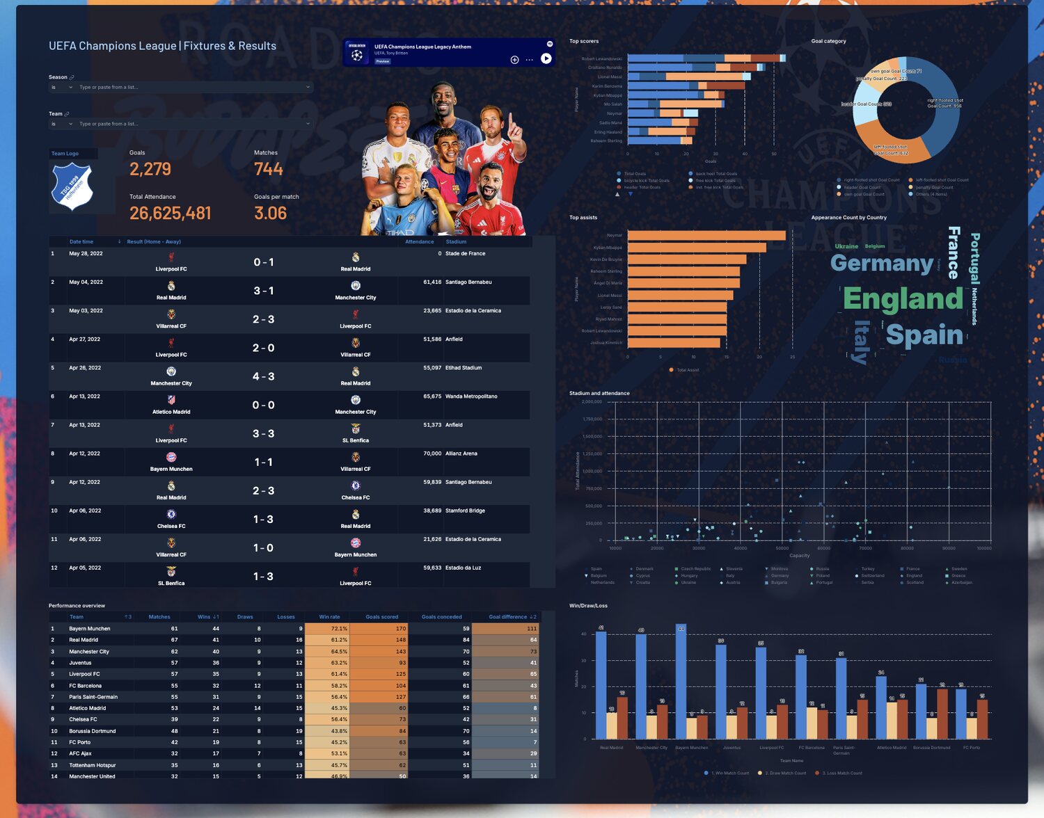
Proof of how much presence one well-built header block can give a page. The hero does the heavy lifting and everything below it stays simple.
What makes it work
- Player cutouts on a dark ground with an embedded anthem card, all inside a single block at the top.
- Below the hero the page keeps to tables and two charts, so the styling never competes with the data.
- A word cloud and an attendance scatter add variety at very little build cost.
- If you only have time to style one thing, style the header.
The views
Each tab is shown below at full width.
Overview
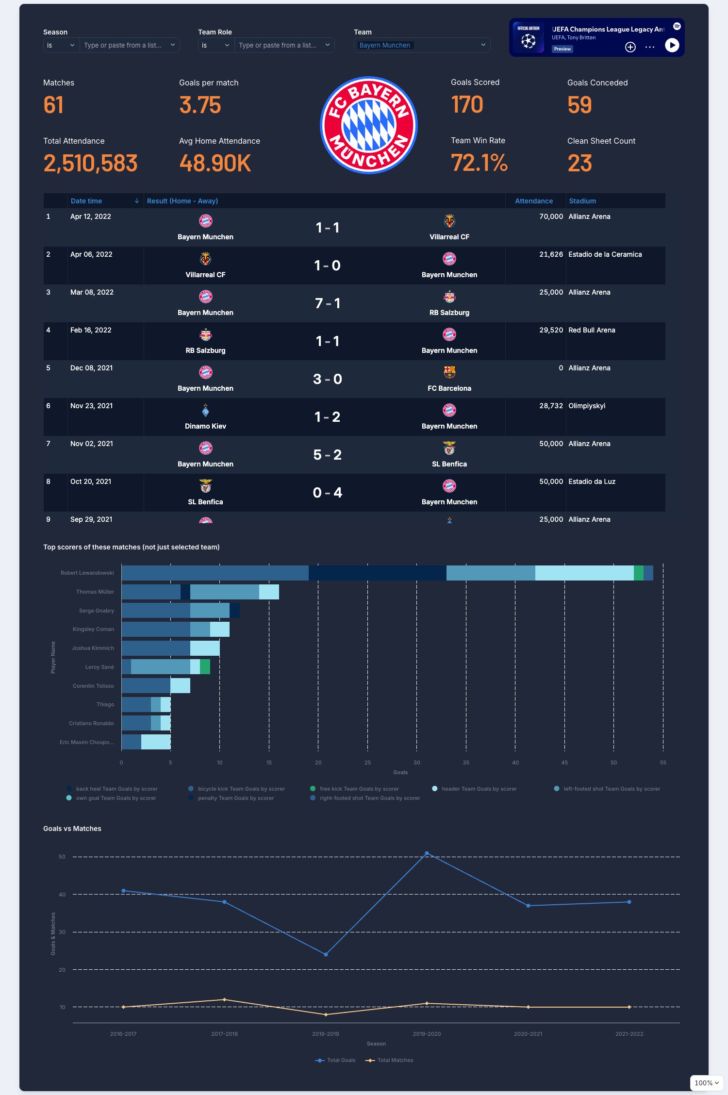
Team Analysis
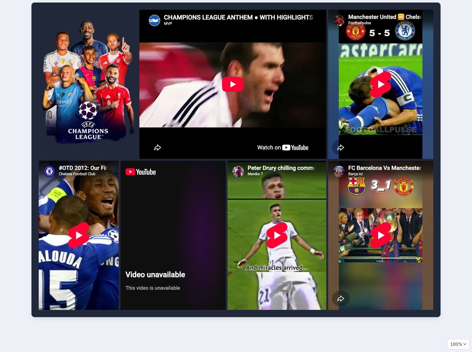
Moments
See it live
Open the live dashboard to click through it yourself. No Holistics account needed.
Theme code
The theme this dashboard actually uses, written out as a reusable PageTheme. Paste it into a
.theme.aml file under Development > Library > Themes to reuse it across your own dashboards,
or inline it as a single dashboard's theme: property. Chart colour palettes are set
separately, so they are not included here.
uefa_champions_league_theme.theme.aml
PageTheme uefa_champions_league_theme {
  title: "Electric Blue"
  background {
    bg_size: "cover"
    bg_image: "url('https://prod-media.beinsports.com/image/1769771826111_9777f484-500d-4625-80e3-4e037f6fb41a.png?ver=03-06-2025')"
  }
  canvas {
    border {
      border_color: "#1e293b"
      border_style: "none"
      border_radius {
        top_left: 10
        top_right: 10
        bottom_left: 10
        bottom_right: 10
      }
    }
    shadow: "md"
    background {
      bg_color: "rgba(15, 23, 42, 0.92)"
    }
  }
  block {
    text {
      font_color: "#94a3b8"
    }
    label {
      font_size: 14
      font_color: "#ffffff"
      font_weight: "semibold"
    }
    padding {
      top: 8
      left: 8
      right: 8
      bottom: 8
    }
  }
  viz {
    table {
      header {
        bg_color: "#0f172a"
        font_size: 14
        font_color: "#378fda"
        font_weight: "semibold"
      }
      general {
        bg_color: "#1e293b"
        font_size: 14
        font_color: "#ffffff"
        hover_color: "#1e293b"
        banding_color: "#0f172a"
        grid_color: "#1e293b"
        border_color: "#1e293b"
      }
      sub_title {
        font_size: 12
        font_color: "#94a3b8"
      }
      sub_header {
        bg_color: "#0f172a"
        font_size: 12
        font_color: "#ffffff"
      }
    }
  }
}
The theme is paired with custom CSS, which lives beside it rather than inside it. See Custom CSS for where it goes.
Custom CSS
@import url('https://fonts.googleapis.com/css2?family=Barlow:ital,wght@0,100;0,200;0,300;0,400;0,500;0,600;0,700;0,800;0,900;1,100;1,200;1,300;1,400;1,500;1,600;1,700;1,800;1,900&family=Inter:ital,opsz,wght@0,14..32,100..900;1,14..32,100..900&display=swap');

h1, p {
  font-family: "Barlow", sans-serif; !important;
}

/* KPI styles */
.h-kpi-metric-kpi {
  font-family: "Barlow", sans-serif;
  font-size: 50px;
  color: #F7863D;
}

.h-kpi-metric-label {
  font-size: 16px;
  color: #ffffff;
}

.h-kpi-metric-diff .friendly-diff:not(.negative) {
  background: #0f766e;
  color: #ccfbf1;
  border-color: #1e293b;
}

.h-kpi-metric-diff .friendly-diff.negative {
  background: #991b1b;
  color: #fee2e2;
  border-color: #1e293b;
}

/* Control variables */
.h-theme-control-block {
  /* Select */
  --h-select-bg: #1e293b;
  --h-select-text: #ffffff;
  --h-select-placeholder: rgba(255, 255, 255, 0.6);
  --h-select-border: #334155;
  --h-select-border-hover: #94a3b8;
  --h-select-border-focus: #378fda;
  --h-select-trigger-icon: rgba(255, 255, 255, 0.7);
  /* Input */
  --h-input-bg: #1e293b;
  --h-input-disabled-bg: #0f172a;
  --h-input-text-color: #ffffff;
  --h-input-placeholder-color: rgba(255, 255, 255, 0.6);
  --h-input-border: #334155;
  --h-input-border-hover: #94a3b8;
  --h-input-border-focus: #378fda;
  --h-input-selection-bg: rgba(91, 194, 231, 0.2);
  --h-input-trigger-icon: rgba(255, 255, 255, 0.7);
  /* Badge */
  --h-badge-bg: #0f172a;
  --h-badge-text: #378fda;
  --h-badge-border: #1e293b;
  --h-badge-hover-bg: #1e293b;
  /* Checkbox */
  --h-checkbox-bg: #1e293b;
  --h-checkbox-hover-bg: #1e293b;
  --h-checkbox-border: #334155;
  --h-checkbox-checked-bg: #378fda;
  --h-checkbox-checked-border: #378fda;
  --h-checkbox-checkmark: #ffffff;
  --h-checkbox-focus-ring: rgba(91, 194, 231, 0.2);
}


/* Checkbox text */
.h-checkbox {
  color: #ffffff;
}

/* Standalone controls + date filter form container */
.dac-ic-block .hui-select-trigger,
.dac-ic-block .h-input,
.h-theme-control-block .h-theme-dm-filter-container .dm-filter-form {
  border-radius: 10px;
}

/* PoP operator select — left edge rounded */
.dac-ic-block .pop-condition-select__operator-select {
  border-radius: 0;
  border-top-left-radius: 10px;
  border-bottom-left-radius: 10px;
}
/* PoP number input — no radius (middle element) */
.dac-ic-block .pop-condition-select__offset-input {
  border-radius: 0;
}
/* PoP period select — right edge rounded */
.dac-ic-block .pop-condition-select__period-select {
  border-radius: 0;
  border-top-right-radius: 10px;
  border-bottom-right-radius: 10px;
}

/* Date filter mark — synced with badge */
.h-highlightable-input mark {
  background-color: #0f172a;
  color: #378fda;
  border: 1px solid #1e293b;
}

/* Pivot total row */
.ag-floating-bottom .ag-cell {
  background-color: #0f172a;
}
.ag-floating-bottom .ag-cell:not(.h-following-span) {
  color: #378fda;
}

/* Metric sheet sparkline */
.h-chart-cell {
  --h-table-sparkline-color: #378fda;
}