Dashboard Customization & Styling
Introduction
To provide a seamless user experience, your embedded analytics should be a native part of your application. Holistics provides several levels of customization to ensure your dashboards align with your design system and user experience:
- Brand styling: Align colors, fonts, spacing, and borders with your host application using Themes and Custom CSS.
- Visualization styling: Fine-tune how individual charts, tables, and KPIs look to highlight what matters most to your users.
- Custom visualizations: Build domain-specific visuals like Gantt charts and Sankey diagrams using Custom Charts and Dynamic Content Blocks.
- Add-on customizations: Fine-tune how dashboards behave across devices with mobile responsiveness and tab layout.
Brand styling (Themes & Custom CSS)
Use Themes and Custom CSS to align your dashboards with your application’s design system. You can adjust key visual elements such as:
- Typography: Adjust font families, import brand fonts, and customize data label sizes.
- Colors: Modify backgrounds, borders, and visualization color palettes.
- Layout: Add custom images, shadows, and padding to blocks.
- Tables: Fine-tune font sizes and borders for table visualizations.
How to use:
- Create a Local Theme to customize your dashboard's look and feel to match your brand.
- (Optional) Add Custom CSS on top of any theme to fine-tune specific elements.
- Embed your dashboard. Themes are automatically applied.
Want consistent branding across multiple dashboards? Create a Custom Theme and reuse it everywhere.
Visualization styling
Beyond dashboard-level theming, you can style individual charts and tables to highlight what matters most to your users. Holistics provides visualization styling options for:
-
Charts: Customize colors, axes, legends, data labels, and series grouping.

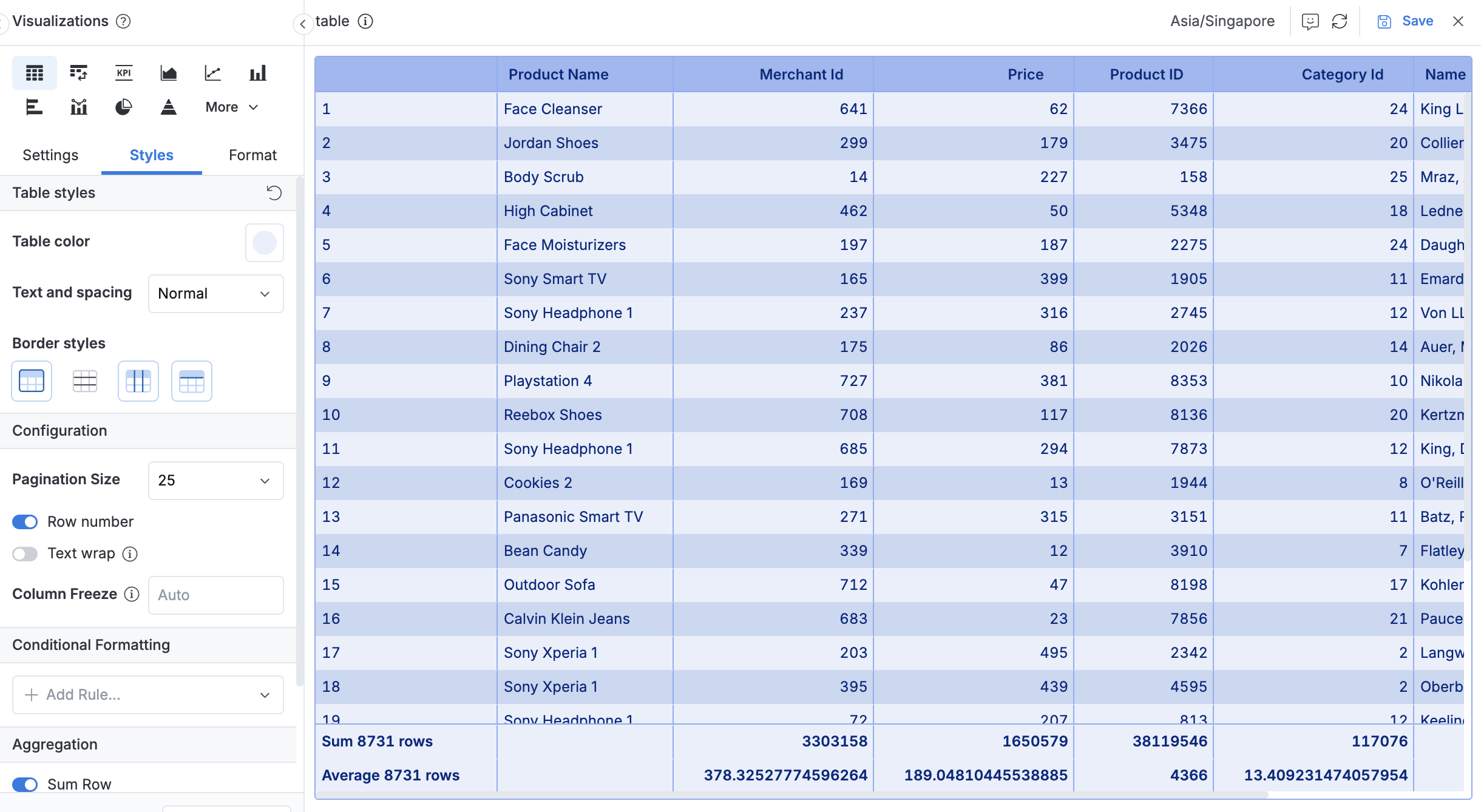
-
Tables: Apply color themes, adjust text spacing, configure borders, and add conditional formatting.
-
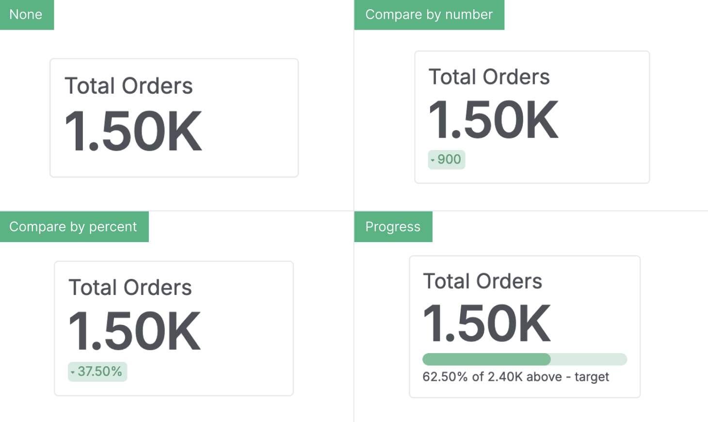
KPI metrics: Control label sizes, colors, and comparison display modes.
All visualization styling you configure is automatically reflected in your embedded dashboards.
View full customization and formatting features in our Visualizations documentation.
Build custom visualizations
When standard charts don't fit your specific industry needs, you can create specialized visuals that feel native to your product.
Custom charts
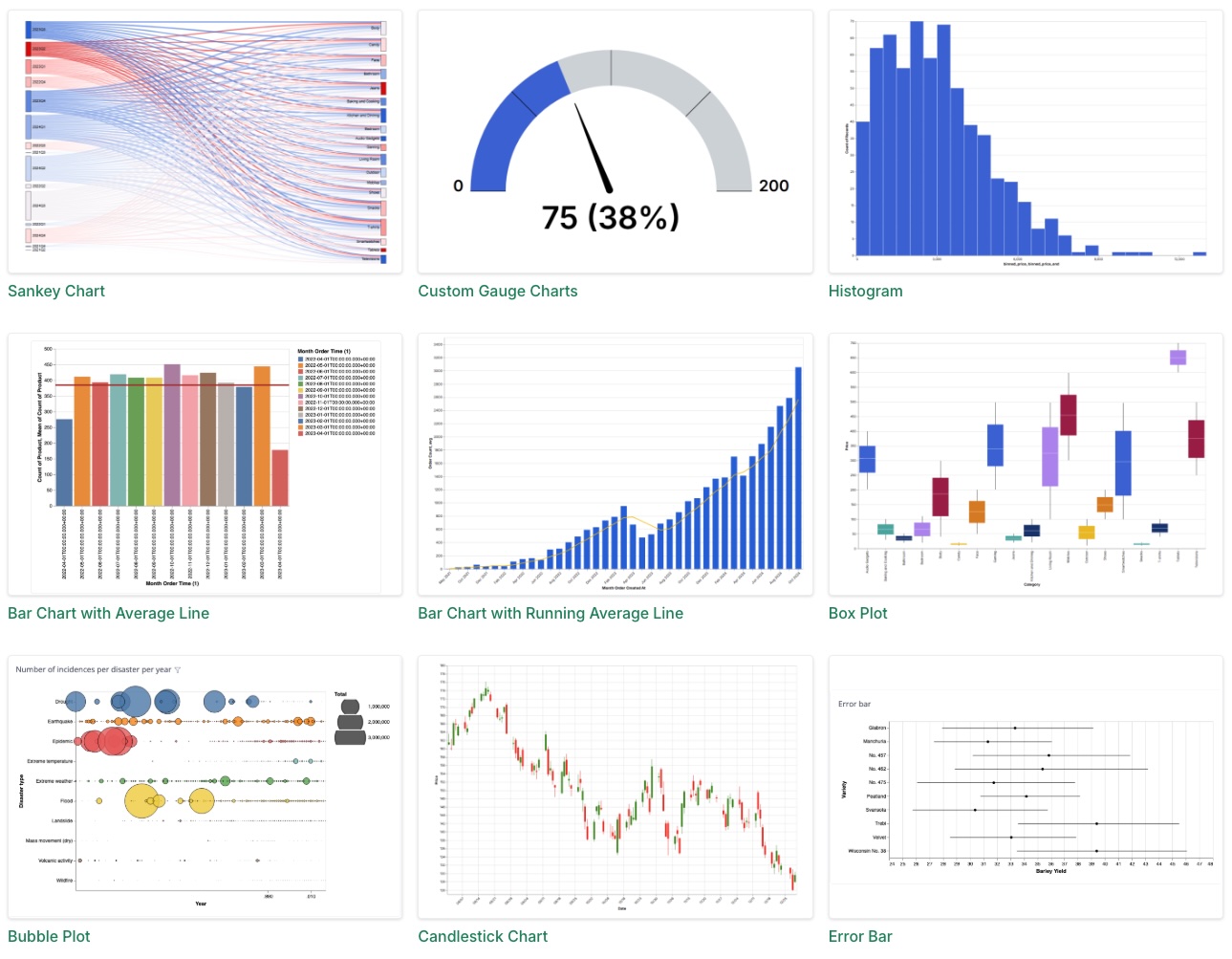
Standard charts don't always fit your product's needs. Custom Charts let you build domain-specific visualizations using the Vega-Lite framework, such as Gantt charts for project management, Sankey diagrams for marketing, or Sunbursts for file storage.
How to use:
- Create a Custom Chart using the Vega-Lite editor.
- Add it to your dashboard as a visualization block.
- Embed your dashboard, and your custom charts will render automatically.
Check out more examples in the Chart Library.
Dynamic content blocks
Dynamic Content Blocks let you build product-native UI elements inside your embedded dashboards, such as branded KPI cards, custom headers, or interactive controls styled to match your app. Since they support HTML, CSS, and Markdown with live data from your models, you can replicate your host application's component patterns directly within the dashboard.
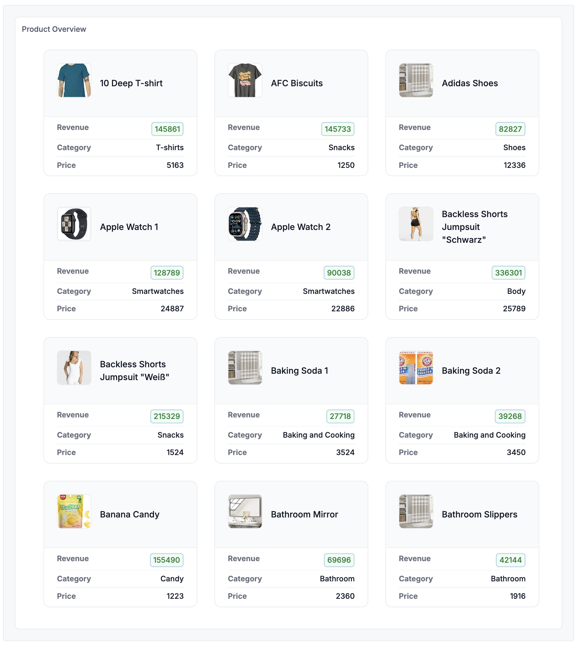
Example: A responsive product card grid, ideal for e-commerce dashboards, product catalogs, and inventory displays.
How to use:
- Create a Dynamic Content Block with HTML, CSS, and Markdown.
- Add it to your dashboard and embed. Your custom UI elements will appear seamlessly.
Check out more examples in the Gallery.
Add-on customizations
Beyond the core styling tools, you can fine-tune how your embedded dashboards behave and present data to your users.
Mobile responsiveness
If your users access your app on mobile, your embedded dashboards adapt automatically with Mobile Responsiveness. Choose between an intelligent Auto-stack or a precision Manual layout to control how content reflows on mobile devices.

How to use:
- Configure mobile layout for your dashboard (Auto-stack or Manual).
- Embed your dashboard. The responsive layout applies automatically on mobile devices.
Tab layout
Organize complex embedded views into multiple Tabs, so your users can navigate between different data perspectives within a single dashboard.
How to use:
- Add tabs to your dashboard and organize blocks across them.
- Embed your dashboard. Tabs are automatically applied in the embedded dashboard.