
19 posts tagged with "enhancement"

View All Tags

๐Ÿ—„๏ธ Reusable Library in Reporting

Demonstration of browsing and inserting a shared component from the Reusable Library in Reporting.

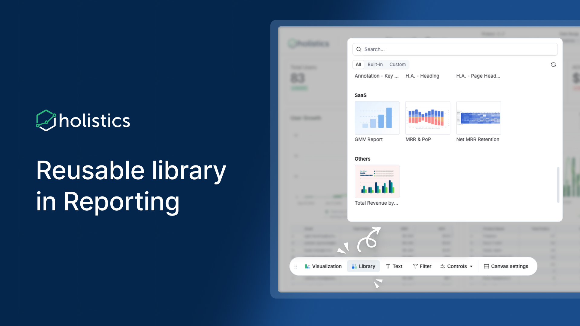
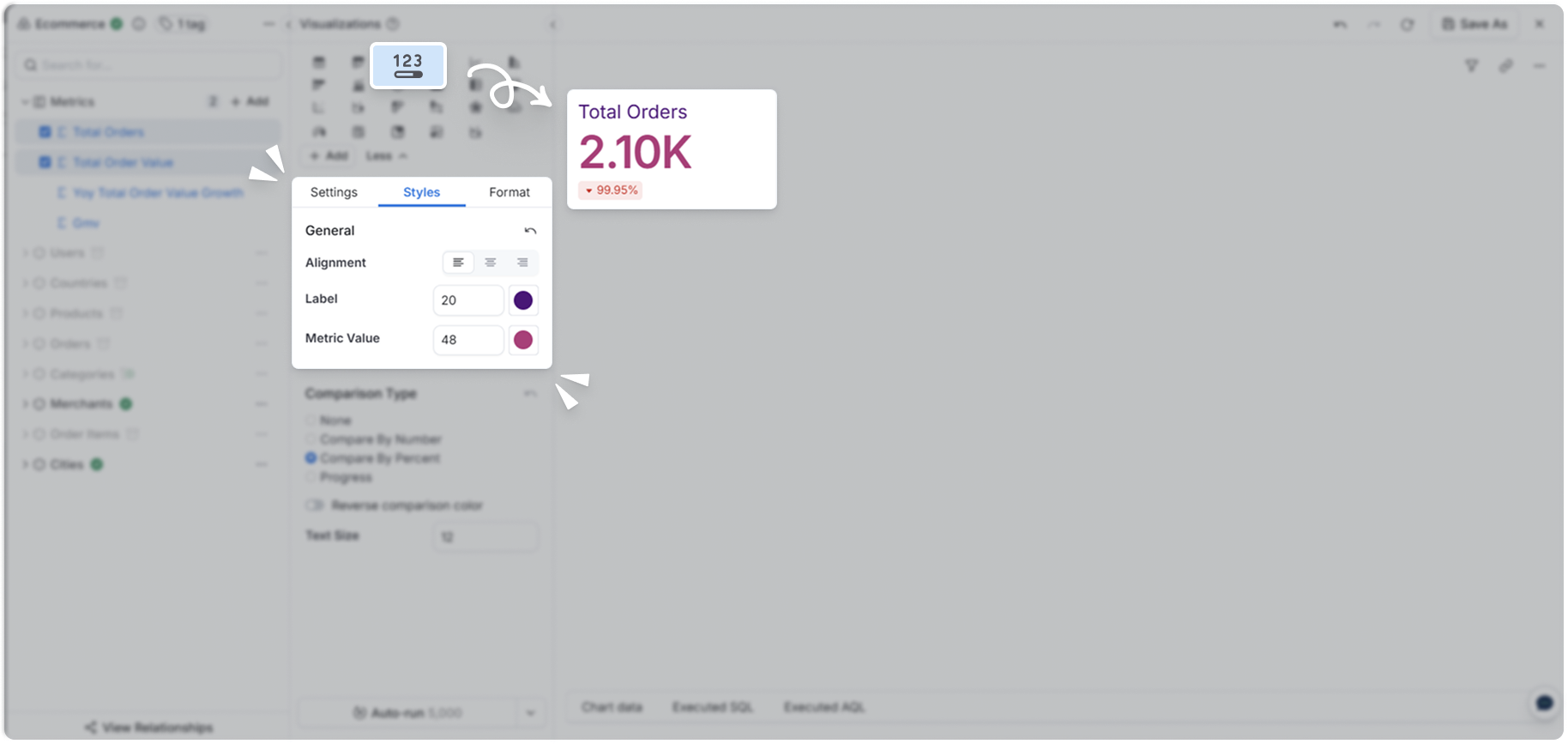
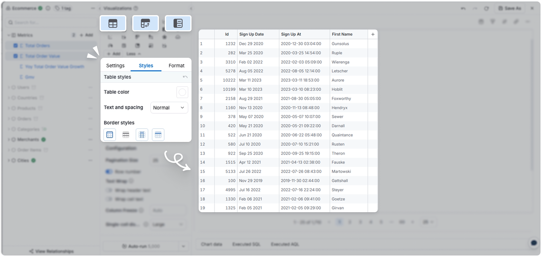
Reusable Library is coming to Reporting โ€” browse and insert shared components directly in the dashboard editor, no need to switch to Development.

Previously, using library blocks required switching to Development, which added friction and completely blocked explorers. With this update, you can insert existing library components right where you work. Blocks built by one team member are instantly available to everyone.

Learn more: Reusable Components

Timelineโ€‹

Expected by end of March 2026.

๐Ÿ›ก๏ธ Prevent invalid metric breakdowns in multi-fact schemas

In complex data models, users can create metric breakdowns that are technically valid but analytically wrong.

These queries run successfully and return plausible numbers, but the results are meaningless. This silent failure undermines trust and hurts self-service.

Now you can control which dimensions can be used with each metric using the filter_direction property on relationships.

Why this mattersโ€‹

  • Prevents silent data correctness issues before they reach end users
  • Turns semantic correctness into a default behavior, not a best practice
  • Keeps self-service powerful and safe, even in multi-fact (galaxy) schemas
  • Reduces the need for manual user education or tribal knowledge

๐Ÿ“š Learn moreโ€‹

๐ŸŽจ KPI metric styling in dashboard theme

Previously, KPI styling had to be set widget by widget and had limited styling options.

๐ŸŒŸ What's newโ€‹

We're bringing KPI metric styling to the dashboard theme and supporting much richer styling options.

โœจ Explore is getting a glow-up

The Explore interface has a new look and feel as part of our ongoing glow-up.

New chart selector - The chart picker now surfaces the most common chart types with a clearer icon set that makes it easier to distinguish between chart types at a glance. Less common charts are tucked behind a "more" option to keep the interface clean.

Configure button - The viz settings panel now opens and closes via a Configure button in the toolbar area.

Toolbar - The toolbar is where you can perform most Explore actions: ask AI, break down your data, drill by time, and more - all without opening the viz panel.

Run button in the toolbar - The Run button has a new home in the top-right toolbar alongside Analyze and Ask AI. This is the first step toward a workflow where you can control charts entirely from the field list and toolbar, without needing to open the viz panel.

Learn more: Explore is getting a glow-up

โœ… Select all fields in a model

Select all fields in a model is now available in the field picker in Holistics.

Previously, selecting every field in a model meant checking each one individually โ€” tedious for large models and a common friction point when exploring a dataset for the first time. Now you can select or deselect all fields in a model with a single click.

A checkbox appears next to each model name in the field picker. Clicking it selects all fields in that model. Click again to deselect.

The same behavior extends to folders and sub-folders, so you can bulk-select all fields within those groups at once.

The checkbox is available for Table visualization only.

๐Ÿค– AI that Asks Back

AI that Asks Back makes the Ask AI experience more interactive and conversational.

Instead of ending after a single response, Ask AI can now guide the conversation forward by suggesting relevant next prompts and asking clarifying questions when needed. This makes it easier to refine your query, explore follow-up questions, and get better answers faster.

What's new:

  • Suggested next prompts help you continue the conversation with one click.
  • Clarifying questions help Ask AI better understand your intent before answering.
  • A smoother workflow means less typing and less copy-pasting.

๐Ÿ”— Connect GitHub at the org level with the Holistics GitHub App

GitHub App integration is now available in Holistics. You can connect external Git repositories at the organization level through a single OAuth install, replacing the per-person Deploy Key (SSH) and Personal Access Token (HTTPS) setup.

What's new:

  • One-click connect: install the Holistics GitHub App on your GitHub org, pick the repos you want, and both git sync and PR Workflow are enabled in one step. No SSH keys to upload, no PATs to copy.
  • Org-level auth: the connection belongs to your GitHub organization, not to any one person's account. Team changes won't break the integration.
  • HTTPS only, no SSH required: works for orgs that prohibit org-wide SSH.
  • Centralized control: permissions, repo access, and revocation are managed from your GitHub org settings, with a full audit log.

Deploy Key and Personal Access Token remain available as fallbacks for non-GitHub providers and for orgs that prefer them.

Learn moreโ€‹

๐Ÿ”ข Auto-abbreviate numbers (K/M/B)

Auto-abbreviation is available for Number (Normal and Currency) fields. Holistics helps you pick the right unit (K, M, or B) based on the value's magnitude - no more 0.00M or 1,000K.

What's newโ€‹

A new Auto option is in the abbreviation picker alongside None / K / M / B. After configured, the system picks the abbreviated unit based on each value's magnitude:

  • Under 1,000: shown as-is (e.g., 800)
  • 1K - 999K: abbreviated as K (e.g., 250K)
  • 1M - 999M: abbreviated as M (e.g., 12M)
  • 1B+: abbreviated as B (e.g., 1.2B)

Learn moreโ€‹

๐Ÿ“ค Export Widget Now Reflects Ad-hoc Interactions

Export captures ad-hoc filters, drill-downs, and breakdown changes

Widget exports now reflect ad-hoc interactions you've applied on screen - so what you export is exactly what you see.

Previously, exporting a chart after applying ad-hoc changes would revert to the original unmodified data. To get an accurate export, users had to switch to Explore mode and manually reapply every interaction. Now the export captures the current on-screen state directly - no workaround needed.

This applies to all supported ad-hoc interactions on the widget:

  • Block-level filters
  • Date Drill
  • Breakdown dimension changes

Both data exports (CSV/Excel) and image exports (PNG/JPEG/SVG/PDF) are covered. No UI changes - same export action, correct output.

๐Ÿ“Š Chart styling in Reporting

KPI metric styling in Reporting Table styling in Reporting

Chart styling is now available in Reporting โ€” configure styles for KPI Metric, Data Table, Pivot Table, and Metric Sheet directly from Dataset Explore and the Report creation flow, no need to switch to Development.

Previously, chart styling was only accessible in Development or the canvas dashboard editor. This added friction and blocked explorers entirely. Now you can do it right in Reporting.

Learn more: KPI Metric ยท Data Table ยท Pivot Table ยท Metric Sheet