Column Chart
Column Chart is one of the most common visualizations. It presents your data in rectangular vertical bars with height proportional to the values of a measure.
When to use Column Chart?
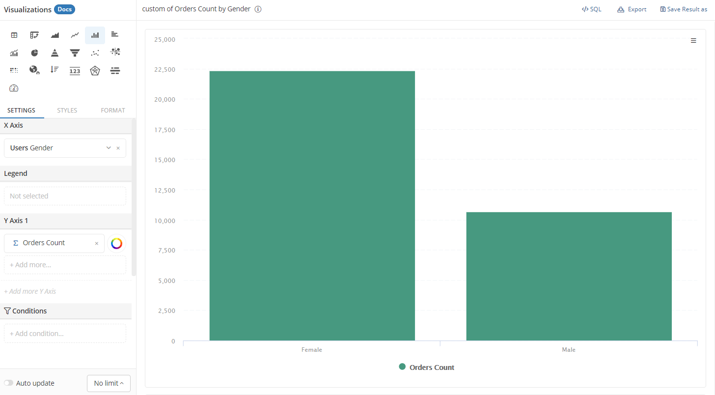
Column Chart is often used when we need to compare values between discrete categories. For example, the number of orders placed by Male and Female customers, or revenue generated by different geographies...
You can also use clustered columns to compare multiple measures at the same time.
Create a Column Chart
At Visualizations, select Column Chart. Under the Settings tab, drag in the necessary dimensions and measures:
- X-axis: Place the field containing the categories you want to compare here.
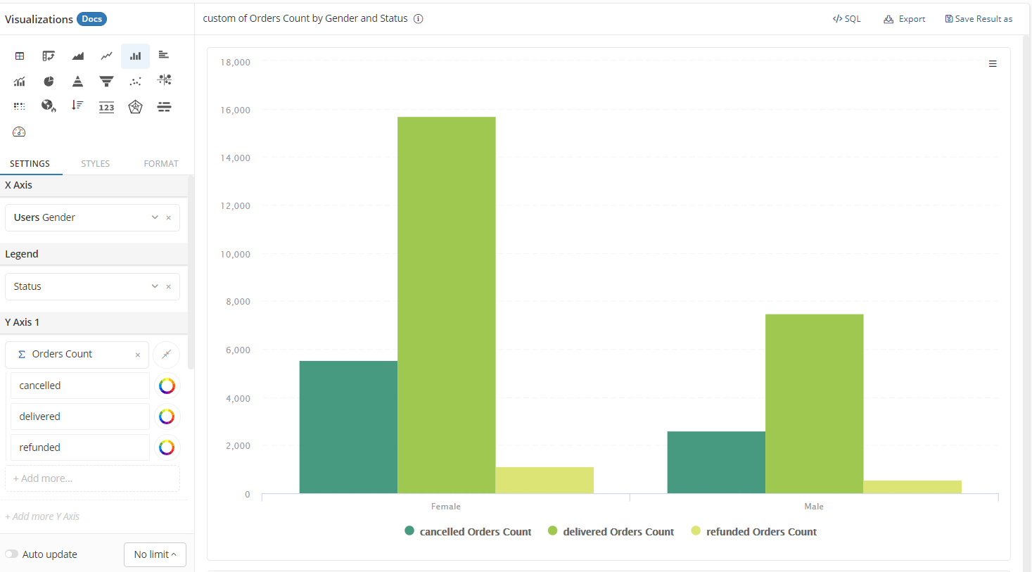
- Legend: Place the field containing the sub-categories that further break down your measures
- Y-axis: The measure that you want to compare should go here.
Clustered Column Charts
Use Legend to break down a measure
When adding a categorical field into the Legend area, each column will be split into multiple columns corresponding to the categories. Each column still represents the same measure.
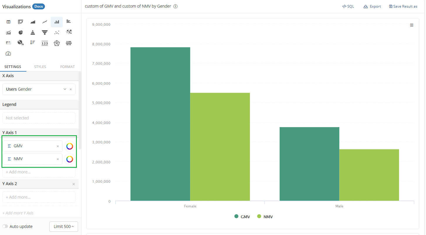
Include multiple measures
If you want to include different measures of the same scale (for example Gross Merchandise Value & Net Merchandise Value), you can put them on the same Y-axis:
The Dos and Don'ts
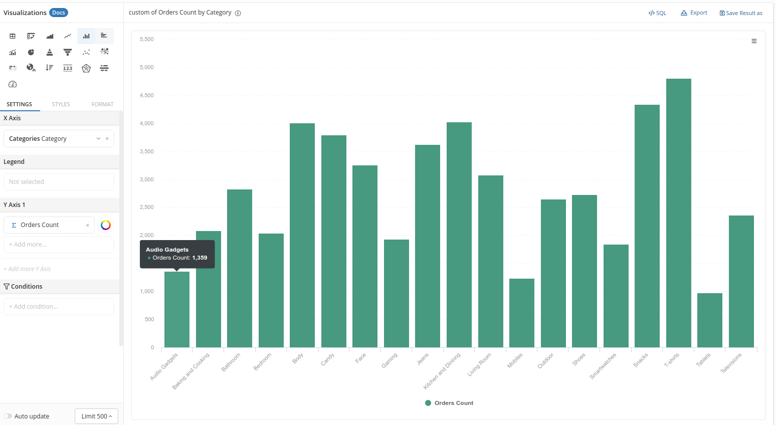
Use (Horizontal) Bar Chart if you have too many categories
While the Column Chart is great to compare a few categories, it is not easy to use when there are more. Your users can be distracted when there are too many unordered vertical columns. Column labels are also tilted and hard to read because there is not enough space:
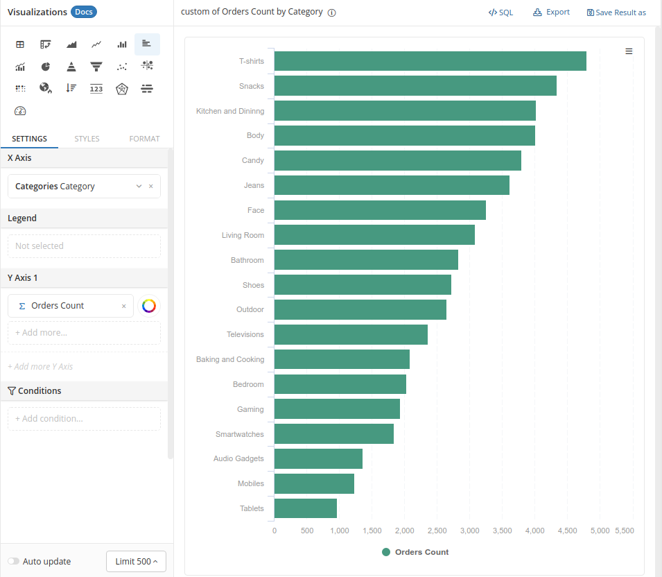
In this case, it makes sense to use the horizontal Bar Chart, and sort the bars in descending order:
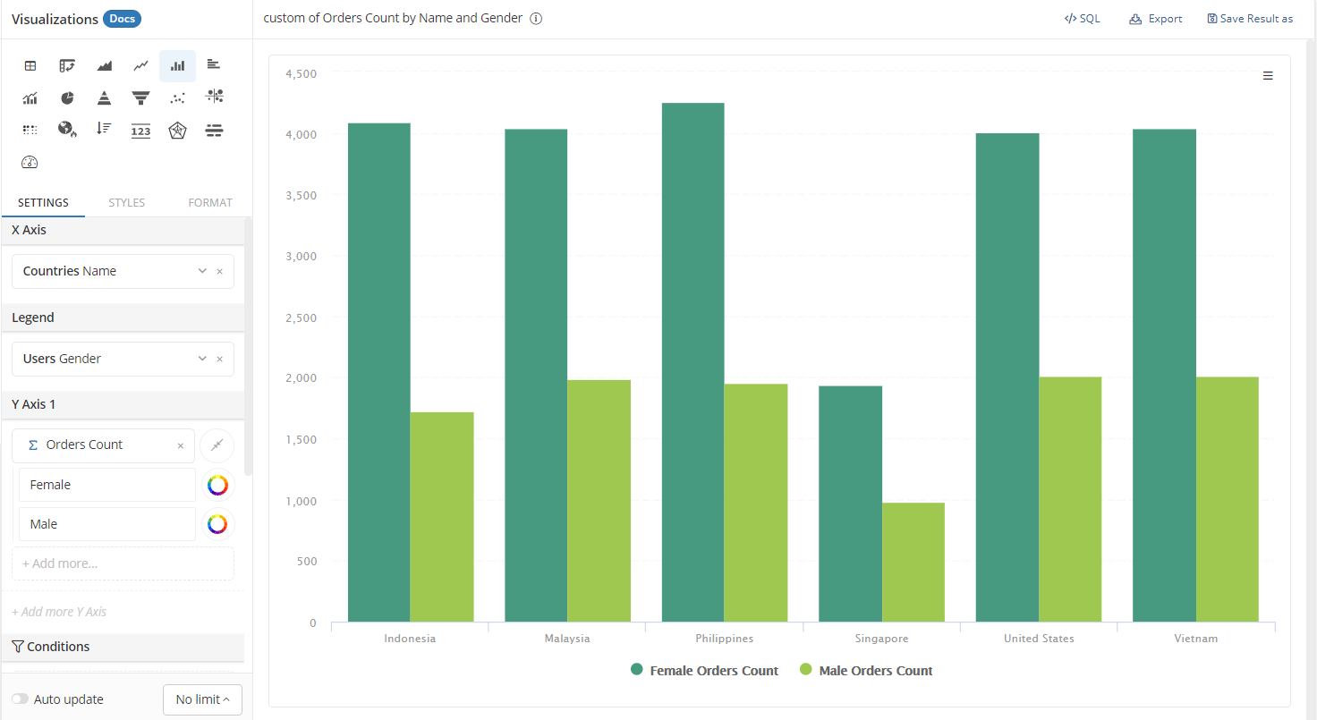
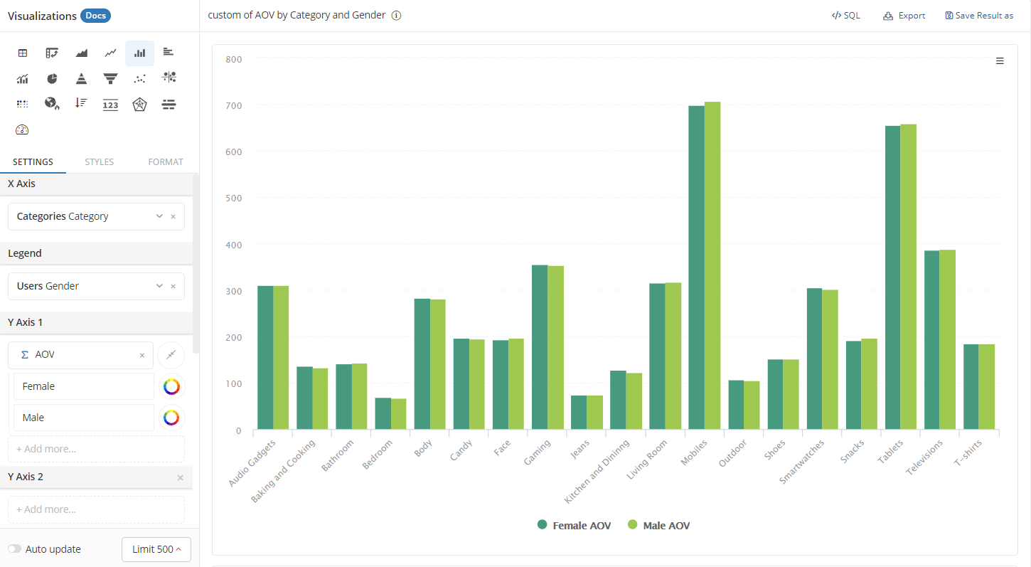
Use low-cardinality dimension in Legend
Too many columns in a cluster will cause distraction and make it hard for chart readers to compare values across dimensions.
For example, you want to compare the average value of orders placed by males and females across different categories:
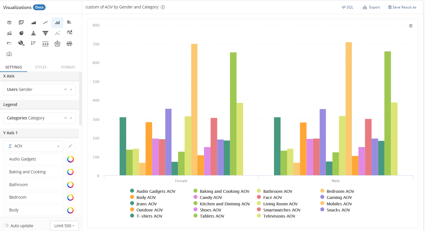
It makes more sense to put the Gender in Legend field instead of Category:
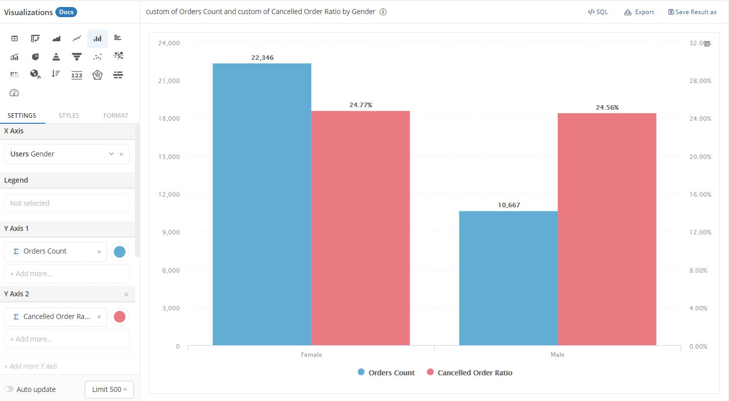
Measures in the same cluster should be of the same scale
It may be tempting to put measures of different scales on the same chart to convey as much information as possible. However, we recommend against this practice because it may confuse your users.
For example, here we put the Orders Count and Cancelled Order Ratio together on the same chart. It is confusing to look at a column of raw counts and a column of percentages next to each other.
Styling options
With Column Chart, you have standard styling options for X-axis, Legend, and Y-axis.
- X-axis - Title: set the title of your X-axis
- Legend:
- Display label: choose to show or hide the legend
- Alignment: choose the position you want to display your legend
- Y-axis:
- Title: Set the title of your Y-axis
- Align: Choose the position you want to display your Y-axis (left or right of the chart). This is particularly useful when you have multiple Y-axes.
- Scale: choose Linear to position your data points normally, or choose Logarithmic to position your data points at log(x). This is a useful display option when your data has a large difference between min and max values.
- Min, Max: By default, this will choose the min and max value of your data, but here you can specify the minimum and maximum limit of your Y-axis
- Show data label: show the raw number of data points in your series
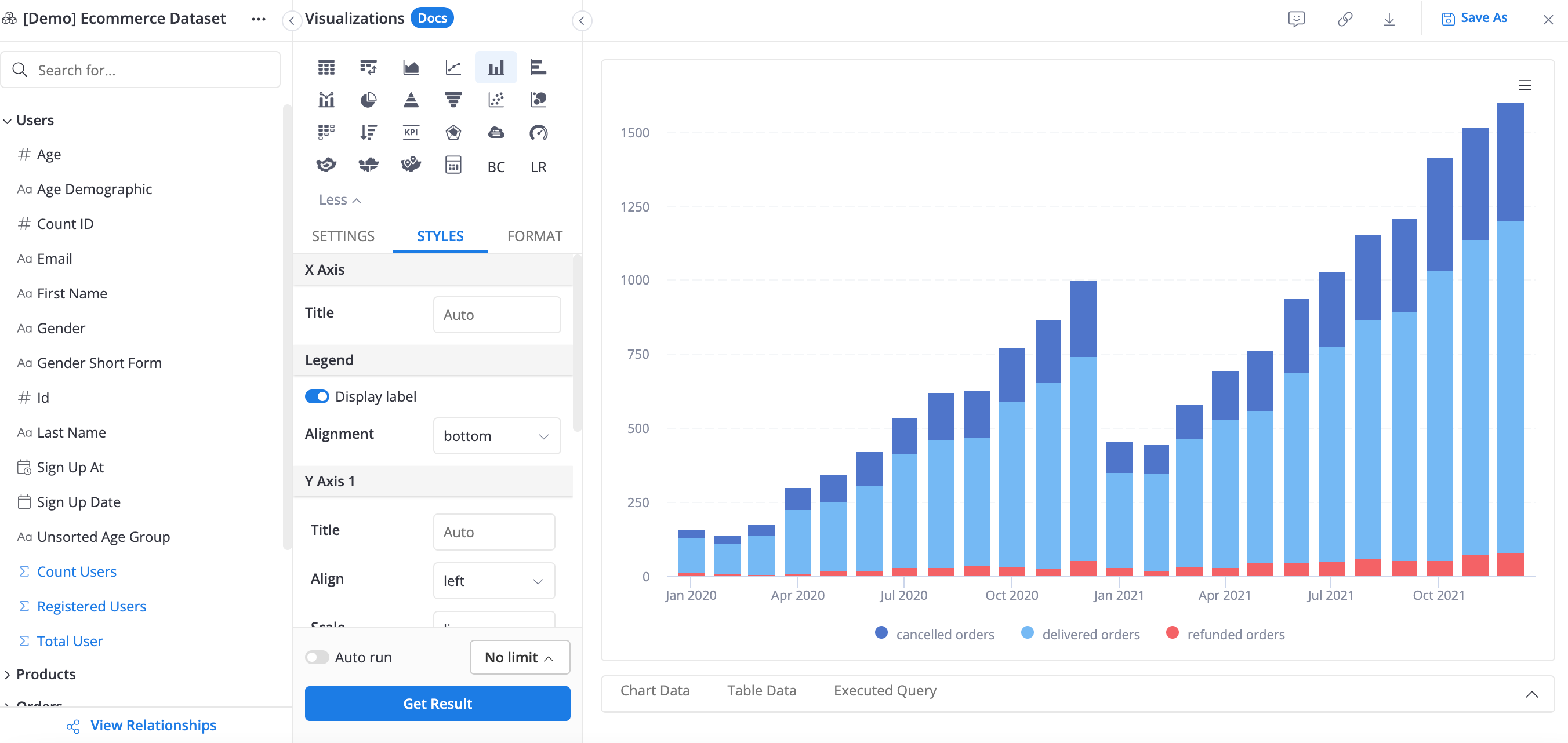
- Stack series: When a series is split into different groups, this option will stack your groups on one another. You can either display the stack using raw value or use percentage.
- Display "Total" value in tooltip
- Totals only work if your measures (in Y-axes) are broken down by Legend;
- Totals are calculated per measure.
- Group small values into "Others": This is useful when you have too many groups. It will only show the most prominent ones and gather groups with small values into the "Others" category. You can specify the number of original groups to be displayed.
- Show rows with no data: Read more about this option here.
Stack series
The Stack series option is particularly useful for Column Chart. When you have a dimension in the Legend field and choose Stack series, you can have an effective comparison of sub-categories' distribution across another dimension.
For example, here we have a comparison of orders placed by males and females of different age groups: