AML Custom Chart
A grasp of these concepts will help you understand this documentation better:
Custom charts in Holistics involve two AML objects:
CustomChartDef- defines a reusable chart template, stored in a.chart.amlfile.CustomChart- uses a chart definition inside aVizBlockto render data.
CustomChartDef
CustomChartDef declares a reusable custom chart template powered by Vega or Vega-Lite. Define it in a .chart.aml file under Development > Library > Custom Charts.
CustomChartDef chart_name {
  label: String
  description: String       // optional
  icon: String              // optional

  fields {
    field <name> {
      label: String         // optional
      type: 'dimension' | 'measure'
      data_type: 'string' | 'number' | 'boolean' | 'date'  // optional
      sort {                // optional
        apply_order: Number
        direction: 'asc' | 'desc'
      }
    }
  }

  options {                 // optional
    option <name> {
      label: String         // optional
      type: 'input' | 'number-input' | 'toggle' | 'radio' | 'select' | 'color-picker'
      options: List[String | Number]  // required for 'radio' and 'select'
      default_value: String | Number | Boolean
    }
  }

  template: @vgl { ... };;  // use @vg for Vega
}
Top-level properties
| Property | Type | Required | Description |
|---|---|---|---|
chart_name | identifier | Yes | Unique AML identifier. Must be snake_case (e.g. my_bar_chart). |
label | String | Yes | Display name shown in the chart picker. |
description | String | No | Short description shown in the chart picker. |
icon | String | No | Icon shown in the chart picker. |
fields | block | Yes | Defines the data field slots users can drag into. See fields. |
options | block | No | Defines user-configurable styling controls shown in Visualization Settings. See options. |
template | @vgl or @vg | Yes | The Vega-Lite or Vega chart specification. See template. |
fields
Each field <name> block defines one slot that users can drag a dataset field into.
| Property | Type | Required | Description |
|---|---|---|---|
type | String | Yes | 'dimension' or 'measure'. Fields marked 'measure' are automatically aggregated. Note: if you reuse Vega-Lite library examples that define aggregation in code, use 'dimension' for all fields to avoid double-aggregation. |
label | String | No | Display name shown in Visualization Settings. |
data_type | String | No | Restricts accepted field types: 'string', 'number', 'boolean', or 'date'. |
sort.direction | String | No | Sort direction: 'asc' or 'desc'. |
sort.apply_order | Number | No | Sort priority relative to other fields. Lower numbers are sorted first. |
options
Each option <name> block defines one user-configurable control shown in Visualization Settings.
| Property | Type | Required | Description |
|---|---|---|---|
type | String | Yes | Control type. See option types below. |
label | String | No | Display label shown in Visualization Settings. |
options | List[String | Number] | Conditional | List of choices. Required when type is 'radio' or 'select'. |
default_value | String, Number, or Boolean | No | Default value for the option. |
Option types
'input'
Renders a free-text input.
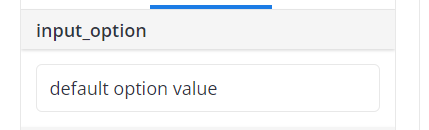
option my_option {
  type: 'input'
  default_value: 'Some default value'
}
'number-input'
Similar to 'input', but only accepts numeric values.
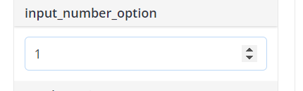
option my_option {
  type: 'number-input'
  default_value: 1
}
'toggle'
Renders a boolean toggle (true/false).
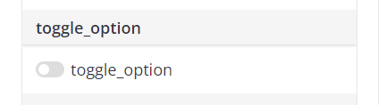
option my_option {
  type: 'toggle'
  default_value: false
}
'radio'
Renders a radio button list. Requires options.
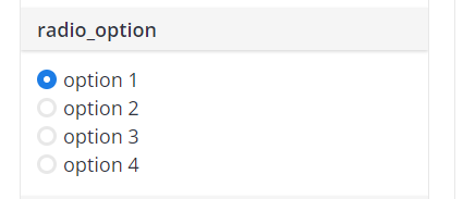
option my_option {
  type: 'radio'
  options: ['option 1', 'option 2', 'option 3']
  default_value: 'option 1'
}
'select'
Similar to 'radio', but renders a dropdown. Requires options.
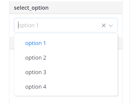
option my_option {
  type: 'select'
  options: ['option 1', 'option 2', 'option 3']
  default_value: 'option 1'
}
'color-picker'
Renders a color picker. Resolves to a hex color string.
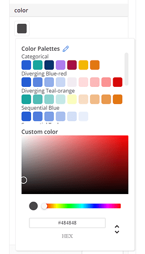
option bar_color {
  type: 'color-picker'
  label: 'Bar color'
  default_value: 'cyan'
}
Reference the selected color in the template:
"mark": {
  "type": "bar",
  "color": @{options.bar_color.value}
}
template
The template property holds the Vega-Lite (@vgl) or Vega (@vg) chart specification.
Runtime variables
Use @{...} placeholders inside the template to access data and user input at runtime.
| Placeholder | Description |
|---|---|
@{values} | The dataset rows returned by the query. Always use as "data": { "values": @{values} }. |
@{fields.<name>.name} | The display name of the field the user dragged into slot <name>. |
@{fields.<name>.type} | The data type of the field (e.g. "date", "number"). |
@{fields.<name>.format} | The format string of the field, for use with holisticsFormat. |
@{options.<name>.value} | The current value of option <name> as set by the user. |
For example, if a user drags Created_at into field a and Revenue into field b, the runtime data looks like:
{
  data: {
    values: [
      { a: "01/01/2022", b: 28 },
      { a: "01/02/2022", b: 55 },
    ]
  },
  fields: {
    a: { name: "Created_at", type: "date", format: "mm/dd/yyyy" },
    b: { name: "Sum of Revenue", type: "number", format: "Number (rounded)" }
  },
  options: {
    tooltip: { value: true }
  }
}
Vega-Lite properties
For a full reference, see the official Vega-Lite documentation.
data
In Holistics, the data source must always be specified as:
"data": {
  "values": @{values}
}
The placeholder @{values} is used by Holistics to pass in the data from the dataset fields the user drags in.
mark
Specifies the shape (bar, line, point, etc.) and its style (color, width, tooltip, etc.).
"mark": {
  "type": "bar",
  "width": 20,
  "tooltip": @{options.tooltip.value},
  "color": @{options.bar_color.value}
}
encoding
Maps declared fields to chart dimensions (x, y, color, etc.).
"encoding": {
  "x": {
    "field": @{fields.a.name},
    "type": "temporal"
  },
  "y": {
    "field": @{fields.b.name},
    "type": "quantitative"
  }
}
params
Declares user interactions the chart accepts (selections, hover, etc.). Used as the foundation for Cross Filter and Context Menu via holisticsConfig.
"params": [
  { "name": "pointSelection", "select": "point" },
  { "name": "highlight", "select": { "type": "point", "on": "mouseover" } }
]
See the Vega-Lite params documentation for details.
Holistics-specific template properties
holisticsConfig
It wires Vega-Lite selections (declared in params) to Holistics interactive features. See Make a custom chart interactive for a full walkthrough.
| Property | Type | Description |
|---|---|---|
crossFilterSignals | Array of strings | Selection names that trigger Cross Filter on click. Use a click (point) selection. |
contextMenuSignals | Array of strings | Selection names that open the Context Menu (Date-drill, Drill-through) on right-click. Use a hover selection ("on": "mouseover") so the menu targets the point under the cursor. |
"holisticsConfig": {
  "crossFilterSignals": ["myPointSelection"],
  "contextMenuSignals": ["myHoverSelection"]
}
holisticsFormat
It applies the user's field format settings to axis labels, legends, tooltips, and headers. Add both properties to the relevant encoding channel:
"axis": {
  "format": @{fields.a.format},
  "formatType": "holisticsFormat"
}
CustomChart
CustomChart is used as the viz type inside a VizBlock to render a custom chart with data.
block <name>: VizBlock {
  viz: CustomChart {
    custom_chart: <CustomChartDef name>  // reference a named definition
    dataset: <dataset_name>
    field <name>: field_ref
    // ...
  }
}
You can also define the chart template inline instead of referencing a named CustomChartDef:
viz: CustomChart {
  custom_chart: CustomChartDef {
    label: '...'
    fields { ... }
    template: @vgl { ... };;
  }
  dataset: <dataset_name>
}
Properties
| Property | Type | Required | Description |
|---|---|---|---|
custom_chart | CustomChartDef name or inline block | Conditional | The chart definition to use. Required if custom_chart_id is not set. |
custom_chart_id | Number | Conditional | ID of a legacy custom chart. Required if custom_chart is not set. |
dataset | String or Dataset | Yes | The dataset to query. |
field | VizFieldFull, FieldRef, String, or ConstantVizField | No | Maps a dataset field to a chart field slot. |
calculation | VizCalculation | No | Inline calculated field for use in the visualization. |
conditions | List[String] | No | WHERE-style filter conditions. |
having_conditions | List[String] | No | HAVING-style filter conditions. |
filter_groups | List[FilterGroup] | No | Filter groups for dynamic filtering. |
filter | VizFilter | No | Visualization-level filter. |
setting | Boolean, String, or Number | No | Chart-level setting. |
settings.row_limit | Number | No | Maximum number of rows returned. |
settings.aggregate_awareness.enabled | Boolean | No | Whether aggregate awareness is enabled. |
settings.aggregate_awareness.debug_comments | Boolean | No | Whether to include debug comments in generated SQL. |
theme | VizTheme | No | Visualization-level theme override. See VizTheme. |
Legacy custom charts
For legacy custom charts created through Admin Settings, reference them by numeric ID. See Legacy custom chart definition.
viz: CustomChart {
  custom_chart_id: 42
  dataset: my_dataset
}