Radar Chart
Radar Chart presents your multivariate data on axes starting from the same point. Values on the axes of the same subject are connected with a straight line, which makes the visualization look like "radar".
When to use Radar Chart?
A Radar Chart is a visually striking means to show outliers and commonalities between objects or to show that a subject is superior to others in every variable.
Radar Chart is only suitable for ordinal measurements, for example ranking or ratings.

Create a Radar Chart
To use Radar Chart, your data need to have the following form:
- Name / ID of the subject to be compared
- The ordinal variables that represent the measurements. These variables must be of the same scale, and they quantify the subject's better or worse quality.

Compare multiple subjects on multiple measurements
Place the Name / ID of the subject in Legend field, and the measurements in Y Axis field. This way the measurements will be visualized for individual subjects:

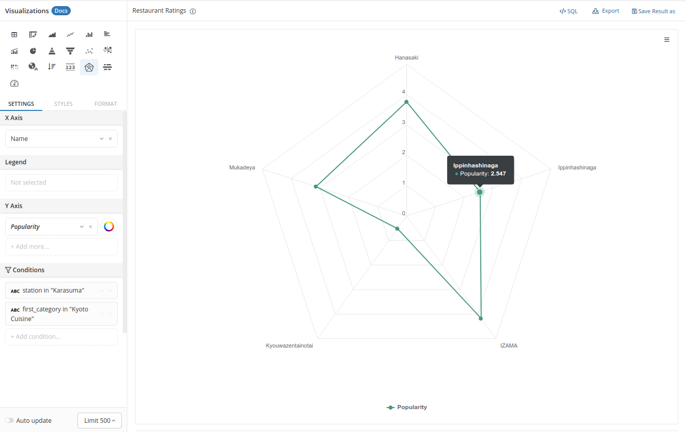
Compare multiple subjects on one measurement
If you only need to compare your subjects on one measurement, simply put your subject's Name / ID in the X Axis field: