KPI Metric
Sometimes, a number is worth a thousand words. KPI Metric visualization is the best choice when you just want a snapshot of your performance, or quickly compare your number with another value.
In Holistics, KPI Metric visualization presents your data as a single number. This is a simple yet effective way to draw attention and invite further data exploration.
Create a KPI Metric Visualization
Step-by-step guide
Follow these steps to create your KPI Metric chart:
-
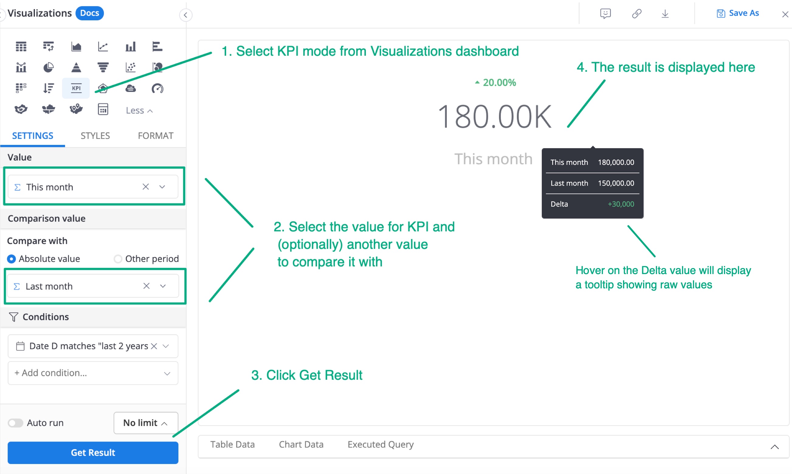
Go to the Visualizations dashboard and select KPI Metric.
-
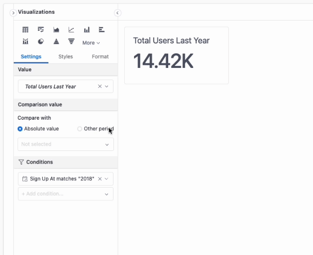
In the Value field, either add a pre-defined custom measure to be used as the KPI value. You can even drag a dimension here and the KPI Metric chart will automatically turn it into an aggregated measure.
- Example of custom measure: You can define a custom measure of Sales in September 2021 from your raw column Sales.
- Example of automatically generated aggregate measure: The dimension Email when input into the Value field has transformed into the aggregate measure Count of Email.
-
(Optional) Another custom measure/ dimension to compare the KPI value with.
-
Compare with absolute value (Default): If you input a custom measure/ dimension with this option on, your KPI will be compared against this value.
-
Compare with other periods: This option will let you compare your KPI with itself in a previous period. For more information, check out the Period over Period feature.

-
Click
Get Result.If you have added the
Comparison valuein step 2, hover over the Delta (represented as a small text above the KPI value) to see the raw numerical values and the Delta.
Display configurations

General Styling
In Style tab, you can start with general styling options that allow you to change the core components of KPI Metric:
- Alignment: Change the alignment of all elements inside the KPI Metric visualization.
- Label: Change the font size and font color of the KPI label.
- Metric Value: Change the font size and font color of Metric value.
This styling is only available in Canvas dashboard. If you save a KPI Metric to a quick dashboard, this styling won't carry over. Only the default styling will be applied.
Comparison Type
In Comparison Type, you can specify how you want to display the Comparison Number along with Metric Value. There are four display modes to choose from:
- None: Show only the Metric Value
- Compare by number: Display the numerical difference between the Metric Value and Comparison Value.
- Compare by percent: Show the difference as a percentage.
- Progress: Visualize goal completion with a progress bar under the Metric Value.

“Compare by number” and “Compare by percent”
These modes include:
- Font size configuration
- Reverse comparison color: By default, green indicates an increase (positive) and red indicates a decrease (negative). For metrics where lower numbers are better (like churn rate or cost), you can flip the color scheme using the toggle.

“Progress” display mode
For this display mode, you can change the progress bar color as well as its caption font size.
