Candlestick Chart
A candlestick chart is essentially a sequence of box-plot-like bars placed side by side. It is commonly used to visualize the price movement of financial instruments such as forex, stocks, and bonds.
- Good for: open-high-low-close price movement over time, stock and forex trading sessions, daily or weekly trading ranges.
- Not great for: a single value per period (use a line or bar chart), non-time-series data, or categories without high and low bounds.
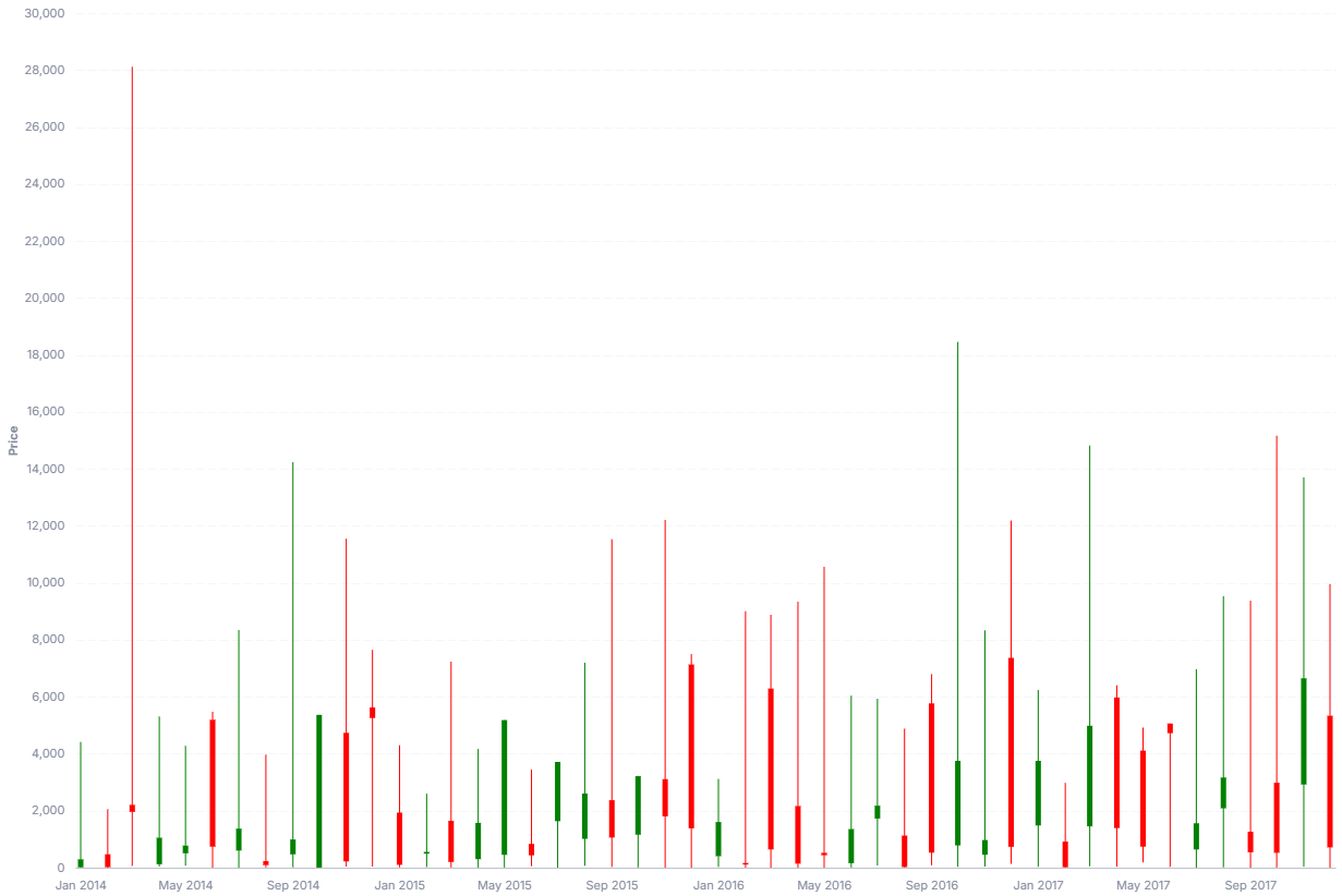
Syntax
Use the following AML definition to add the Candlestick Chart to your custom chart library.
CustomChartDef candlestick_chart {
  label: 'Candlestick Chart'
  icon: 'hicon:chart-candlestick'
  description: 'To visualize the open, high, low, and close price movement of financial instruments over time.'
  fields {
    field date {
      label: 'Date'
      type: 'dimension'
      data_type: 'date'
      sort {
        apply_order: 1
        direction: 'asc'
      }
    }
    field low {
      label: 'Low'
      type: 'measure'
      data_type: 'number'
      sort {
        apply_order: 2
        direction: 'asc'
      }
    }
    field high {
      label: 'High'
      type: 'measure'
      data_type: 'number'
      sort {
        apply_order: 3
        direction: 'asc'
      }
    }
    field open {
      label: 'Open'
      type: 'measure'
      data_type: 'number'
      sort {
        apply_order: 4
        direction: 'asc'
      }
    }
    field close {
      label: 'Close'
      type: 'measure'
      data_type: 'number'
      sort {
        apply_order: 5
        direction: 'asc'
      }
    }
  }

  options {
    option tooltip {
      type: 'toggle'
      label: 'Show tooltip'
      default_value: true
    }
    option green_candle {
      type: 'color-picker'
      label: 'Green candlestick'
      default_value: 'green'
    }
    option red_candle {
      type: 'color-picker'
      label: 'Red candlestick'
      default_value: 'red'
    }
  }

  template: @vgl
  {
    "data": {
      "values": @{values}
    },
    "layer": [
      {
        "mark": "rule",
        "params": [
          {"name": "normalPointSelection", "select": {"type": "point", "toggle": "true", "clear": "mouseup"}},
          {"name": "hoverPointSelection", "select": {"type": "point", "on": "mouseover", "clear": "mouseout"}}
        ],
        "encoding": {
          "y": {"field": @{fields.low.name}},
          "y2": {"field": @{fields.high.name}}
        }
      },
      {
        "mark": {
          "type": "bar",
          "tooltip": @{options.tooltip.value}
        },
        "params": [
          {"name": "candle_hover", "select": {"type": "point", "fields": [@{fields.date.name}], "on": "mouseover", "clear": "mouseout"}}
        ],
        "encoding": {
          "y": {"field": @{fields.open.name}},
          "y2": {"field": @{fields.close.name}}
        }
      }
    ],
    "encoding": {
      "x": {
        "type": "temporal",
        "field": @{fields.date.name},
        "axis": {"grid": false, "format": "%b %Y"}
      },
      "y": {
        "axis": {
          "title": "Price"
        },
        "type": "quantitative",
        "scale": {
          "zero": false
        }
      },
      "color": {
        "condition": {
          "test": "datum['@{fields.open.name}'] < datum['@{fields.close.name}']",
          "value": @{options.green_candle.value}
        },
        "value": @{options.red_candle.value}
      },
      "opacity": {
        "condition": [
          {"test": "!length(data('candle_hover_store'))", "value": 1},
          {"param": "candle_hover", "empty": false, "value": 1}
        ],
        "value": 0.15
      }
    },
    "holisticsConfig": {
      "crossFilterSignals": ["normalPointSelection"],
      "contextMenuSignals": ["hoverPointSelection"]
    }
  };;
}
 View on GitHub
Legacy syntax
CustomChart {
  fields {
    field date {
      type: "dimension"
      label: "Date field"
    }
    field low {
      type: "dimension"
      label: "Low price"
    }
    field high {
      type: "dimension"
      label: "High price"
    }
    field open {
      type: "dimension"
      label: "Open price"
    }
    field close {
      type: "dimension"
      label: "Close price"
    }
  }

  	options {
		option tooltip {
			type: 'toggle'
			label: 'Show tooltip'
			default_value: true
		}
		option green_candle {
			type: 'color-picker'
			label: 'Green candlestick'
			default_value: 'green'
		}
    option red_candle {
			type: 'color-picker'
			label: 'Red candlestick'
			default_value: 'red'
		}
	}

  template: @vgl
  {
    "data": {
      "values": @{values}
    },
    "layer": [
      {
        "mark": "rule",
        "encoding": {
          "y": {"field": @{fields.low.name}},
          "y2": {"field": @{fields.high.name}}
        }
      },
      {
        "mark": {
          "type": "bar",
          "tooltip": @{options.tooltip.value}
        },
        "encoding": {
          "y": {"field": @{fields.open.name}},
          "y2": {"field": @{fields.close.name}}
        }
      }
    ],
    "encoding": {
      "x": {
        "axis": {
          "format": "%m/%d",
          "labelAngle": -45
        },
        "type": "temporal",
        "field": @{fields.date.name},
      },
      "y": {
        "axis": {
          "title": "Price"
        },
        "type": "quantitative",
        "scale": {
          "zero": false
        }
      },
      "color": {
        "condition": {
          "test": "datum.@{fields.open.name} < datum.@{fields.close.name}",
          "value": @{options.green_candle.value}
        },
        "value": @{options.red_candle.value}
      }
    }
  };;
}
Required fields
A Candlestick Chart expects exactly five fields. Each row of input is one period (one candle) with its open, high, low, and close values.
| Field | Label | Type | Role |
|---|---|---|---|
date | Date | dimension | Time period for each candle; sets the x position. Sorted ascending (apply_order: 1). |
low | Low | measure | Lowest price; bottom of the wick. Sorted ascending (apply_order: 2). |
high | High | measure | Highest price; top of the wick. Sorted ascending (apply_order: 3). |
open | Open | measure | Opening price; one end of the candle body. Sorted ascending (apply_order: 4). |
close | Close | measure | Closing price; the other end of the candle body. Sorted ascending (apply_order: 5). |
Data requirements: Pre-aggregate to one row per date; the template does not combine duplicate periods. Each row needs all four price values, and the template colors a candle with the green option when open is less than close (otherwise the red option).
Sample data:
| date | low | high | open | close |
|---|---|---|---|---|
| 2024-01-02 | 184.30 | 188.44 | 187.15 | 185.64 |
| 2024-01-03 | 183.89 | 185.88 | 184.22 | 184.25 |
| 2024-01-04 | 181.59 | 183.09 | 182.15 | 181.91 |
| 2024-01-05 | 180.17 | 182.76 | 181.99 | 181.18 |
| 2024-01-08 | 181.50 | 185.60 | 182.09 | 185.56 |
Options
Set these options to adjust the chart without editing the Vega template. The CustomChartDef block above declares each option's type and allowed values.
| Option | Default | Effect |
|---|---|---|
tooltip | true | Shows a tooltip on hover over each candle body. |
green_candle | green | Fill color for up periods, where close is higher than open. |
red_candle | red | Fill color for down periods, where close is at or below open. |
Known limitations
-
Every row needs all four price values. Each candle reads
open,high,low, andclose. Rows missing any of these render incompletely. -
One row per period. The template does not aggregate, so duplicate dates draw overlapping candles. Pre-aggregate to a single open-high-low-close row per period.
-
The y-axis does not start at zero. The scale is set to fit the price range (
zero: false), which is right for price data but means bar lengths are not proportional to absolute value.