Line Chart
Line Chart displays your data as a series of points ordered along an X-axis and connected by straight lines. This is one of the basic chart types used in almost every business scenario.
When to use a Line Chart?
A line Chart is useful when you want to examine a trend of a continuous variable over a dimension, for example, the change in your revenue over months. (If that dimension is time, then we have a "time series".)
Line Chart can be used to examine a single series, multiple series of the same scale, or multiple series of different scales.
Create a Line Chart
To use a Line Chart, the result set of your query or data exploration must have a series of data points and a dimension by which you want to aggregate your data.
Select Line Chart visualization, and drag in the necessary fields in the Settings tab:
- X-Axis: The dimension that your data points will be plotted along. Normally this is where you put your time field.
- Y-Axis: This is where you put the field containing data points that you want to aggregate.
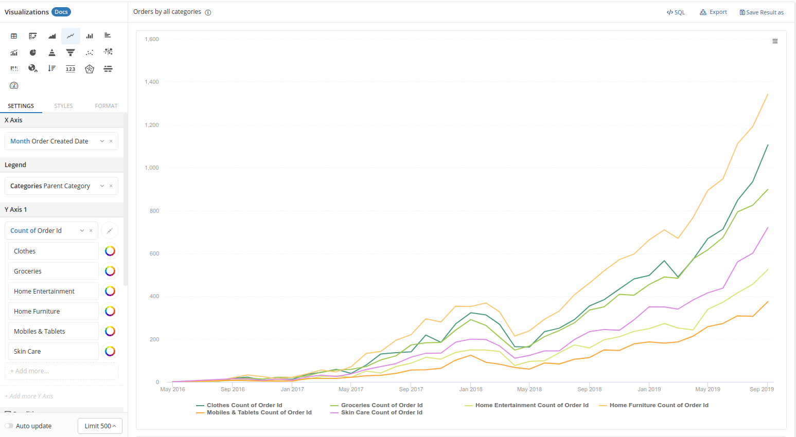
Multiple series using Legend
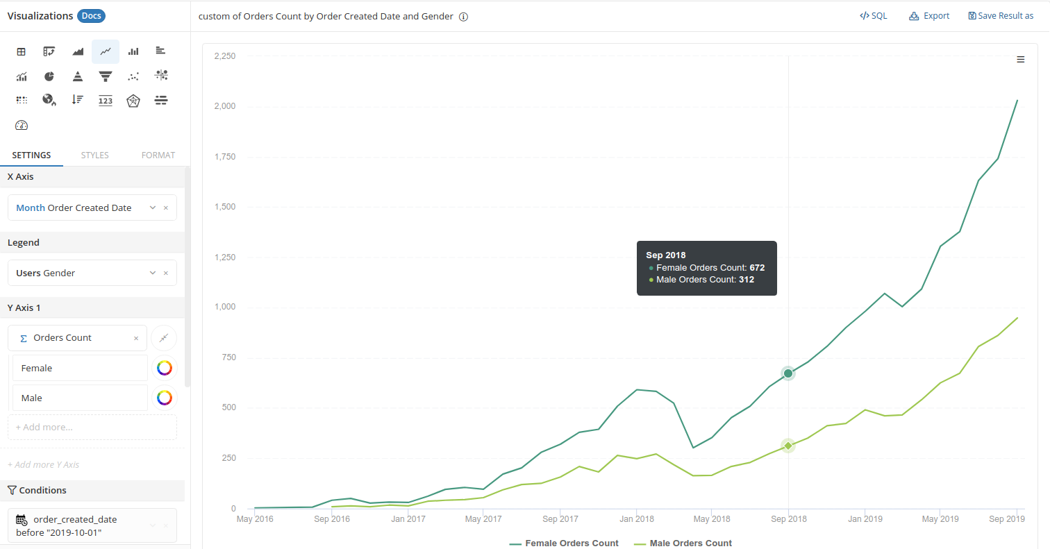
Legend contains the dimension to split your series so you can compare the same metrics across different groups. For example, the number of orders by gender:
Multiple series on the same Y-axis
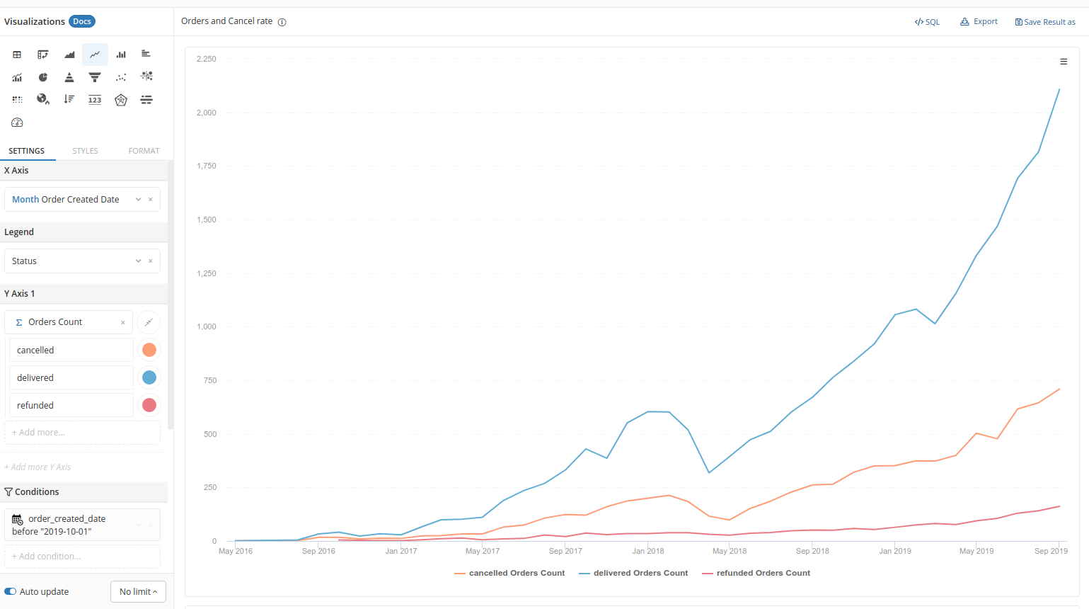
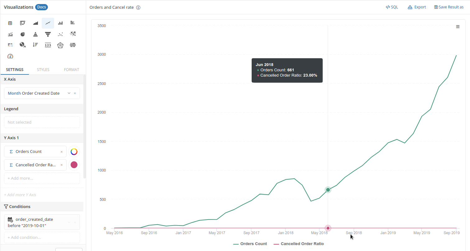
In the Y-axis field, you can drag in multiple series of the same scale to be displayed along one another.
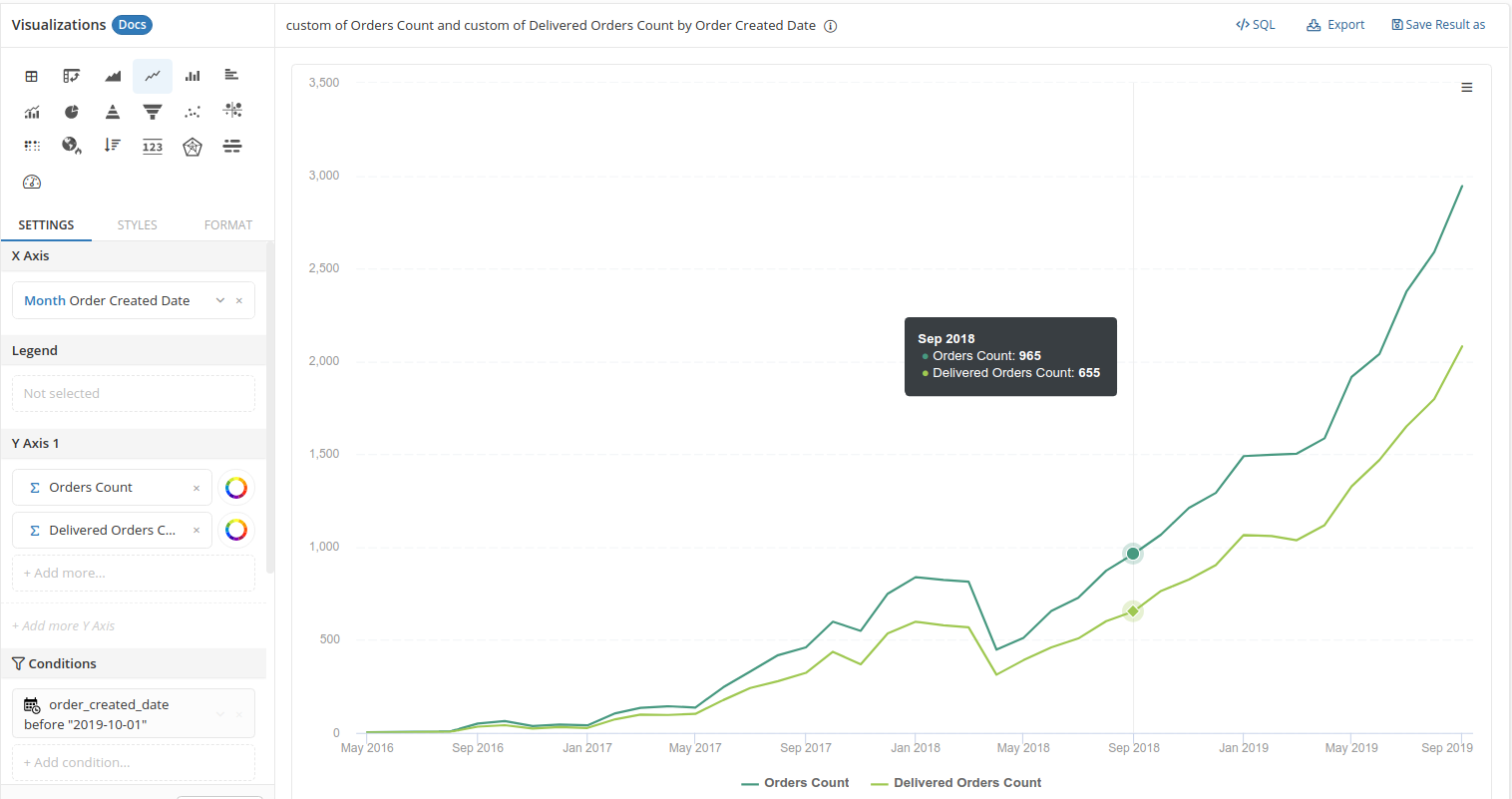
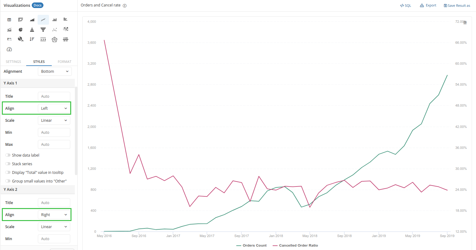
The min and max value of the Y-axis is determined by the min and max of all measures dragged in. If your measures are not on the same scale, the display result will not make sense. For example, the Orders Count's value can go up to thousands while the Cancelled Order Ratio can only go up to 1 (100%).
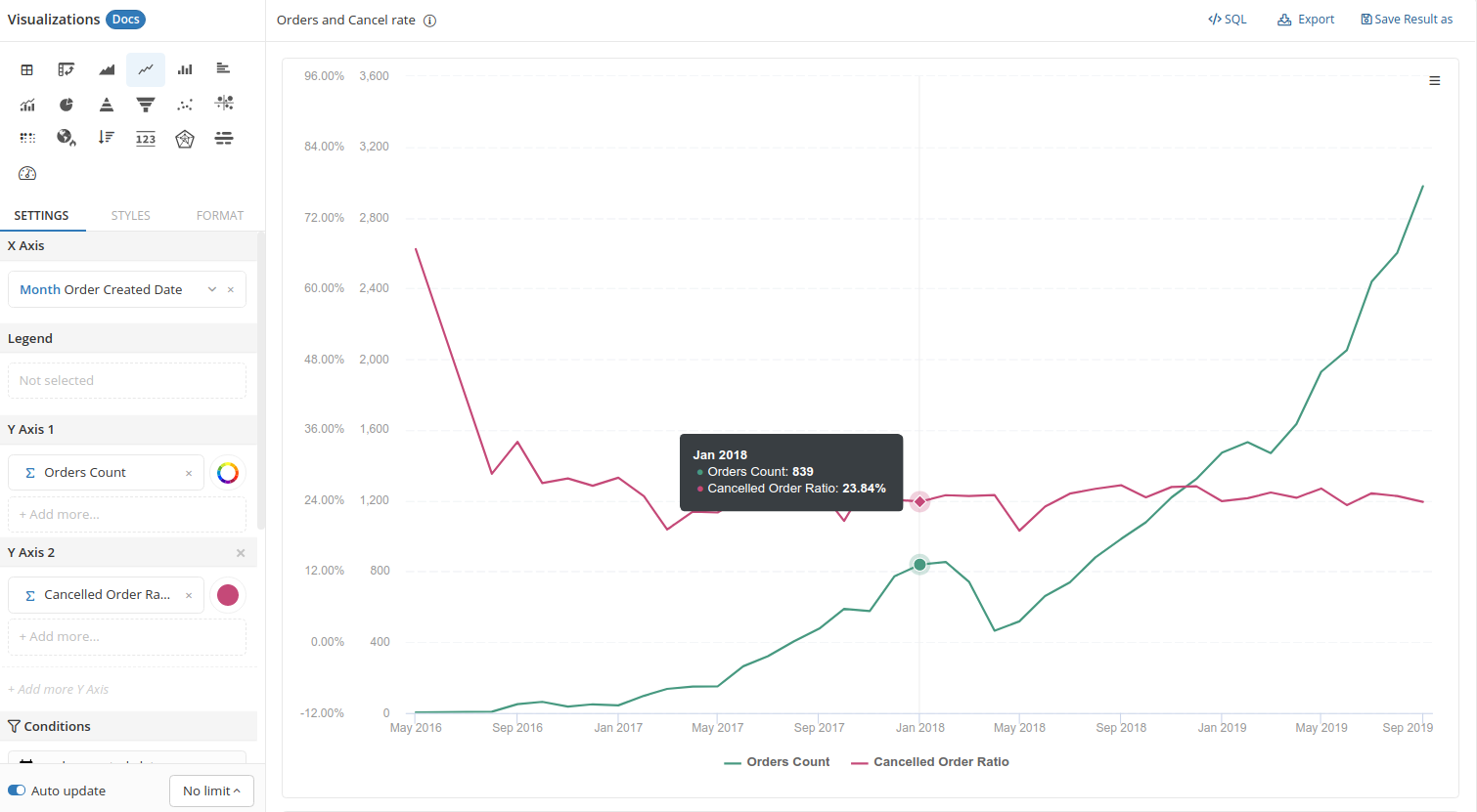
Multiple series on different Y-axes
To solve the cases where you want to put different series of different scales together, you will need to add another Y-axis to your chart:
The Dos and Don'ts
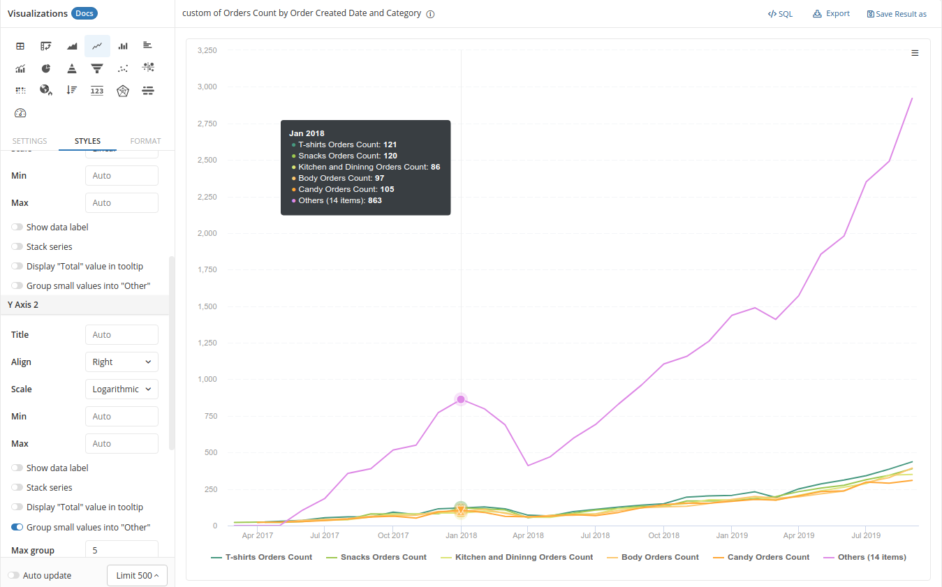
Use low-cardinality dimension in Legend
The ease of adding multiple series to your chart also means you can easily clutter your visualization with noise:
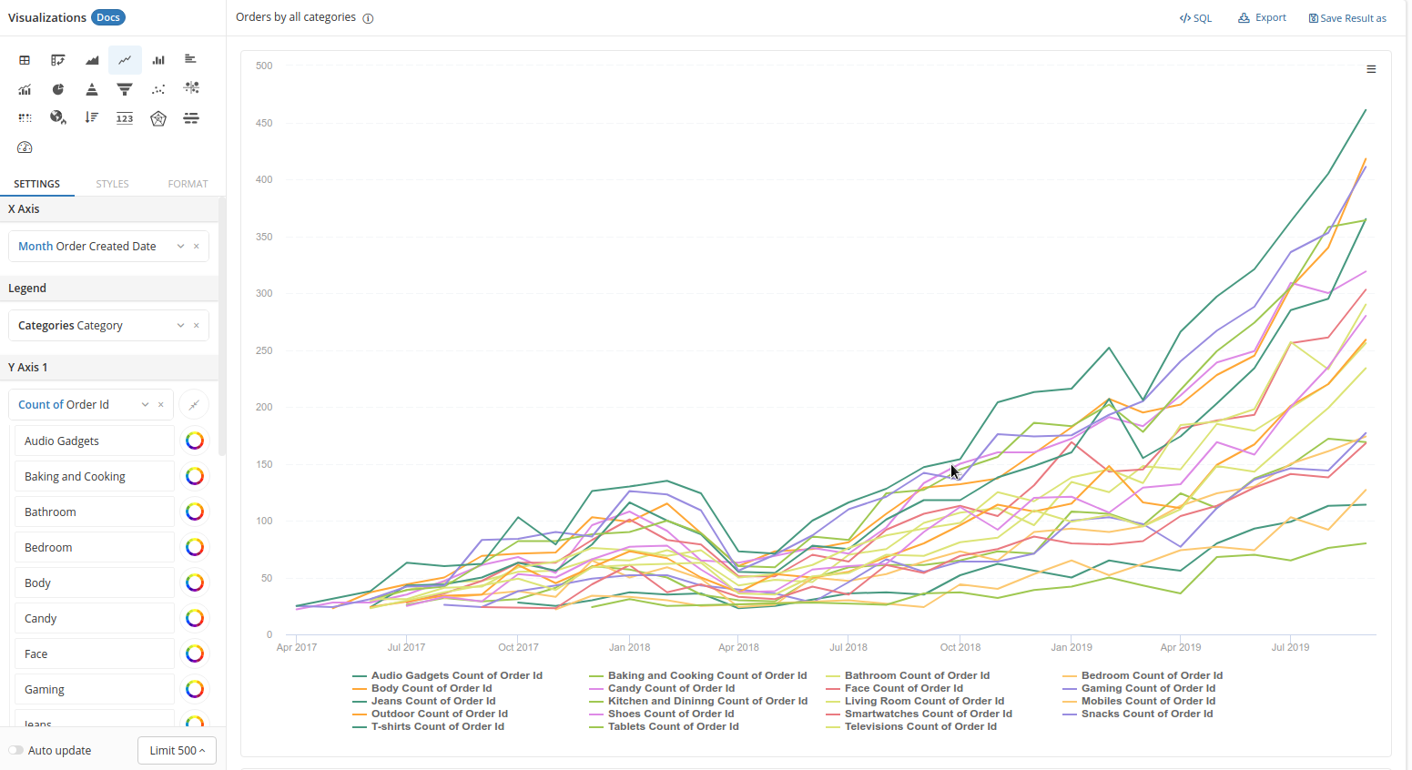
Therefore, it is recommended that you split your series by a dimension with low cardinality, or add only the series that are most relevant.
If you need to use a high-cardinality dimension, you can manually group the original values into larger groups (using Custom Dimensions or SQL)...
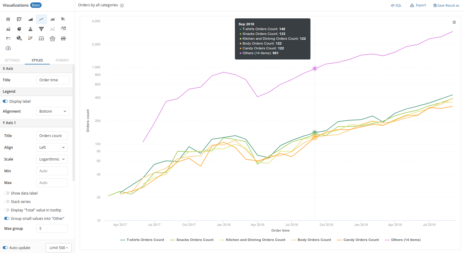
Or group small values into "Others" using our styling option.
There should be two Y-Axes at most
If you want to use multiple Y-axes, there should be only two Y-axes at most, and the axes should be aligned on two sides of the chart to reduce clutter:
Styling options
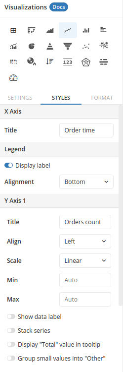
- X-axis - Title: set the title of your X-axis
- Legend:
- Display label: choose to show or hide the legend
- Alignment: choose the position you want to display your legend
- Y-axis:
- Title: Set the title of your Y-axis
- Align: Choose the position you want to display your Y-axis (left or right of the chart). This is particularly useful when you have multiple Y-axes.
- Scale: choose Linear to position your data points normally, or choose Logarithmic to position your data points at log(x). This is a useful display option when your data has a large difference between min and max values.
- Min, Max: By default, this will choose the min and max value of your data, but here you can specify the minimum and maximum limit of your Y-axis
- Show data label: show the raw number of data points in your series
- Stack series: When a series is split into different groups, this option will stack your groups on one another. You can either display the stack using raw value or use percentage.
- Display "Total" value in tooltip
- Totals only work if your measures (in Y-axes) are broken down by Legend;
- Totals are calculated per measure.
- Group small values into "Others": This is useful when you have too many groups. It will only show the most prominent ones and gather groups with small values into the "Others" category. You can specify the number of original groups to be displayed.
Show data points
This is useful when you want to display or hide all points on the line plot.
Especially, when you want to show disconnected/discontinuous data points which cannot be shown in our chart until users mouse over them, just simply toggle on the option Always display points under STYLE > Others in our Visualization Settings. Please refer to the video below: