How to create a Filled Map?
What is a Filled Map?
A Filled Map is a type of map that displays polygon shapes corresponding to geographical borders, such as country borders or state borders. Each shape on the map is filled with a distinct color based on the value it represents.

Types of Filled Map
Choropleth Map
Choropleth Map is a type of Filled maps where regions are colored based on a numerical value, typically ratio data such as per-capita income or population density.
Distribution Map (Coming soon)
Distribution Maps are Filled maps but the regions are colored based on a string value, most typically a subject such as an animal, religion, or political parties.
Custom Map
Custom Maps are designed to support dataset that contains geographical data type that Holistics has not supported (i.e. Zipcode, Counties, districts, wards...) (see more: Supported location formats)
Learn how to create custom map like the map of Alabama's counties' population below.
Types of Fields
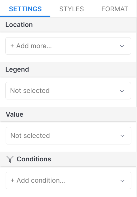
- Location (required): This field indicates the specific geographic positions where the data points are located.
- Legend: The legend field provides additional information or categories to distinguish and classify the data points on the map. It can be used to assign colors, symbols, or labels to represent different groups or types of data.
- Value: The value field represents a numerical or quantitative attribute associated with each data point.
- Conditions: The condition field allows for the application of filters to selectively view data points based on specific criteria or requirements.
Creating a Filled Map
📝 Goal: Following these steps to visualize the number of COVID-19 cases in the US by states:
Sample Data
- Dataset: Google Sheet link (updated 27th July 2020)
Step 1: Select the filled map icon from the visualizations pane.
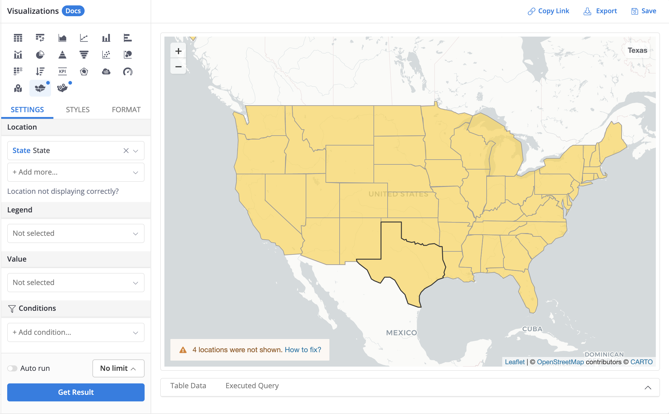
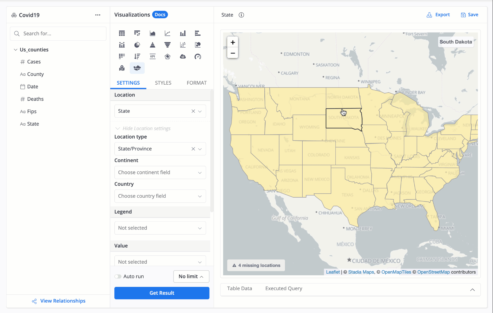
Step 2: In the Viz settings, drag and drop your desired location field into the Location section.
Once you drag the field, a dropdown will appear, asking you to assign a specific location type for that field. This step is NOT optional, we recommend doing it to enhance the precision of the map. You can learn more about improving map precision in Holistics here.
For example, if your field is named State, you can select State/Province from the dropdown.

Your location data should be in the form of full-text country names or abbreviation. For more information, see Supported location formats.
Step 3: Click on Get Results to view the map. By default, all locations will be colored light orange.
Step 4 (Optional): If you want to change the global color or assign different colors to each location, navigate to the Styles section. Select your location field and click on the colored box next to each location to modify its color.
📝 Next: Now that your Filled Map can visualize all the states in the US, let's highlight the cumulative number of COVID cases across all states. This is where Choropleth Map comes in.
To generate a Choropleth Map, follow these steps:
Step 1: Input your location data into the Location field
Step 2: Then, input a numerical value into the Value field.
Step 3: Click Get results.

Color Formatting Options

To customize the map's formatting, navigate to the Styles tab and follow these options:
Click on
Set Color By…to choose a field to apply color to your map. Once you've selected a field, you'll see the following options:Click on the color scale in
Styleto change the color scheme of the map.Select
Smoothto generate a color gradient for both the map and the scale.Choose
Stepsto divide the color scale into blocks, each representing a range of values. For example, if the data ranges from 0-100 and you set 5 steps, there will be 5 corresponding color blocks: 0-20, 20-40…
Min-Mid-Max: By default, these fields are set to Auto, but you can change them to Number or Percent from the drop-down list on the left of the input field. Once changed, enter your own values, and the color scale in the Style section will immediately reflect the updates.
If your input data for min or max is out of range (e.g., your data range is 1-100, but you input 101 in min), Holistics will use the maximum color as the displayed color. If your input data for mid is out of range (e.g., you enter 1000 in mid), Holistics will not make any changes to the color scale.
Improving map precision
Sometimes, Holistics will not recognize one or more of the location names in your data.
When this happens we will display a small notice modal on the lower right of the preview window. Hovering on this will help you understand which location names we failed to recognize.
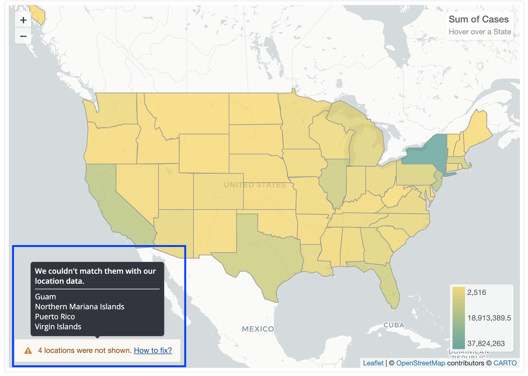
This may happen if there is a location or abbreviation that Holistics does not recognize, mostly because of typos, wrong formats, or the fact that such location exists in 2 different places (i.e. "Paris" is both the city of France and the city of Texas, USA)
To improve the map precision, see How to improve map precision in Holistics.