Metric Sheets
Tired of collating your key metrics from different dashboards or charts to create an executive report? Fret no more - Holistics's Metric Sheets brings all of your key metrics into a spreadsheet, gives you a bird's-eye view of your organization's performance, and allows simple yet powerful customizations.
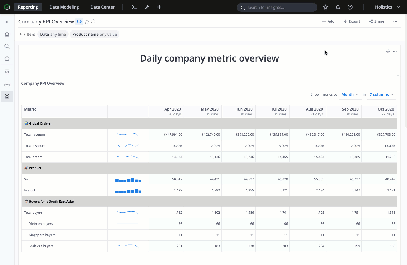
How Metric Sheets Works
One of the most common reporting formats is something that:
- Shows all important metrics in one place
- Each row represents a metric
- Each column shows data aggregated to a certain time period (daily, weekly, monthly, quarterly, yearly...)
- Arrange metrics in a hierarchy
- Let you easily change report start time, end time, aggregation time period
- Automatically update with the latest data
This is often done in an Excel sheet like so:
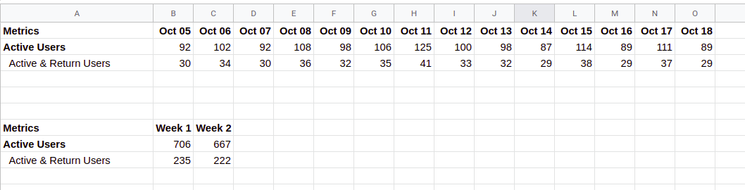
But:
- You don't have access to fresh data, because you need to periodically query and dump your raw data into an external sheet and manipulate it.
- You need different sheets for different aggregation periods, especially for non-additive metrics (like unique counts, averages, or ratios)
Normal SQL-based reporting can give you access to fresh data, but emulating the same format with SQL is tricky.
Holistics's Metric Sheets combines the best of both worlds: You can have fresh and correct data from your database/data warehouse thanks to Holistics's SQL modeling layer, and display it in an Excel-like format with only a few drags and drops:
One killer feature is that our Metric Sheets can easily deal with non-additive metrics. More about that in the FAQ section below.
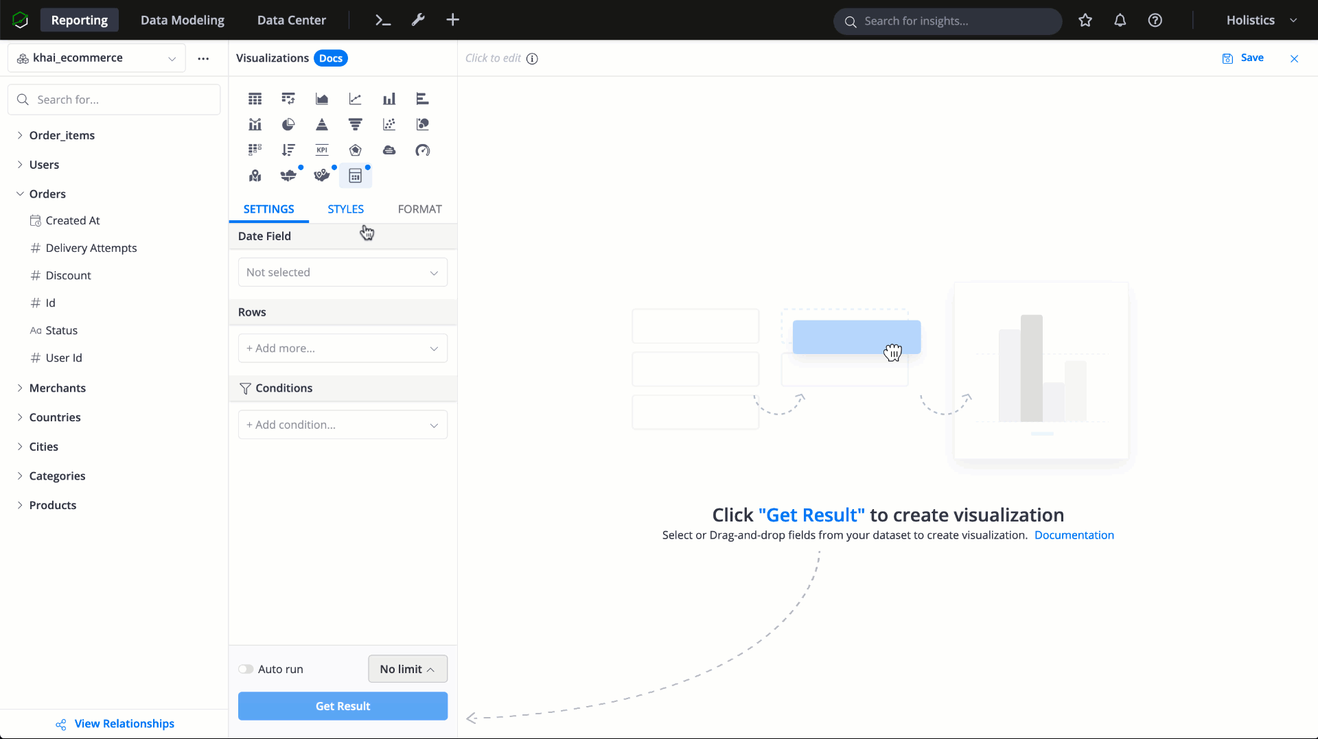
Setting up Metric Sheet
Metric Sheets is available as a visualization type and can be added as a widget within the Dashboard.
Basic setup
-
Date Field: You can use any date field in your dataset and the measure will be aggregated on that date field.
We support the following date aggregations:
- Standard: Daily, Weekly, Monthly, Quarterly, Yearly
- To-Date: Week-to-Date, Month-to-Date, Year-to-Date
-
Rows: In Metric Sheets, each metric is displayed in a row. A metric can be any aggregation: simple count, sum... provided in the UI, pre-built Measures, or Business Calculations.
For example, if you use user.signup_date as the Date Field, and in Rows you have Count of orders → The Metric Sheet will display the number of orders made by users who signed up on a specific date
Check out When and how to use a Date Dimension Model? for best practice when dealing with reporting date/time periods
Table styles
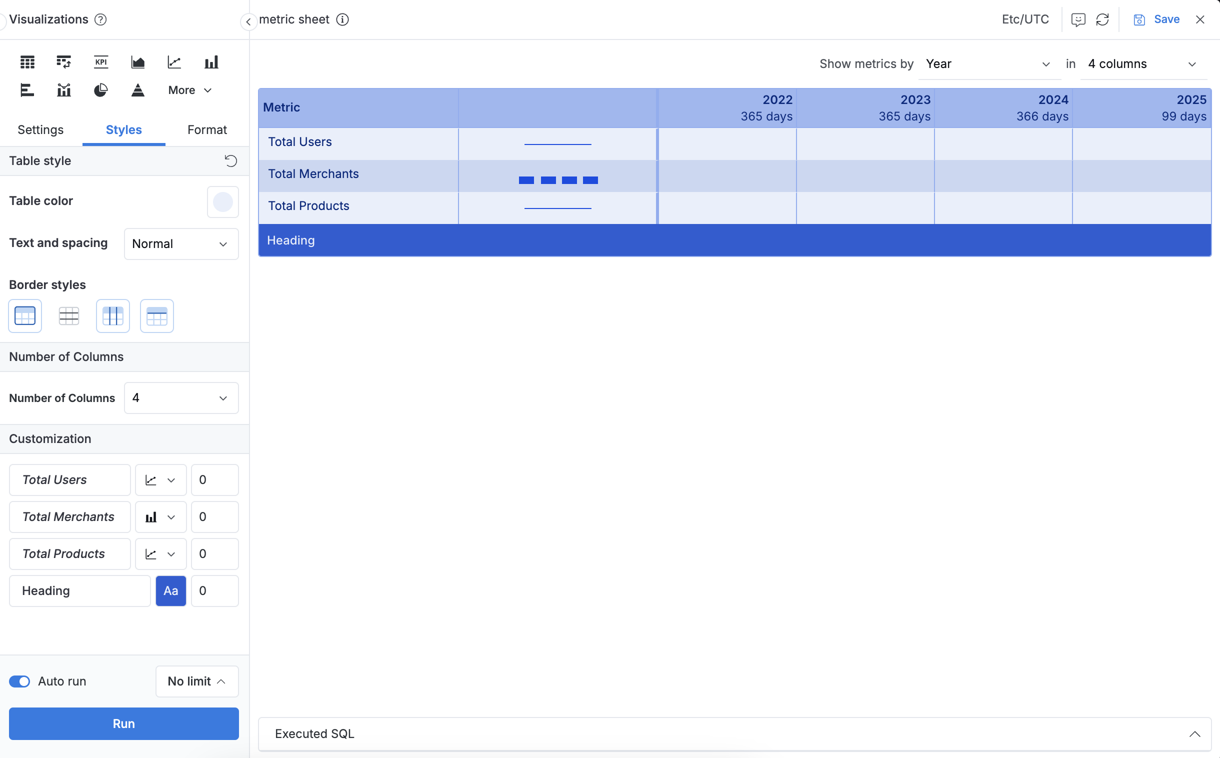
- Table color: Select a color theme that automatically applies different shades to table components (headers, banding, body, font color, etc.)
- Text and spacing: Choose from three presets to control text size and cell padding:
- Compact: Smaller font size and reduced padding for dense data displays
- Normal: Balanced spacing and font size (default setting)
- Wide: Larger font size and increased padding for enhanced readability
- Border styles: Customize which borders to include or remove in your table.
Custom table styles applied here will override any table theme styles defined in your Dashboard Theme.
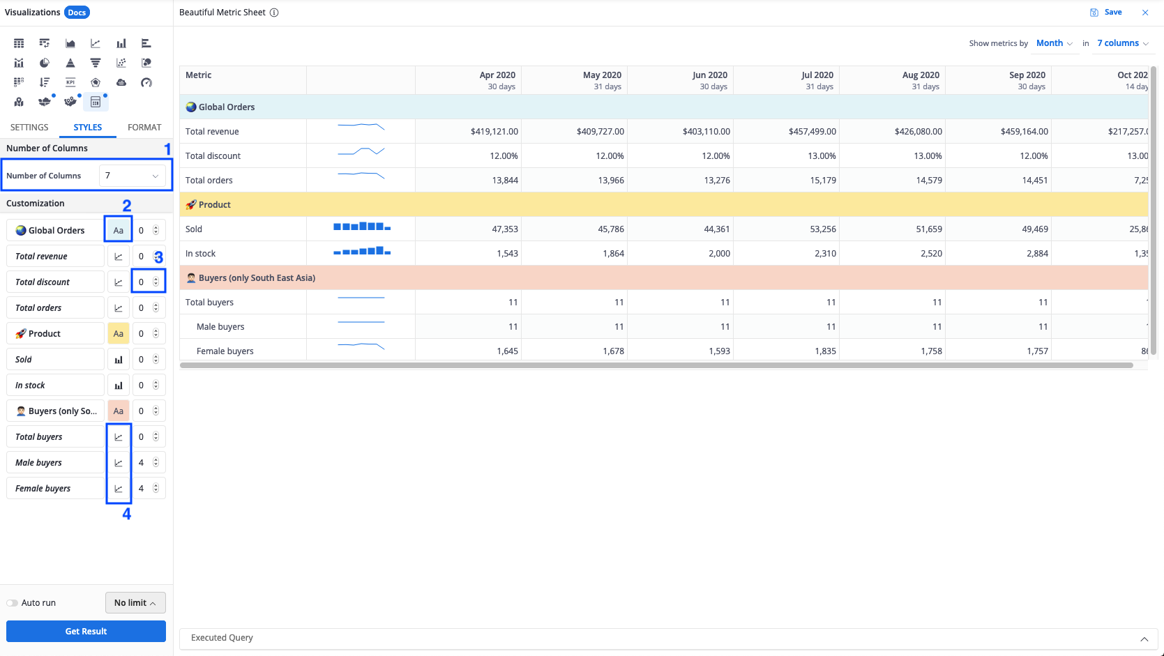
Customization options
- Number of Columns: Specify how much data will be displayed on the Metric Sheet
- Heading/notes color: Add color to the heading to make the sections more distinguishable
- Indent: Adding space from the left margin to indicate hierarchy for measures
- Sparkline: Visualize the changes of measures through time
Set up Filters for Metric Sheet
You can add filters for the Metric Sheet by creating a dashboard filter and applying that filter to the Metric Sheet.
Changing the filters in the dashboard will then affect the data in the Metric Sheet.

How date filters and display settings work on the final result:
-
Filtering on the exact field that you chose as the Date Field will define the base time range to query your underlying data.
-
Aggregation Period and Number of Columns in visualization settings may filter your data one more time if their combination produces a shorter time range.
For example, you have:
- Sign Up Date as Date Field, Total Signups as a metric
- Filtering condition is Sign Up Date between 2019-01-01 and 2019-12-31 (12 months)
- Aggregation period is Month
If you choose Number of Columns = 4, the final sheet will only show the last four months instead of 12 columns for 12 months

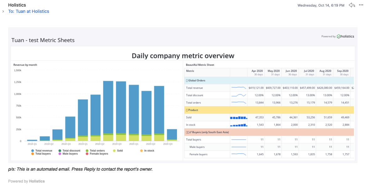
Send Metric Sheets in Email Schedule
Since the Metric Sheet is a part of the dashboard, you can schedule it to be sent to your team's or clients' emails. Please note that the metric sheet will be included in the email as a screenshot of its current state in the dashboard.
FAQs
Do Metric Sheets work with non-additive metrics?
Yes, provided that you have access to non-aggregated data.
With Metric Sheets, non-additive metrics like unique count of users, average revenue of each time period etc... are calculated correctly when you change the time aggregation period (Daily to Weekly, Monthly, Yearly... and vice versa)
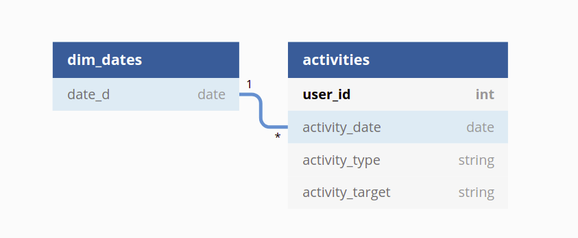
For example, we have the following user_activities dataset. In model activities, each row is an event created by a user:
Dataset user_activities

Model dim_dates {
  field date_d
}

Model activities {
  field user_id
  field date_d [ref: > dim_dates.date_d]

  measure active_users = "COUNT(DISTINCT user_id)"
}
Let's say the report consumer is provided with an Excel report containing data pre-aggregated to daily level:
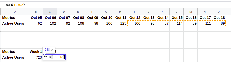
Since count of active users is a count_distinct, the report consumer cannot simply sum the daily numbers to weekly, monthly, yearly levels as it will double count the number of active users.
This is not a problem with Holistics's Metric Sheet, because every time you change the aggregation period, the metric will be calculated from scratch:
When choosing Daily aggregation:

select
	D.date_d
  , COUNT(DISTINCT user_id) AS active_users
from activities A ON D.date_d = A.date_d
When choosing Weekly aggregation:

select
  DATE_TRUNC('week', D.date_d) as week_d -- aggregation period is changed
  , COUNT(DISTINCT user_id) AS active_users
from dim_dates D
left join activities A ON D.date_d = A.date_d