November 26, 2025
🔔 Configure Failure Recipients per Schedule & Alert
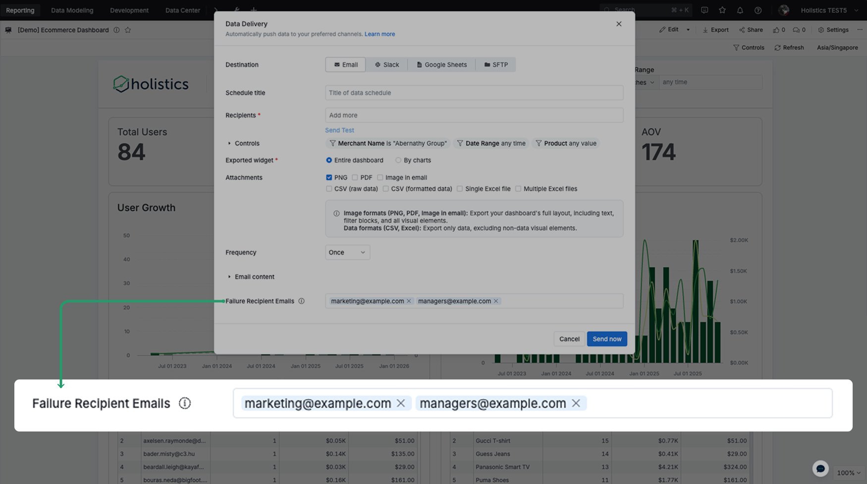
We’re excited to share our new feature: Configure Failure Recipients per Schedule & Alert! 🚀
🌟 The Problem We’ve Solved
Currently, when a scheduled dashboard delivery fails, the system sends notifications to:
- Schedule/alert creator,
- Dashboard/report creator,
- And any globally-configured admin recipients.
This means everyone gets every failure notification, regardless of whether they’re responsible for that specific schedule. This leads to notification fatigue and slower incident response.
🌟 The Solution
This feature lets you add custom recipients to receive failure notifications for each individual schedule or alert, on top of the default recipients.
For more details, see our public docs on Notify Delivery Failures.