With Canvas Dashboard, you can build the most visually stunning dashboard in the world, but no one will know if every dashboard visit is a game of “spin the loading wheel”.

Dashboards should be both fast and beautiful, we get it, so we’ve brought Job Monitoring and Job Performance Analytics to Canvas Dashboards.

Now you can spot the slowest reports in your workspace, see which Canvas Dashboards are dragging their feet, check if your Holistics Job Workers are overwhelmed, and make necessary optimizations to ensure your dashboards are fast enough to actually be admired.

If you have any questions, please let us know in this Community Post.


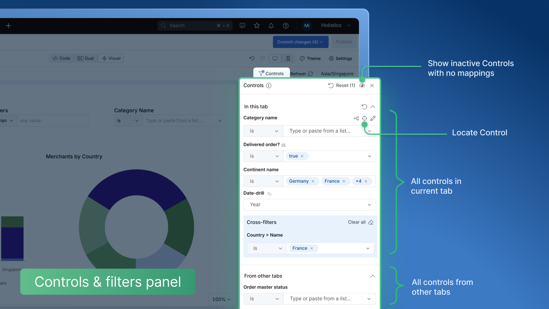
Tired of scrolling to check if your filters are mapped to the right report’s fields? We’ve got your back! We’ve added a nifty count indicator to show you at a glance how many reports are mapped.

pin to homepage

TL;DR: Your dashboards open faster now.

We’ve made another round of improvements to how fast dashboards open in Holistics. Now, from the moment you click a link until all the widgets pop up (minus the result data), everything moves quicker.

If you're into the nitty-gritty details of the optimizations we’ve made, check out this community post.


Now you can pin important dashboards to everyone's homepage. A small feature but it makes everyone's life a lot simpler. No more digging through layers of menus or searching endlessly!

pin to homepage

P/s: This is especially handy when your boss wants to rub it in everyone's face that revenue is tanking, and everyone needs to work ridiculously harder.

Just rename your Revenue dashboard to 'The Ship is Sinking' and pin it to the homepage for maximum impact!


As data usage increases, analysts often take on the responsibility of maintaining, debugging, and optimizing data resources. To support their efforts, we now make Job Monitoring available to Analysts, not just Admins.

job monitoring for data analyst

We made it easier to find the right fields by providing more information about hidden ones in the Dataset View List.

Better dataset view UX

Adding a Condition when exploring is much easier thanks to:

  • A new “Used in this report” section, containing selected fields for quicker selection.
  • Or you can just click this shortcut & add directly from the field list.
UX Condition Group