Dynamic Content Blocks
Introduction
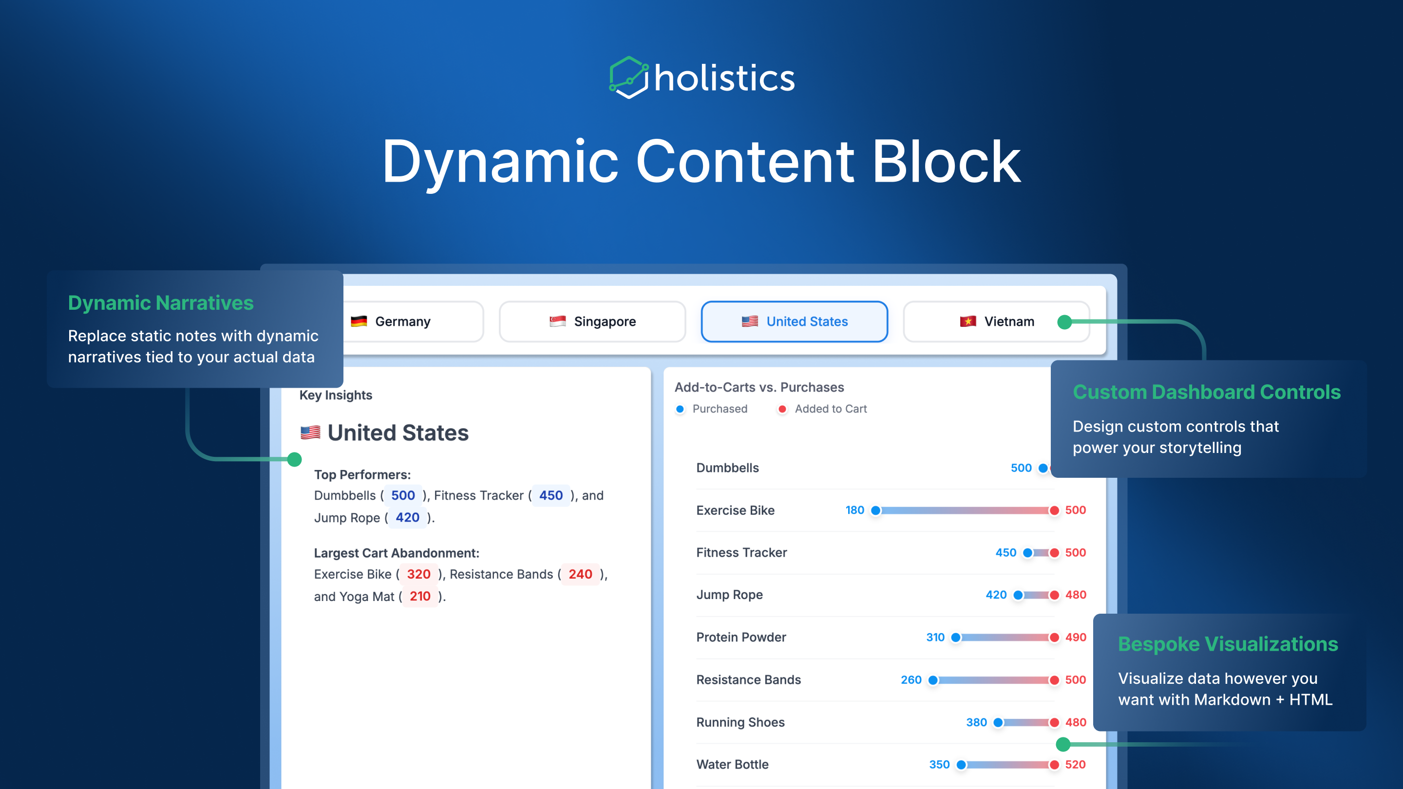
Dynamic Content Blocks let you build custom, data-driven content using Markdown, HTML, and CSS that automatically updates with live data from your models.
Why Use Dynamic Content Blocks?
Standard chart types work well for common scenarios, but sometimes you need more flexibility:
- Narratives with live data - Generate insights like "Revenue increased by 12.4% compared to Q2" that refresh automatically, instead of static text
- Custom visualizations - Build Dumbbell charts, Kanban boards, calendar heatmaps, or any chart type not available in standard options
- Branded layouts - Design product catalogs, metric cards, or KPI displays that match your company's visual identity
- Interactive controls - Create custom filter buttons or date selectors using HTML and cross-filtering
How It Works
Dynamic Content Blocks combine two things:
- Your data (from a dataset query)
- A template (HTML/Markdown with placeholders).
The template references data fields using a simple syntax, and Holistics renders the final content by injecting live values.
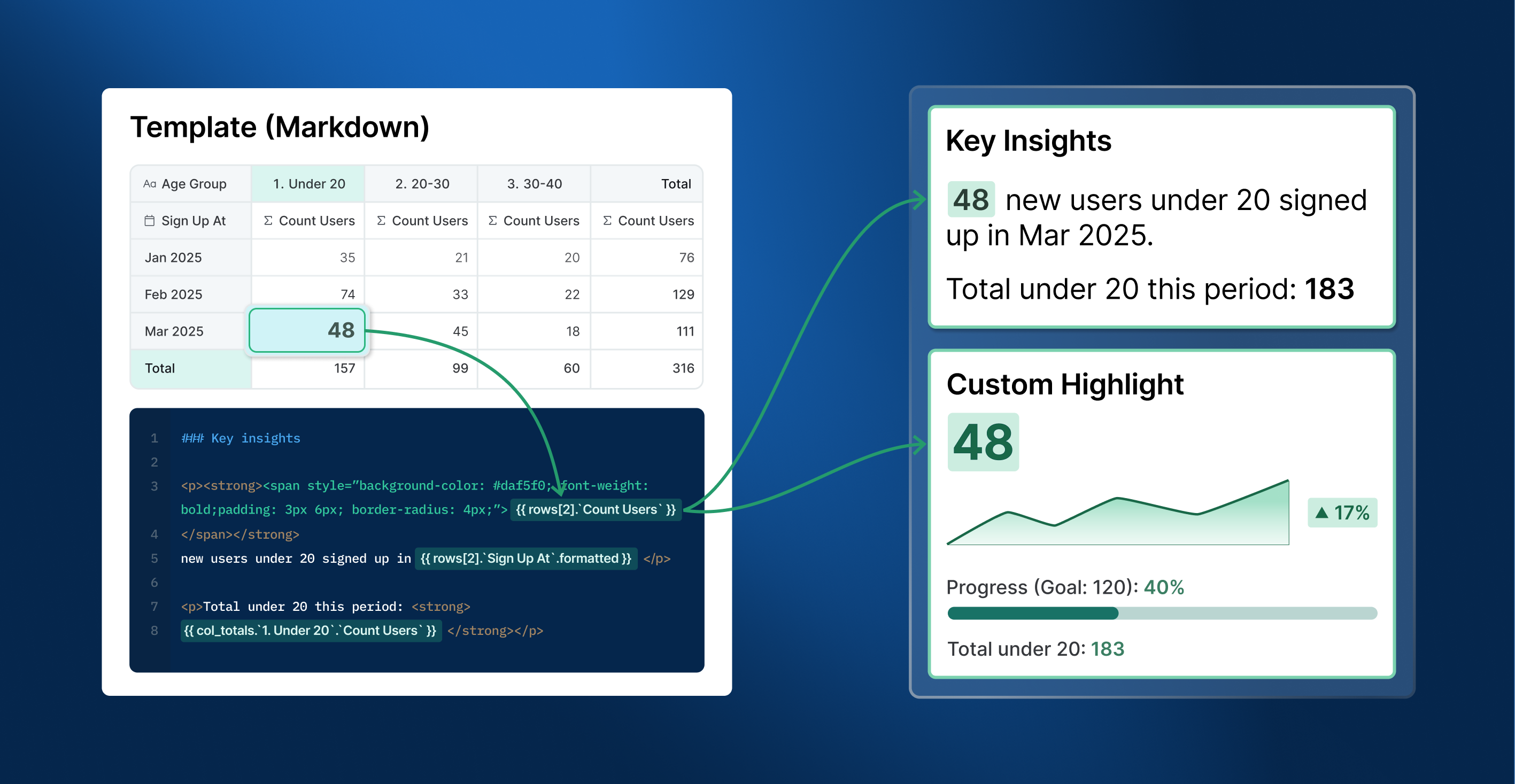
When your underlying data changes, the rendered content updates automatically.
Limitations
- No JavaScript execution in templates (HTML/CSS only), for security reasons
Get Started
- Getting Started - Step-by-step tutorial to create your first block
- Syntax Reference - Complete guide to template syntax and troubleshooting
- Template Gallery - Ready-to-use examples you can copy and customize