Adding annotations to charts
Introduction
Annotations are useful when you want to add contextual information to your charts, such as marking important events, changes, or milestones that may have impacted your metrics.
For example, you might want to annotate when you launched a new product feature, ran a marketing campaign, or encountered system issues - this helps viewers better understand the trends and patterns in your data.
By following this guide, you will learn how to create annotations that can be included in your dataset and reused in any charts that you build from that dataset.
General Approach
To add annotations to your charts in Holistics, you'll need to follow these three main steps:
- Create a data model containing your annotations data with event dates and descriptions
- Join this annotations data with your main dataset using a date-based relationship
- Configure your chart visualization to display the annotations at the specified dates. The annotations will appear as a separate line on the Y-axis of your chart.
Implementation
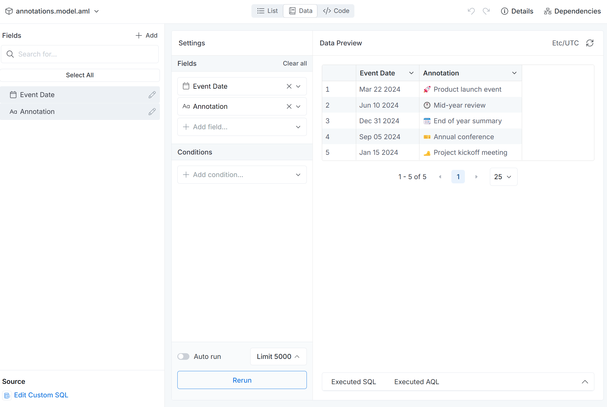
1. Create the Annotations Data Model
First, you'll need to create a Table Model or use SQL to create a Query Model on the fly that returns two essential columns:
event_date: The date of the annotationannotation: The text description of the event
Here's a sample query to create an on-the-fly data model:
Model annotations {
  type: 'query'
  label: 'Annotations'
  description: 'Model for storing chart annotations and important events'
  data_source_name: 'demo_pg'

  dimension event_date {
    label: 'Event Date'
    type: 'date'
    hidden: false
    definition: @sql {{ #SOURCE.event_date }};;
  }

  dimension annotation {
    label: 'Annotation'
    type: 'text'
    hidden: false
    definition: @sql {{ #SOURCE.annotation }};;
  }

  query: @sql
    SELECT
        CAST('2024-01-15' AS DATE) AS event_date, '🦶 Project kickoff meeting' AS annotation
    UNION ALL
    SELECT
        '2024-03-22', '🚀 Product launch event'
    UNION ALL
    SELECT
        '2024-06-10', '🕛 Mid-year review'
    UNION ALL
    SELECT
        '2024-09-05', '🎫 Annual conference'
    UNION ALL
    SELECT
        '2024-12-31', '🗓️ End of year summary'
    ;;;

  models: []
}
The resulting data table will look like this:
2. Add the Model to Your Dataset
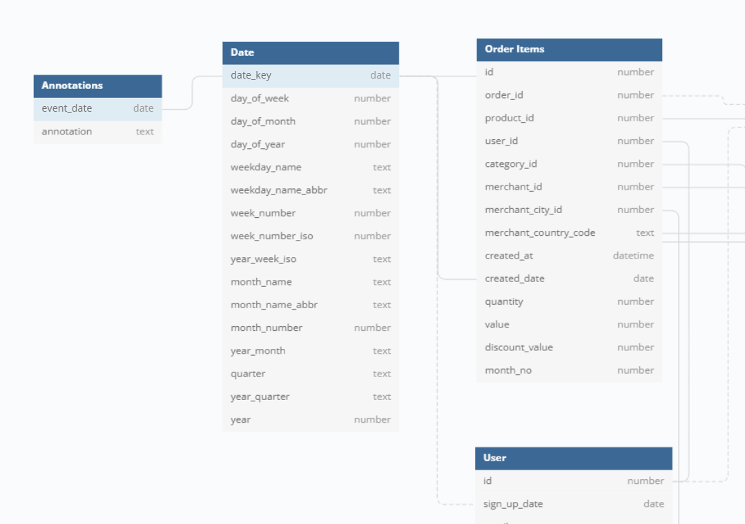
After creating the annotations model, you need to integrate it with your existing dataset, and set up a relationship between your main date dimension and the annotations date.
For example, in this case, we create a "one-to-one" relationship between date_dim.date and annotations.event_date in the dataset ecommerce.
3. Display Annotations in Your Chart
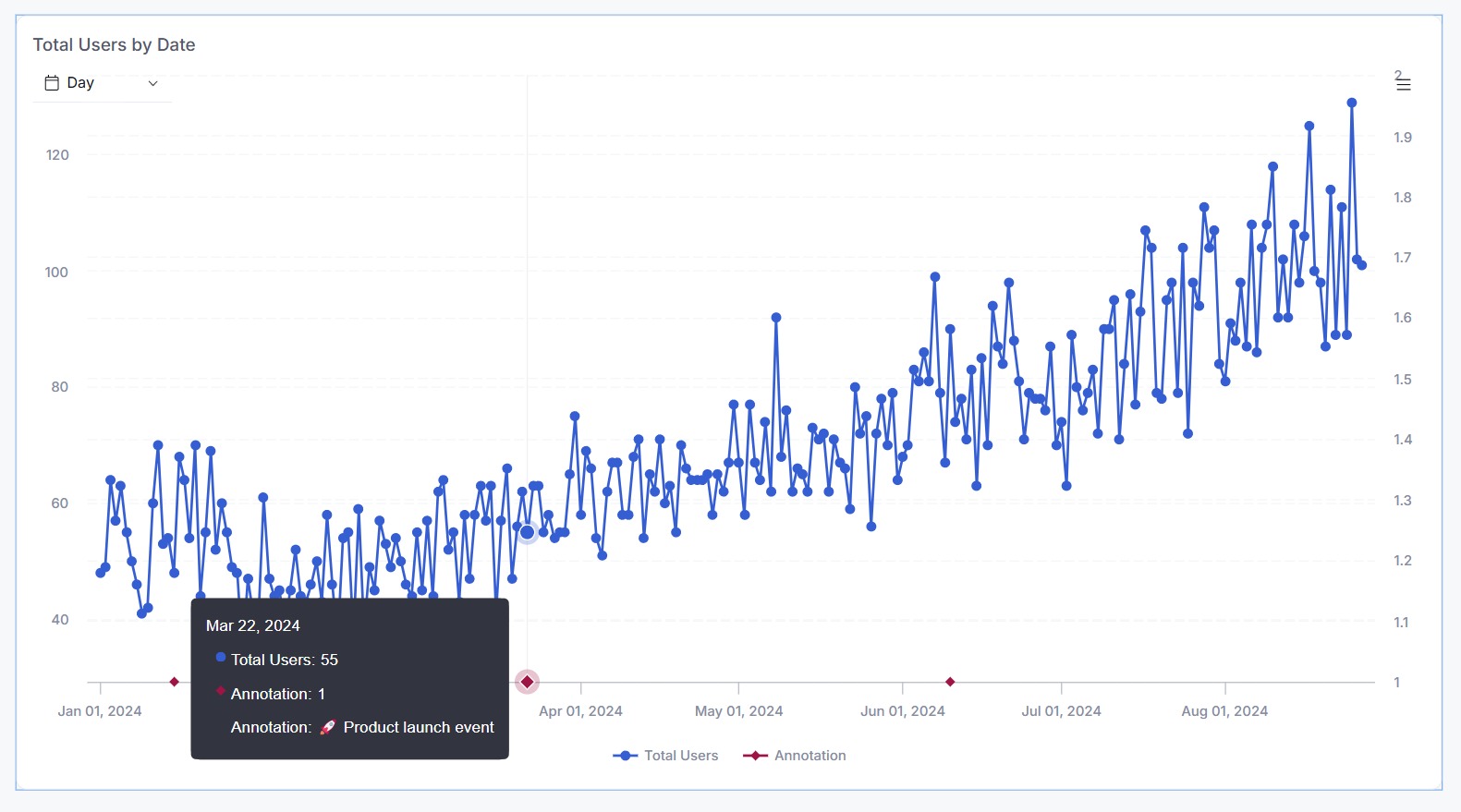
Next, we will set up annotations to appear as markers on your chart, with each point representing a specific event.
The annotations will be displayed on a secondary Y-axis. Each annotation point will have a tooltip that displays the content of the annotation when you hover over it.
With this approach, you have to use either combination chart or line chart or column chart to enable secondary Y-axis.
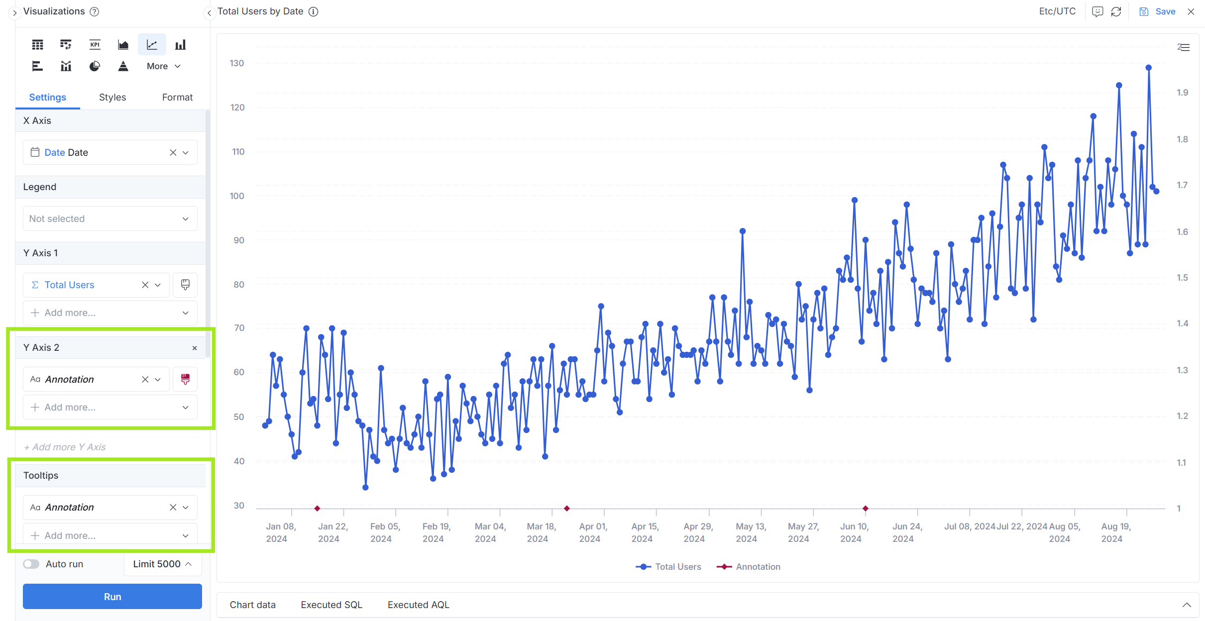
Setup A - Annotations as Data Points on Line Chart
A.1 Configure Chart Data Settings
In addition to your normal chart setup:
-
Create a measure
count(annotations.annotation), then place it on the secondary Y-axis, and set its visualization type to line chart. This will display a data point on any date that has at least one annotation. -
Create another measure
max(annotations.annotation)and add it to the tooltip section.
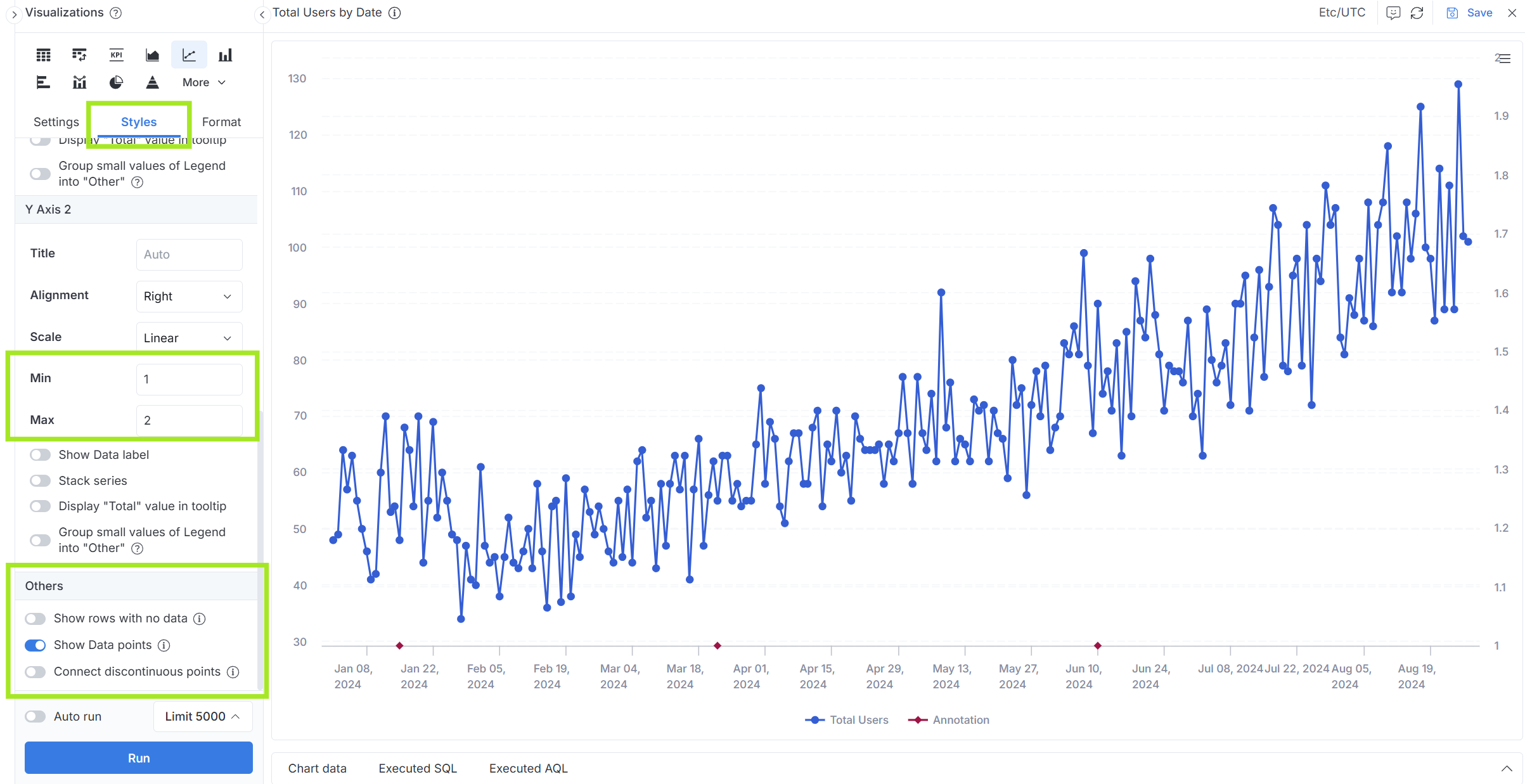
A.2 Adjust Chart Styles
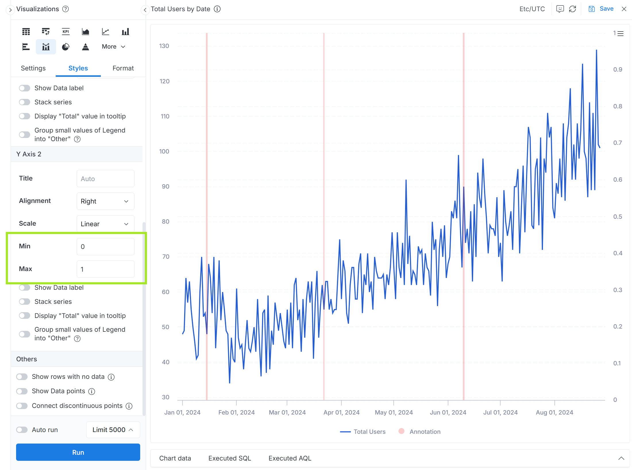
For the secondary Y-axis,
- Set appropriate minimum and maximum values to position annotation points at the bottom of the chart
- Enable "Show data points" option
- Disable "Connect discontinuous points" option to prevent unwanted line connections
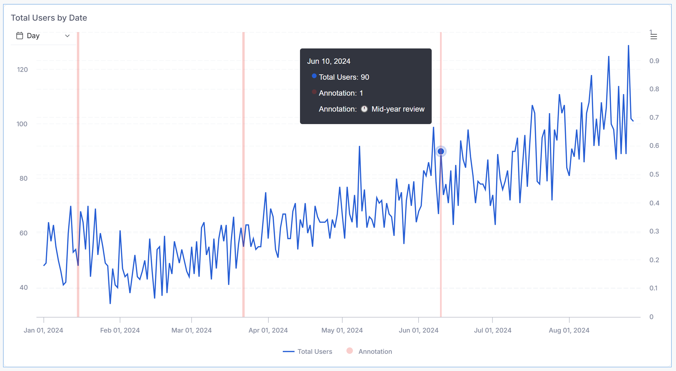
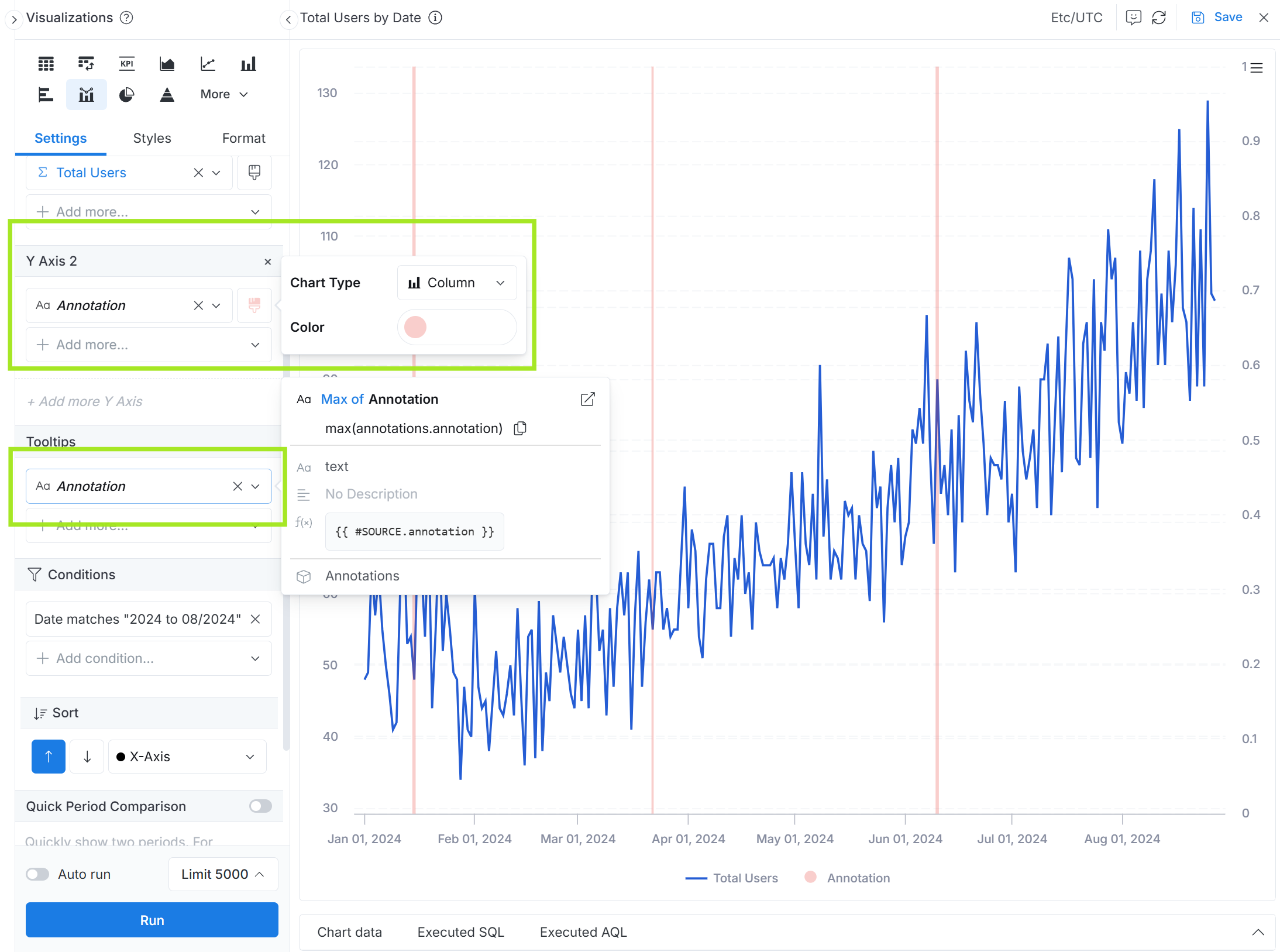
Setup B - Annotations as Vertical Lines
B.1 Configure Chart Data Settings
In addition to your normal chart setup:
-
Create a measure
count(annotations.annotation), then place it on the secondary Y-axis, and set its visualization type to column chart. This will display a data column on any date that has at least one annotation. -
Make the color of the secondary Y-axis lighter than the main Y-axis.
-
Create another measure
max(annotations.annotation)and add it to the tooltip section.
B.2 Adjust Chart Styles
For the secondary Y-axis, set appropriate minimum and maximum values to position annotation points at the bottom of the chart