Dashboard best practices
This page outlines some best practices to follow when creating Holistics dashboards.
Before you begin
Here are some principles to consider before you create a dashboard.
User-First Design
When it comes to building and designing a dashboard, the user has to come first. Without taking into account who will be using the dashboard and what their goal is, you really can’t design a great dashboard.
Styling and Color Design
Choosing a color palette that matches your organization’s brand creates a unified graphic language and experience for your users. You can also use color for easy-understandable color coding. For example, if you monitor traffic to your website you can show an increase in traffic in green and a decrease in red.
Best practices to follow
Organize your dashboard
The information you are displaying on your dashboard should be organized logically.
- Whatever data and insights are most important should get the prime real estate at the top left portion of your dashboard so it has the best chance of catching a user’s attention.
- The rest of the dashboard should be displayed based on priority. Underneath the main section should be supporting details or trends. Below that, you can provide data tables or more specific information.
Separate the level of details
- Level 1: High-level dashboard - Optimize for comprehensiveness. Optimize the filters to be drilled through into Level 2 dashboards. The goal of this dashboard is to have trendlines inform you of the general direction of key metrics and patterns for deeper investigation.
- Level 2: Detailed Dashboard - Optimize for breakdown details of Level 1 dashboard (use drill-through feature). Used for understanding.
- Level 3: Action-Driven. Use when there are clear actions to be taken (data alerts etc). (Note: Data Alerts is still a work in progress).
Chose the right charts for the job
To help you choose the right representation of your data, here’s our short summary to choose the correct types of data visualization for your report.
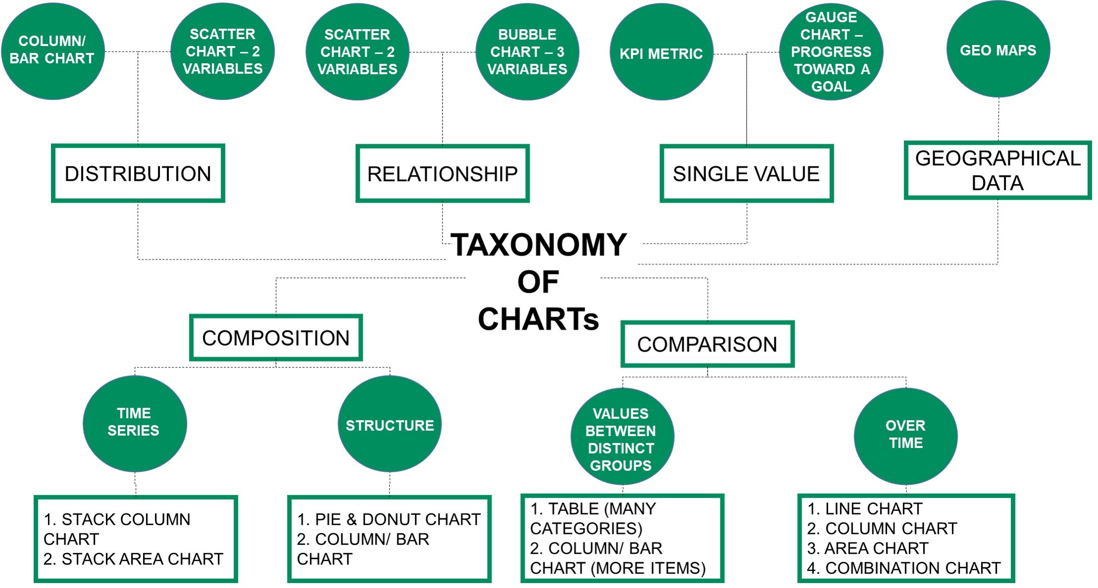
Moreover, Holistics provides some visualization types by default for common analytics use-cases such as:
- Retention Heatmap for Cohort Retention Analysis
- Native support with Period-over-Period Comparison
- Metric sheets help to keep all your metrics in one sheet and visualize it with sparklines
Use the right format for easy reading
- Be consistent with chart scales on axes, chart dimension ordering, and also the colors used for dimension values within charts.
- Be sure to encode quantitative data nicely. Don’t exceed three or four numerals when displaying numbers. Display measures to one or two numerals left of the decimal point and scale for thousands or millions i.e. 5.2M, not 5,200,000.
- Try to avoid mixing levels of precision and time. Make sure that time frames are well understood. Don’t have one chart that has last month next to filtered charts from a specific month of the year.
- Also try to avoid mixing big and small measures on the same scale, such as on a line or bar chart. For example, one measure can be in the millions and the other measure in the thousands. With such a large scale, it would be difficult to see the differences of the measure that is in the thousands. If you need to mix, choose a visualization, like a combination chart, that allows the use of a second axis.
- Avoid cluttering your charts with data labels that are not needed. The values in bar charts, if large enough, are usually well understood without displaying the actual number.
Performance Tips
Troubleshooting
Click here to learn about Performance Troubleshooting in Holistics.
Reduce number of widgets
We wrote an article on Best practices to improve Holistics reporting performance, but it’s worth reiterating here. The easiest way to make dashboards load faster is to ask for less data.
- You could also break up a dashboard into multiple dashboards to reduce the number of items that need to load on a single one. It is advisable to have a maximum of 10 - 15 widgets per dashboard for better report performance.
- If a user wants to dive deeper into the details related to a certain section of a dashboard, they should be able to easily navigate to a new page or dashboard with that data using Drill Through and Cross-filtering.
Preload dashboard
See:
Disable Dashboard auto-run
Other tips
- Your viewers can hide/unhide items on the chart by clicking on the legends
- In addition to customizing click behavior, you can use Text widgets to provide additional context, links to related dashboards, questions, or other relevant sites. Moreover, let’s use the
HTMLin the Text widget to embed videos and images to your dashboard or just create some inline CSS to style the text.
Common challenges
- Left out adding filters, and drill-throughs. Some users miss out on the ability to add filters to dashboards.