Custom CSS for Dashboards
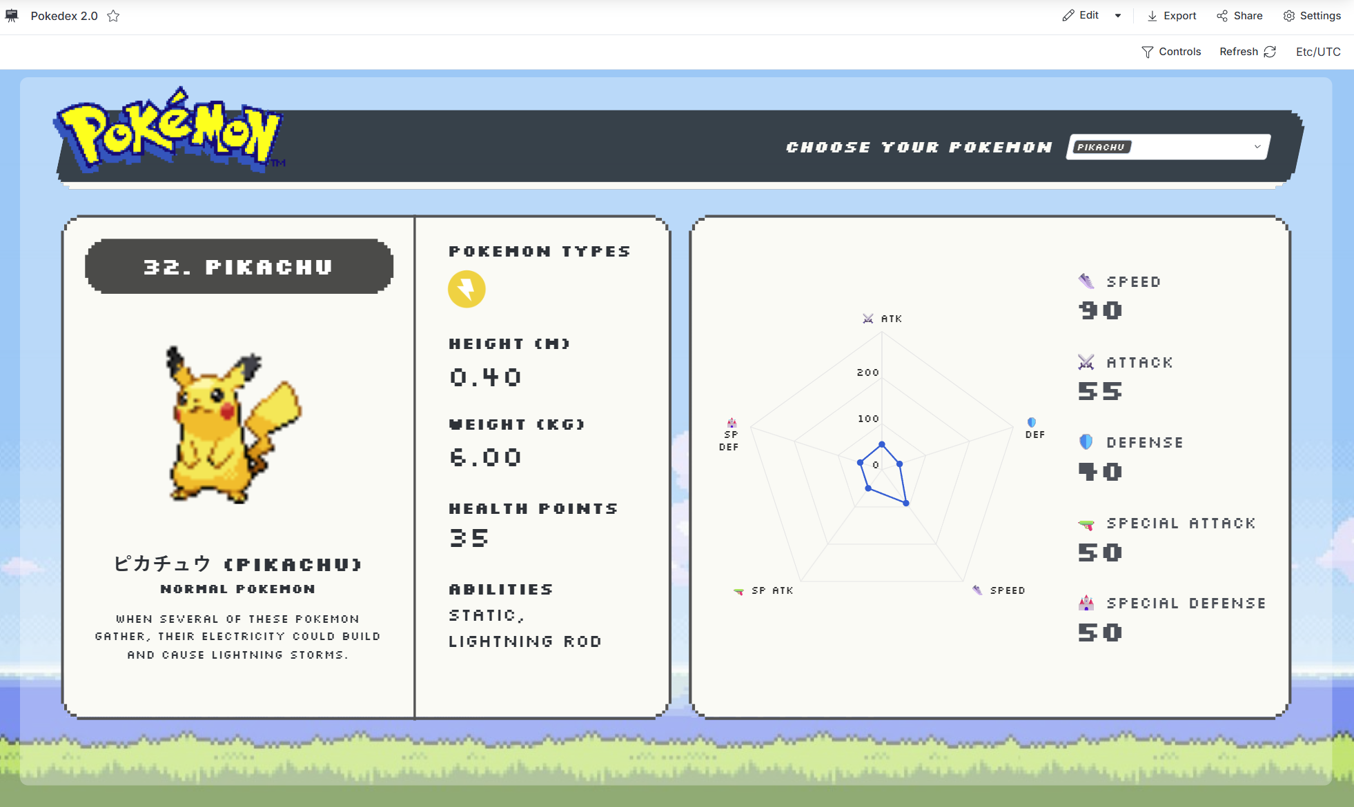
When theme parameters aren't enough to express your workspace's visual identity, you can drop into custom CSS. This is how admins and analysts achieve brand-specific colors, custom KPI styling, and unique visual treatments that match your organization's design standards. For example, you can build a dashboard like the one below:
How to Define Custom CSS
Define custom CSS in your dashboard theme settings.
PageTheme classic {
  // existing theme properties
  custom_css: @css
    /* your custom CSS rules here */
  ;;
}
Where can you apply custom CSS to?
1. Custom CSS Classes
Define custom CSS classes in your PageTheme, then use them in HTML elements within TextBlocks. This approach keeps your styles organized and reusable across your dashboard.
Example:
PageTheme classic {
  // existing theme properties
  custom_css: @css
    .my-custom-header {
      font-size: 24px;
      color: #2563eb;
      font-weight: bold;
    }
  ;;
}

block t1: TextBlock {
  content: @md
    <div class="my-custom-header">Q1 Sales Performance</div>
  ;;
}

block t2: TextBlock {
  content: @md
    <div class="my-custom-header">Q2 Sales Performance</div>
  ;;
}
Improve reusability with Block Library:
You can take this further by turning your text blocks into reusable components in your Block Library. This allows you to reuse the same styled component across multiple dashboards without duplicating code.
// Define a reusable function for your custom header
Func custom_header_block(title: Text) {
  TextBlock {
    content: @md
      <div class="my-custom-header">${title}</div>
    ;;
  }
}

PageTheme classic {
  custom_css: @css
    .my-custom-header {
      font-size: 24px;
      color: #2563eb;
      font-weight: bold;
    }
  ;;
}

// Reuse the function across multiple blocks
block t1: custom_header_block(title: "Q1 Sales Performance")
block t2: custom_header_block(title: "Q2 Sales Performance")
2. Leverage Holistics' Semantic Classes
Use Holistics-provided semantic classes to style dashboard elements consistently. These classes are preserved by Holistics and are stable: they won't change between updates, making them safe for long-term use.
Example:
PageTheme classic {
  // existing theme properties
  custom_css: @css
    .h-kpi-metric-label {
      text-align: center;
      font-size: 14px;
      color: #64748b;
    }

    .h-kpi-metric-diff {
      font-weight: bold;
      color: #16a34a;
    }
  ;;
}
Semantic Classes Reference
These classes are guaranteed to remain stable across Holistics updates:
| Class Name | Description |
|---|---|
dac-canvas | Main dashboard canvas container |
h-dac-toolbar | Top toolbar of the dashboard |
h-dac-toolbar-left | Left section of the toolbar (includes tab selector) |
h-dac-toolbar-right | Right section of the toolbar (includes controls, timezone, etc.) |
dac-viz-block | Container for a visualization block |
dac-viz-block-label-container | Container for the visualization title |
dac-viz-block-label | Visualization title text |
h-kpi-metric-kpi | KPI value display |
h-kpi-metric-label | KPI label text |
h-kpi-metric-diff | KPI difference indicator |
dac-ic-block | Filter block container |
dac-ic-block-label | Filter title text |
dac-text-block | Text content block |
3. Direct Element Classes (Use with Caution)
You can target elements without semantic classes, but this approach is risky as class names may change in future updates.
Important warnings:
- Avoid overriding Tailwind utility classes (e.g.,
.text-blue-gray-80,.bg-white,.p-4) as these may change without notice - Use this method only for urgent needs when semantic classes aren't available
- If you need to customize an element without a semantic class, contact our support team to request a new semantic class
Need Help?
For more advanced customization techniques and community-shared examples, visit our Community Forum discussion on custom CSS.
If you need a semantic class for an element that doesn't have one, please let us know through the Community Forum or support channels.