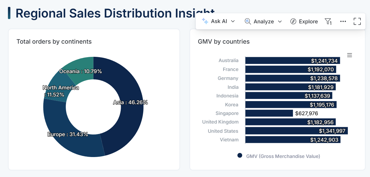
Visualization Blocks
Visualization blocks (charts, tables) are key components that help you tell the story on your dashboards. They're the primary way to present data findings and enable interactive exploration.
Creating Visualization Blocks
You have three ways to create visualization blocks:
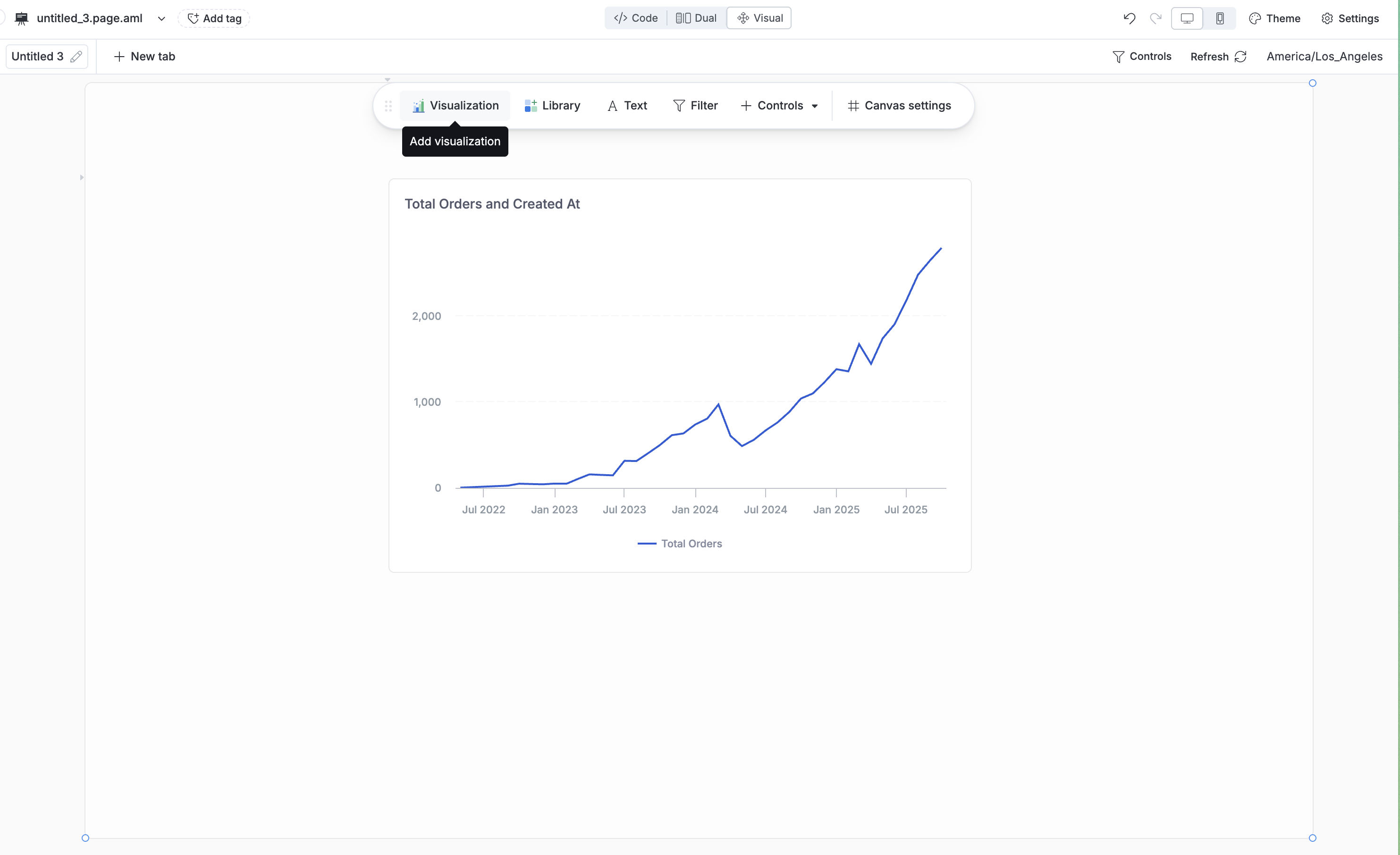
Create Directly in Dashboard: Build visualization blocks directly on your dashboard using the canvas tool panel.
Save from Dataset exploration: Explore your dataset first, build your chart, then save it to a dashboard.
Save from AI conversation: Ask questions about your data using the AI chat, generate visualizations, then save them to your dashboard.
Using Visualization Blocks
Present Data and Insights
Use visualization blocks to:
- Highlight key metrics with KPI cards and scorecards
- Show trends over time with line and area charts
- Compare categories with bar and column charts
- Display distributions with pie charts and histograms
- Reveal relationships with scatter plots and bubble charts
Choose from a wide variety of chart types to match your data and message.
Follow Up with AI
Users can click on any visualization block to ask questions and get AI-powered insights about the data they're viewing. The AI understands the context of your chart and can help uncover patterns, explain anomalies, or suggest next steps.
Enable Interactive Exploration
Visualization blocks aren't static - users can interact with them to dig deeper:
- Break down data by adding new dimensions on the fly
- Drill down into specific data points to see underlying details
- Filter across the dashboard by clicking on data points (cross-filtering)
- Drill through to related dashboards for deeper analysis
- View underlying data to see the raw records behind any chart
Learn more about Dashboard Interactions.