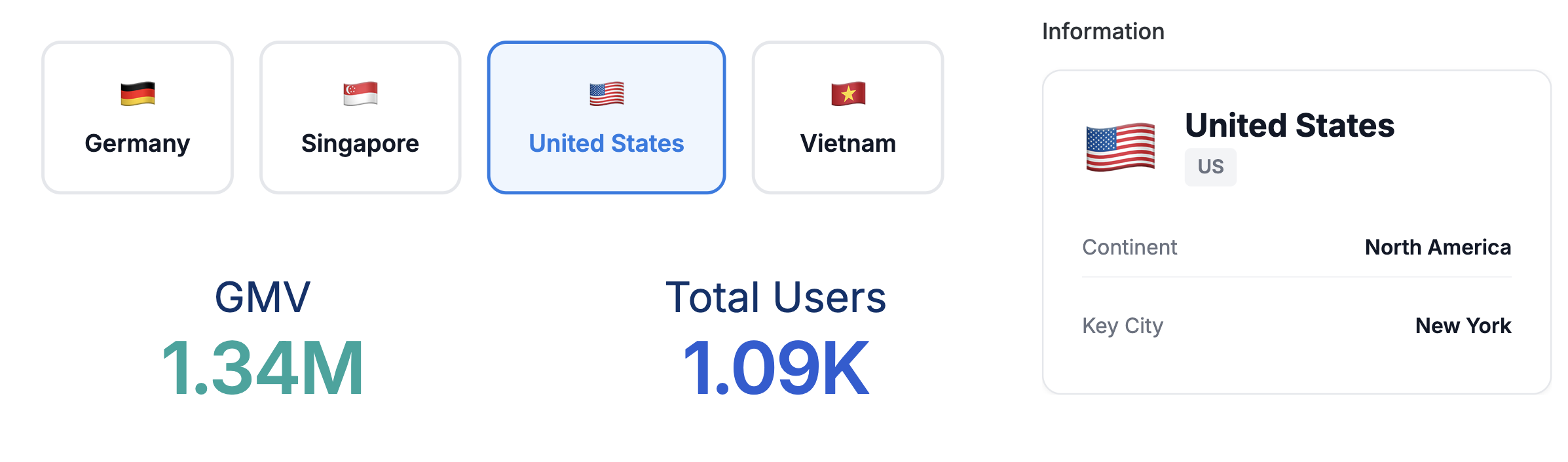
Interactive Control Buttons
Clickable buttons that act as filter controls, allowing users to select options that filter other dashboard components.
Best for: Region selectors, category filters, interactive dashboards
Key techniques: map(rows) loop, <h-drill> component for interactivity, hover/active states
Template Code
<style>
  .country-selector {
    display: flex;
    gap: 1rem;
    padding: 1rem;
    flex-wrap: wrap;
  }

  .country-card {
    position: relative;
    display: flex;
    flex-direction: column;
    align-items: center;
    gap: 0.5rem;
    padding: 1.25rem 1.5rem;
    background: #FFFFFF;
    border: 2px solid #E5E7EB;
    border-radius: 12px;
    cursor: pointer;
    transition: all 0.15s ease;
    min-width: 120px;
    text-align: center;
  }

  .country-card:hover {
    border-color: #3B82F6;
    background: #F8FAFC;
    transform: translateY(-2px);
    box-shadow: 0 4px 12px rgba(59, 130, 246, 0.15);
  }

  .country-card:active {
    border-color: #1B7CE4;
    background: #EFF6FF;
    transform: translateY(0);
  }

  .h-drill-selected.country-card {
    border-color: #1B7CE4;
    background: #EFF6FF;
    transform: translateY(0);
  }

  .h-drill-selected.country-card > .country-label {
    color: #1B7CE4;
  }

  .country-icon {
    font-size: 1.5rem;
    line-height: 1;
  }

  .country-label {
    font-size: 0.9375rem;
    font-weight: 600;
    color: #111827;
  }
</style>

<div class="country-selector">
{% map(rows) %}
  <h-drill row="0" value="{{ `Country`.raw }}">
    <div class="country-card">
      <span class="country-icon">{{ `Country Icon`.formatted }}</span>
      <span class="country-label">{{ `Country`.formatted }}</span>
    </div>
  </h-drill>
{% end %}
</div>
Required Data Fields
| Field | Type | Description |
|---|---|---|
Country | Dimension | Filter value (e.g., country name) |
Country Icon | Dimension | Display icon (e.g., flag emoji) |
How Cross-Filtering Works
- The
<h-drill>component wraps each clickable element - The
valueattribute specifies what value to filter by (use.raw) - When clicked, the value is applied as a filter to other dashboard components
- The
.h-drill-selectedclass is added to the child element when selected
Sample Data
Import this data into Holistics to use: sample-data-control-buttons.csv
Country,Country Icon
Germany,🇩🇪
Singapore,🇸🇬
United States,🇺🇸
Vietnam,🇻🇳
Customization Tips
- Change the color scheme by modifying the border and background colors
- Adjust the hover/active states to match your brand
- The selector pattern uses
.h-drill-selected.country-card(both classes on same element) - Add more content to each button (e.g., metrics, descriptions) by extending the card HTML