Period-over-period Comparison
Introduction
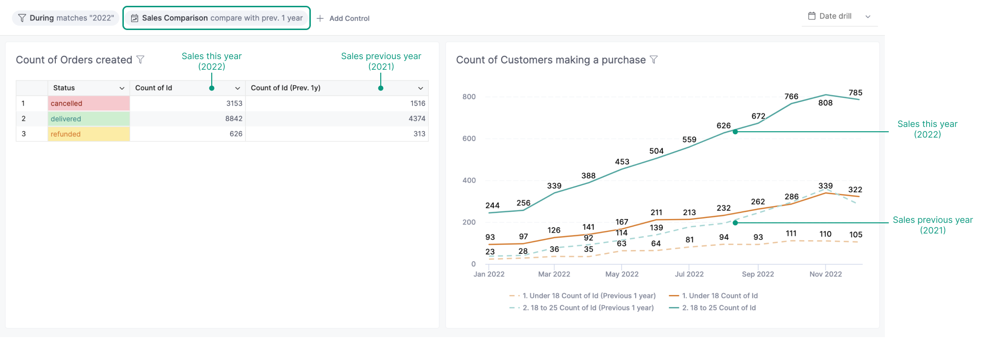
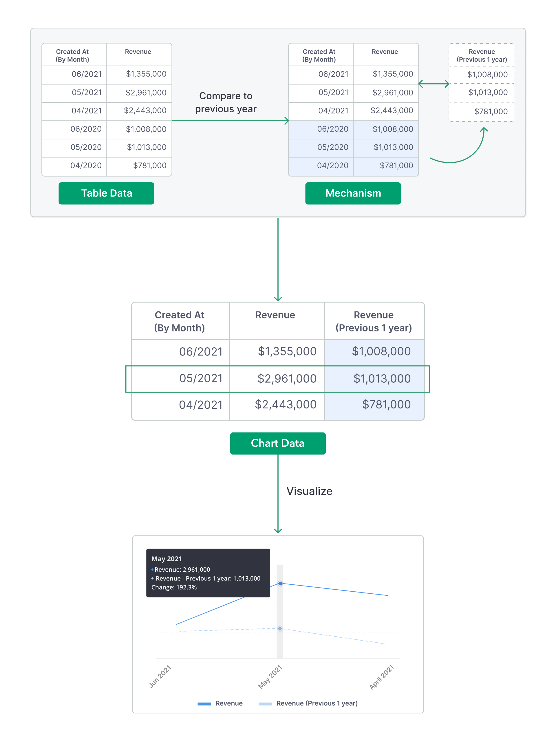
With Period Comparison feature, users can quickly visualize and compare data of different periods without complicated modeling steps.
For example, comparing sales of this year with the previous year:
Set up
You can set up Period Comparison as part of a visualization, allowing users to see the comparison immediately when they visit the dashboard. Additionally, you can set up Period Comparison as a control on your dashboard, enabling users to interact with it for different timeframe comparisons.
When exploring a dataset or building a visualization
In the dataset exploration (or visualization editing) interface, there are two options to set up Period Comparison:
- Click on a measure/metric in the Settings and choose Add calculation: Period-over-period comparison.
- Turn on Quick period comparison toggle at the bottom of the Settings.
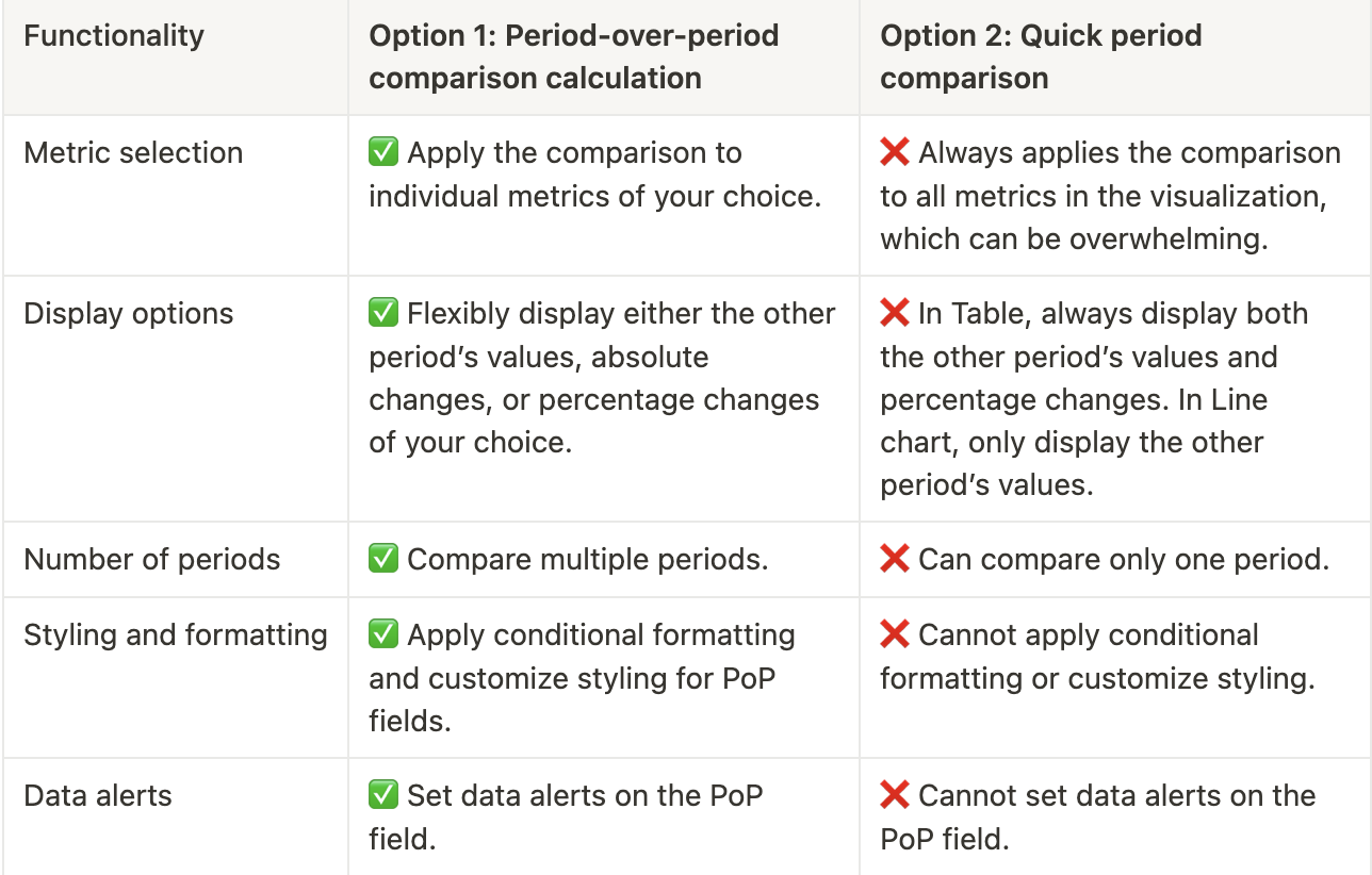
In all cases, we recommend using the first option. Here's why:
- The second option, the Quick Period Comparison toggle, is an early feature designed to support period-over-period (PoP) analysis. However, from customer feedback over time, we've found it to be limited in flexibility and customizability.
- With our robust AQL foundation, the Period-over-period comparison calculation utilizes AQL's power and an intuitive UI to accommodate all use cases that the Quick Period Comparison cannot. For instance:
Please see below for detailed instructions for each option.
Period-over-period Comparison Calculation:
- Input at least one measure/metric in your visualization.
- Click Add calculation: Period-over-period comparison.
- Choose one option from our quick suggestions, or select Custom to create your own.
- Adjust the field label, styling, or formatting as desired.
- 4.0 Version: If you are currently using version 3.0, you'll need to upgrade to 4.0 version to use this feature and other cool stuff.
- AQL-Enabled: Once your version is upgraded to 4.0, make sure you have enabled AQL for your datasets.
This is the built-in, UI-centric functionality to create period-over-period comparisons. Alternatively, you can use AQL expressions as detailed here: Period Comparison Guide using AQL.
Quick period comparison toggle:
- Input at least one measure/metric in your visualization
- Toggle on Quick Period Comparison in Visualization Settings
- Select a date/time field to act as the time dimension of the comparison
- Select Comparison Type & Period to compare
When building a dashboard
- On Dashboard: Click on the Add Control button, and choose Period Comparison.
- On the “Add Period Comparison” modal:
- Enter a label for your comparison
- Select the Comparison type & Period to compare
- Select the widgets that you want to apply the comparison, and choose a date/time field to act as the time dimension of the comparison.
- Currently, the Period Comparison control on dashboards is similar to the Quick period comparison toggle in the dataset exploration flow described above. We are working on an improved version for dashboards.
- Each widget can be mapped to only one Dashboard Period Comparison at a time
- If a widget already has Period Comparison in its settings, Dashboard Period Comparison will take precedence when you view it in dashboard mode. The widget's Period Comparison remains in tact, and will show when you Explore or Edit the widget.
For non-time series charts
Holistics's Period Comparison also works on non-time series charts.
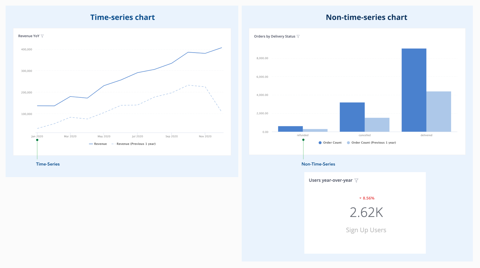
However, since they display aggregated data without a time dimension, the setup will need a few extra steps.
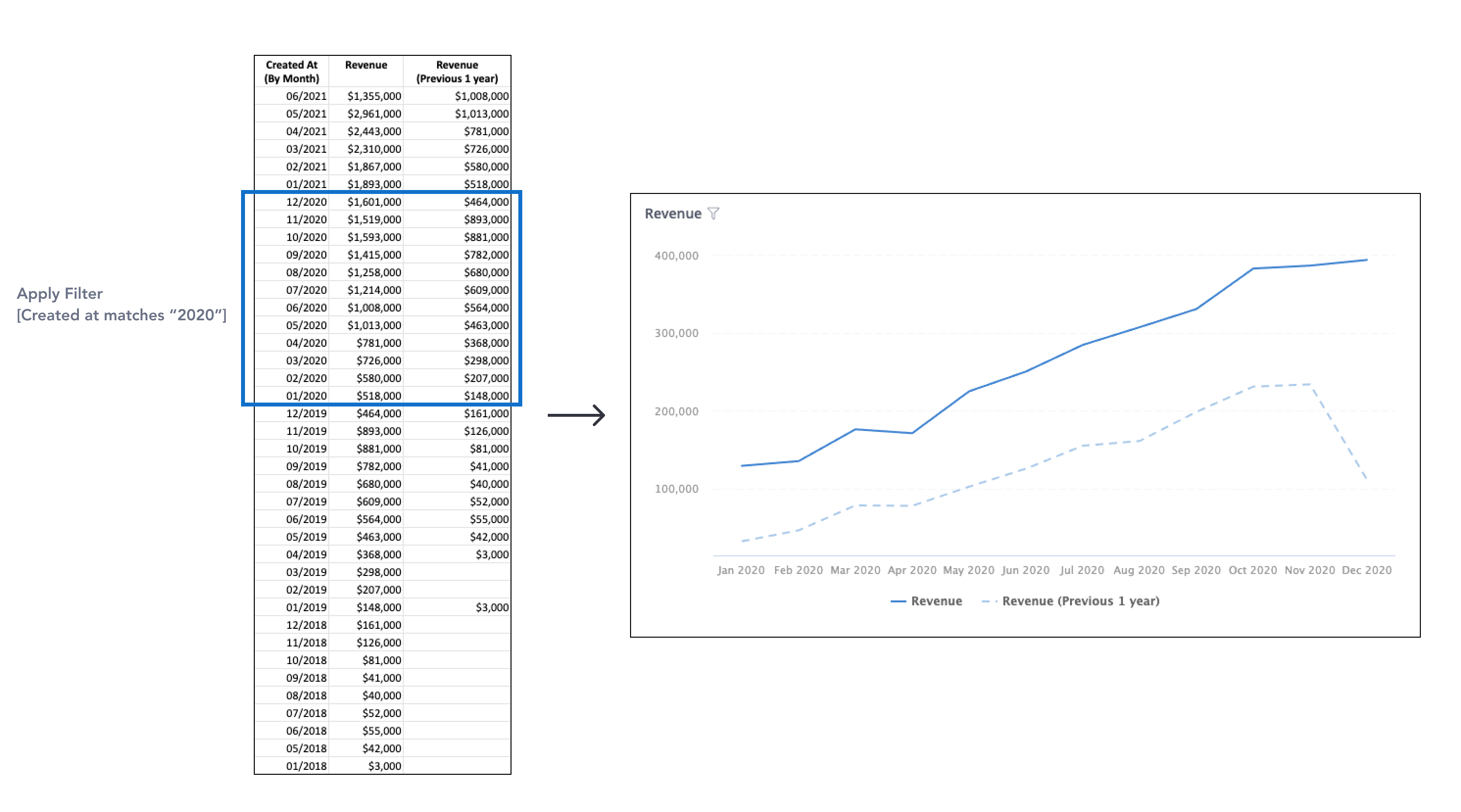
If you use Previous period comparison, you will need to specify a base time period so that Holistics can take that period and shift it back. In other words, you need to add a time filter to your data. Without a filtering condition, two periods will return the same result.

- If you use Custom period comparison, without filtering on the base time period, the feature still works. You will compare metrics calculated on all time against metrics calculated on a custom time period.
How it works
Period Comparison supports two types of comparison:
- Previous period: a relative time shift from the original timeframe. For example: compare this month with 2 months ago
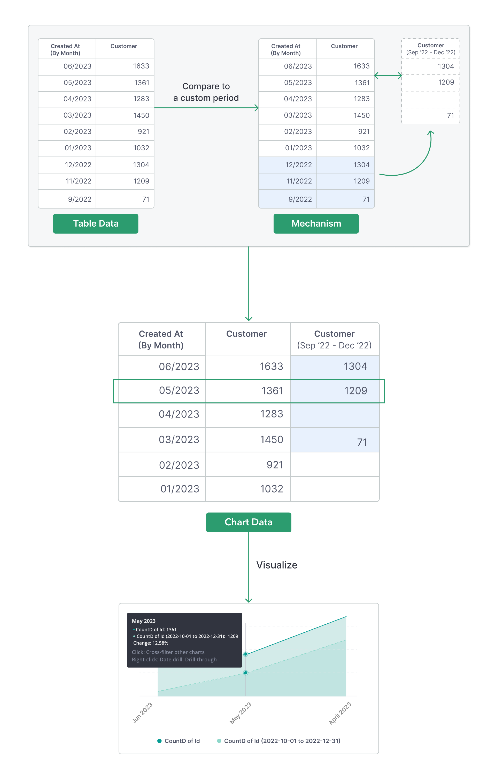
- Custom period: an absolute timeframe chosen by the user. For example: compare this week with the Christmas period (2023-12-24 to 2024-01-02)
We will go into details of how each type works in the next sections.
Previous period comparison
Previous period comparison will take the base time period, shift it back by an amount of your choice (1 month, 1 year...), calculate your metrics at that shifted time period, and display the time points of base period and past period in parallel. For example:
- Previous 1 year comparison: June 2023 is compared to June 2022
- Previous 1 week comparison: This Friday is compared to last week's Friday
Custom period comparison
Custom period comparison will calculate the metrics at the custom selected time period, and the two time periods are displayed together so that the first time points are aligned. Time points in both periods are sorted in the same order.
In the following example, the custom period (09/2022 -> 12/2022) is compared with the base period (01/2023 -> 06/2023). Data points are sorted in descending time order, and the month 12/2022 is aligned with the month 06/2023 as they are both at the first position of their respective period.
Availability
Chart types supported
The following chart types support Period Comparison:
- Table
- Pivot Table
- Line/Bar Chart family: Line/Bar/Column/Area/Combination chart
- Metric KPI
Databases supported
Period Comparison is supported in the following databases:
- PostgreSQL
- Google BigQuery
- Amazon Athena
- Snowflake
- Presto
- Amazon Redshift
- MySQL
- Microsoft SQL Server
- Clickhouse
Other notes
Date filters only apply to the base period
If users want to limit the data from both periods for privacy purposes, we suggest using Row-level Permission.
When base and past periods have different length
For example, we compare the base month with previous 1 month.
If the base month has more days than the previous month (March vs. February), then the line for previous month will show blank for the missing days:

If the base month has less days than the previous month (February vs. January), then the chart will cut off at the end of the base month:

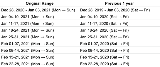
Comparing weeks of years
If the data is aggregated to Week grain and is to be compared with previous 1 year, we will do the following:
- We convert the weeks into seven-day blocks. The first day of the week follows Week Start Day setting.
- We shift those seven-day blocks back one year to create the past period
- The metrics calculated for this past period will be aggregated by these seven-day blocks and may not represent a normal week (that starts from Monday and ends with Sunday)
In other words, Week 1 of this year may not be aligned with the days of Week 1 last year, but is aligned with the seven-day block that happened exactly 1 year ago.
For example, when comparing weekly Revenue of January 2021 and February 2021 with their previous 1 year. The Week Start Day is Monday.