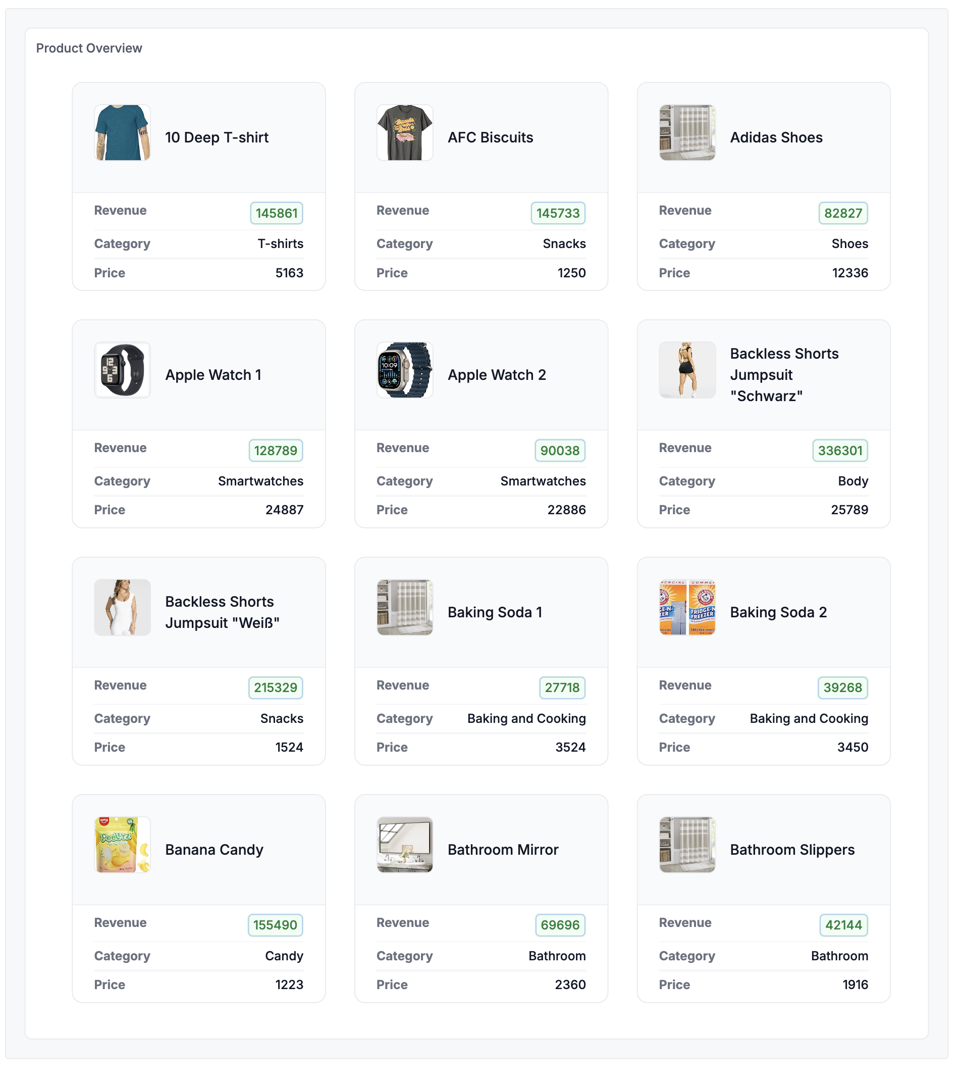
Product Cards Grid
A responsive grid of product cards with images, metrics, and clean layouts for displaying multiple items at a glance.
Best for: E-commerce dashboards, product catalogs, inventory displays
Key techniques: CSS Grid responsive layout, image handling with .raw, looped card generation
Template Code
<style>
  .deals-container {
    display: grid;
    padding: 1.5rem;
    grid-template-columns: repeat(1, minmax(0, 1fr));
    column-gap: 1.5rem;
    row-gap: 2rem;
    list-style: none;
  }

  @media (min-width: 1024px) {
    .deals-container {
      grid-template-columns: repeat(2, minmax(0, 1fr));
    }
  }

  @media (min-width: 1536px) {
    .deals-container {
      grid-template-columns: repeat(3, minmax(0, 1fr));
      column-gap: 2rem;
    }
  }

  .deal-container {
    overflow: hidden;
    border-radius: 0.75rem;
    border: 1px solid #E5E7EB;
    list-style: none;
  }

  .deal-header {
    display: flex;
    padding: 1.5rem;
    column-gap: 1rem;
    align-items: center;
    border-bottom: 1px solid rgb(17 24 39 / 0.05);
    background-color: #F9FAFB;
  }

  .deal-logo {
    object-fit: cover;
    flex: none;
    border-radius: 0.5rem;
    border: 1px solid rgb(229 231 235);
    width: 4rem;
    height: 4rem;
    background-color: #ffffff;
  }

  .deal-name {
    font-size: 1rem;
    font-weight: 500;
    line-height: 1.5rem;
    color: #111827;
  }

  .deal-details {
    padding: 1rem 1.5rem;
    font-size: 0.875rem;
    line-height: 1.5rem;
  }

  .deal-details-inner {
    display: flex;
    padding: 0.3rem 0;
    column-gap: 1rem;
    justify-content: space-between;
  }

  .text-gray-500 {
    color: rgb(107 114 128);
  }

  .text-gray-900 {
    color: rgb(17 24 39);
  }

  .font-medium {
    font-weight: 500;
  }

  .revenue-badge {
    display: inline-block;
    padding: 2px 6px;
    border-radius: 0.375rem;
    font-weight: 500;
    color: rgb(21 128 61);
    background-color: rgb(240 253 244);
    border: 1px solid rgb(22 163 74 / 0.1);
  }
</style>

<ul class="deals-container">

{% map(rows) %}

<li class="deal-container">
  <div class="deal-header">
    <img src="{{ `Product Image Url`.raw }}" class="deal-logo" alt="{{ `Name`.raw }}">
    <div class="deal-name">{{ `Name` }}</div>
  </div>

  <dl class="deal-details">
    <div class="deal-details-inner">
      <dt class="text-gray-500">Revenue</dt>
      <dd><span class="revenue-badge">{{ values.`Revenue` }}</span></dd>
    </div>

    <div class="deal-details-inner">
      <dt class="text-gray-500">Category</dt>
      <dd class="font-medium text-gray-900">{{ `Category Name` }}</dd>
    </div>

    <div class="deal-details-inner">
      <dt class="text-gray-500">Price</dt>
      <dd class="font-medium text-gray-900">{{ values.`Total Price` }}</dd>
    </div>
  </dl>
</li>

{% end %}

</ul>
Required Data Fields
| Field | Type | Description |
|---|---|---|
Name | Dimension | Product name |
Product Image Url | Dimension | URL to product image |
Category Name | Dimension | Product category |
Revenue | Measure | Revenue metric |
Total Price | Measure | Price metric |
Sample Data
Import this data into Holistics to use: sample-data-card-grid.csv
Name,Product Image Url,Category Name,Total Price,Revenue
Samsung Bluetooth Earphone,https://m.media-amazon.com/images/I/61xtSvzyi1L._AC_UL320_.jpg,Audio Gadgets,32615,$102414.00
Sony Headphone 1,https://m.media-amazon.com/images/I/61qzLC0pG+L._AC_UY218_.jpg,Audio Gadgets,29529,$96082.00
Face Cream,https://m.media-amazon.com/images/I/61El1UzIVVL._AC_UL320_.jpg,Face,8832,$107831.00
Playstation 4,https://media.holistics.io/j4wlo8-Group-2884.png,Gaming,31842,$126679.00
Sony Xperia 1,https://media.holistics.io/tdcmvm-Group-2882.png,Mobiles,39826,$169948.00
Apple Watch 1,https://media.holistics.io/1pm8rk-Group-2887.png,Smartwatches,24887,$128789.00
Customization Tips
- Adjust the grid breakpoints in
@mediaqueries for different responsive behavior - Change the
.revenue-badgecolors to highlight different value ranges - Add more detail rows by duplicating the
.deal-details-innerblock - Use
.rawfor image URLs to ensure proper rendering